A retelling of my first hackathon experience — a UX case study

In the days leading up to HackFest 2019, formerly known as HackChella, I truly did not know what to expect from the experience. When I tried to picture what I might be in for, depraved scenes from HBO’s Silicon Valley kept flashing through my mind.
Now that I am safely on the other side, l can say that it was actually pretty fun, and that I would definitely recommend it to young professionals looking to build a career in tech. Enza Academy, the organizers, were incredibly generous, and my team included was full of thoughtful and talented individuals. It was definitely a success overall, and a very interesting learning experience.

Ideation
When it came time to choose a team after the organizers’ introductory remarks, the process was pretty straightforward. Everyone that happened to be sitting at my table agreed that we should partner up, and the eight of us headed to a conference room to begin brainstorming. Our team was made up of six software engineers of varying experience levels, one risk management analyst, and myself, the sole UX designer.
We could choose to work in response to a handful of prompts created by the organizers, which addressed issues ranging from transportation and healthcare to data and privacy. After collectively voting on everyone’s project ideas, which were all extremely different, we decided that the most viable concept was to create a service that helps users lower their energy consumption. This was in response to the following prompt: “Create a software solution that can empower people, cities, or businesses to harness renewable energies or embrace radically sustainable practices.”
In an ideal world, we could have spent a lot more time carefully defining the problem we hoped to address rather than jumping to solutions, but the format of the hackathon doesn’t really allow for this. Instead, we were defining our problem at the same time that we were defining our solution, well aware that the hackathon was already almost 1/3 over, even though it just started.
Nonetheless, the gist of our working definition of our problem space was as follows: People know that they should reduce their energy consumption, but they don’t have an easy way to measure their usage habits aside from monthly bills. How might we create a service that makes it convenient for users to lower their energy consumption?
Design Process
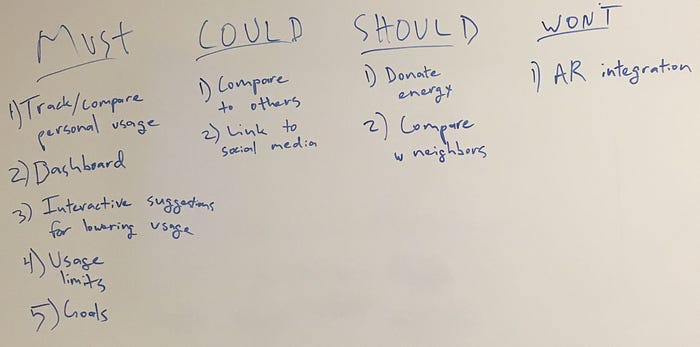
The process of creating a project from scratch can be a daunting one. We could apply our efforts in so many different directions, and it’s often challenging to get everyone on the same page. For this reason, I proposed that we utilize the MoSCoW method to clarify our approach by collectively deciding which features we must have, should have, could have, and won’t have.
We agreed that over the next 36 hours, we would focus on creating the following features:
- Have a dashboard display of users’ energy consumption rates in real time
- Show how those rates change over time
- Give the user suggestions for how to easily reduce energy consumption
- Give users the option to create self-imposed limits on their consumption
- Let users set consumption goals and track their progress
The next morning, came up with a name for our project: Lit.io. As our developers worked to integrate a ConEdison energy usage API into our project, I started sketching out designs for our homepage. In order to better familiarize myself with the design conventions users would expect from our service, I spent several hours conducting competitive analysis.
Toward this end, I studied the UI components of successful health, exercise, and billing apps, considering in particular the way they presented dynamic information clearly and concisely. The goal of visual design in these situations seems to be a form of aggregation: making processes that are relatively complicated as simple as possible through content hierarchization. Additionally, I noted the different ways these various services showed users the occurrence of change over time through infographics, since that would be so important to users’ optimization of our service.
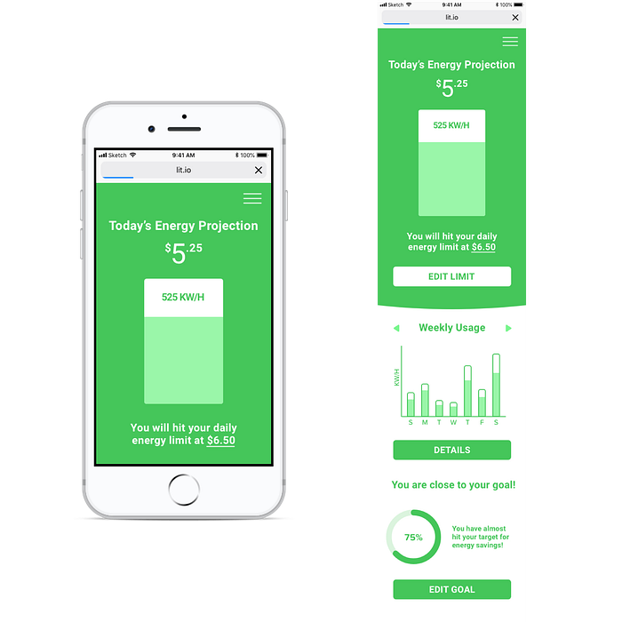
Even though energy conversation is an incredibly serious topic, I wanted the user interface to be calm and friendly. More than that, I wanted it to be fun, too, since we were essentially gamifying the process of reducing energy consumption. I chose green to accomplish these goals, and also to signify both the environment and the money users would save on their electricity bills.
Additionally, I created my designs with a mobile-first mentality because roughly 57% of all online traffic in the United States comes from smartphones and tablets.
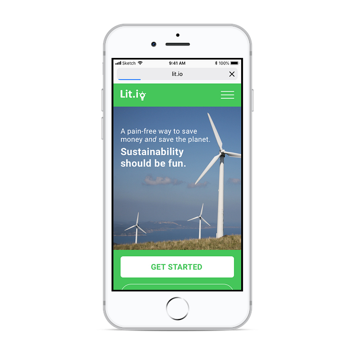
For the homepage, I wanted to convey a clean, modern feel that conveyed simplicity and straightforwardness, all while reinforcing the mission-driven aspect of our project.
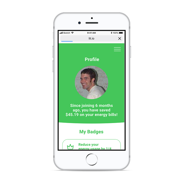
The profile page shows the user how much money they have saved since joining the app, and also shows which badges they have earned in the process. These badges are designed to enhance the enjoyability of the service, and to amplify the user’s sense of being rewarded for their efforts. (And yes, that is Tom from Myspace.)
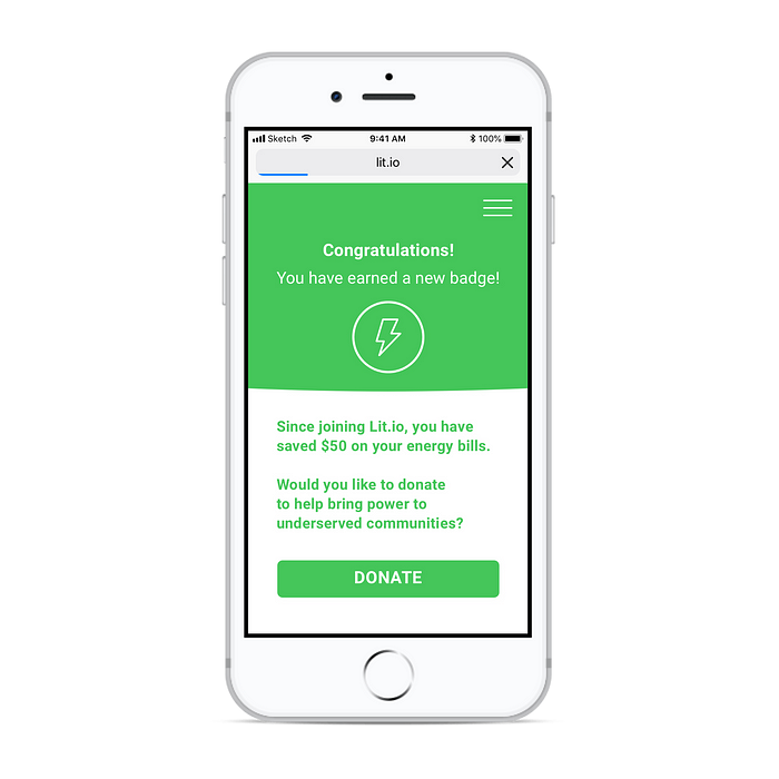
Since Lit.io was conceived as a project with humanitarian goals, we wanted to give users the option to pay their savings through the app forward to people in need. This feature is similar to the “round up and donate” option offered by Lyft, for example.


While producing the wireframes above, I was constantly in conversation with the developers on our team as they prototyped in real time (you can see the final repository here.) Toward the end of the second day, they told me that they hand their hands full. We had hoped to integrate a social function into the app – the badges were designed with this end in mind – but unfortunately did not end up having time for that.
Next, I stopped wireframing and spent some time experimenting with logo designs in order to further articulate the Lit.io brand identity. I wanted to make something contemporary and approachable. Furthermore, I wanted to convey a sense of optimism and possibility through these designs, while also creating a sense of continuity with the personality of the rest of the site.
The next day, it was both exciting and stressful to share our final product with the rest of the hackathon. As can be expected, we had our fair share of last-minute complications, but I’m happy with how everything turned out. It was great working with such smart, skilled people and coming up with a cool project under a tight deadline.
Next Steps
If we were to pursue this project further, it would be incredibly important to do extensive user research before moving forward. Given our limited timeframe, we were forced to work almost exclusively off of our collective knowledge and through improvised research. This was certainly helpful, but it would not suffice if Lit.io was a long-term endeavor.
It would be great to study the way users pay utility bills, and conduct as many interviews as needed to really get a sense of user needs and behaviors in the energy consumption space. It would also be crucial to learn more about the way users conceive of themselves in relation to something as abstract as “the environment,” and how these attitudes might affect a project such as Lit.io. Indeed, this additional research might lead us to shift the direction of the project entirely.
In conclusion, I’d like to thank Enza Academy again for so generously putting this hackathon together. I’m looking forward to next year!

