Learning management systems, redesigned — a UX case study
Rethinking how students and professors manage their academic lives.

This is the part one of a three-part series where I’m going to show my process on how I designed an online platform for students and professors as my project for the Awari’s UX course. Case study’s structure:
- Part I: Introduction — Exploring the problem-space.
- Part II: Converging — Creating the solution and testing it.
- Part III: Ta-dah! — Final result, features review and conclusion.
I would like to thank Erick Mazer Yamashita for mentoring me during the journey and for providing amazing feedback and guidance.
Project overview
For my very first big UX project, I aimed to create an online platform that would work as a Learning Management System (LMS) for superior education institutions, so both students and professors could improve how they manage their academic duties and by doing so, improving their quality of work and quality of life.
The problem — And why it is relevant.
To fully understand why this project is urgent, it’s necessary to understand how bad the current situation actually is and how it is making academic life worse.
The current platform being used at my university is called Moodle. It has problems in many of its layers. The lack of transparency makes students unsure about their deadlines which increases anxiety. The problematic notification system increases paranoia and makes the platform untrustworthy. Such online environments are so hard to setup most teachers simply give up, making student’s lives much harder. Unfortunately this is also the case for most LMS’ out there.

I’ve been seeing this happen for too long and I now finally decided it was about time to help design a solution to this problem — or at least to contribute somehow into moving this important subject forward. A well-designed platform is not the final answer to this complex problem but it’s somewhere to start.
Goals — What I was hoping to accomplish.
I had three main goals during the project.
- Regaining control: I wanted to empower users to take control of their academic lives by simplifying and helping them track their responsibilities. More importantly: I wanted to make sure they could accomplish their tasks with ease in a simple and straightforward experience.
- Adiós anxiety: the academic lifestyle is stressful and difficult. I wanted to help alleviate that by helping users to properly manage their lives. If they have help with daily tasks that means having more free time to do things they love which translates into a higher quality of life.
- Centralizing everything: I wanted to create a centralized experience to connect both students and professors. If everything is in one single place every time, they know exactly where to go when looking for something. That not only saves a lot of time and effort but also reduces stress.
Challenges —What I had to overcome.
Many were the challenges faced during this project but I’m going to be listing the top challenges in no particular order.
- New yet familiar: the new platform has to solve complex problems yet it has to be familiar enough to increase usage. That’s because a large fraction of the target audience is known for being very old-school so there is a huge wall between some of the user’s base and the final product and its benefits. That’s why it has to be familiar so it can minimize this adoption difficultly and show — especially professors — how time-saving and convenient this platform could be.
- Time constraints: because of the course I had a project deadline and had to show progress every week. But because I’m graduating myself I also had my own academic duties and the finals do not wait for you to finish designing that one more page. So time managing was a constant battle.
- Approaching research: professors had little to no interest in the project which forced me to find smarter ways to do research since I wouldn't be able to expect their input. They are too busy either helping students with their research projects or doing their own research, teaching and doing all kinds of bureaucratic work. That’s why it was hard to find professors to invest their time into helping this project. I had to get creative and find a proxy for their data.
- Many user archetypes: user of such systems come from all over the country, they have very distinct and multicultural backgrounds. Their thinking and their references couldn’t be more different. I had to make sure I was communicating with them all.
- Responsibility for the side effects: I’m interested in this project especially because I see how some not-so-great decisions in the current solutions are and the huge negative impact it has on users. I know this is just a case study for a course but the problem is real and if I’m trying to help I better keep in mind that my product could have side effects.
Research —Where it all begins
I started by making a research plan to clarify why research was necessary, how I would do it and what were my expectations. Next, I present the methods I choose. This document was part of the course and we were instigated to comunicate to a whole company what we, as designers, were doing and why it was relevant. A very important task because that’s the reality of many companies.
All research was conducted with users who have been using Moodle as their LMS. This is important to keep in mind because they do not necessarily have knowledge about any other LMS.
Analyzing reviews — Understanding the market landscape.
To start building my comprehension of the context of LMS’ users I decided to read G²Crowd online reviews about such systems. I read online reviews about 6 different systems to recognize patterns of delight and pain. By doing so I was expecting to conjecture what are the most frequent problems users face when trying to manage their academic lives.

On G²Crowd you can filter their reviews by industry and every review is organized by good and bad impressions — which is very convenient and because of that, I was able to keep a very organized files without breaking a sweat.
Self-selection bias plays an important role in this context but this data would be a great place to start.
I won’t list every single finding here but I’m going to show the most relevant and common points I was able to detect on 3 of the 6 products analyzed.

Keep in mind that these are not the only good and bad points about these products. These are simply the most common aspects mentioned in reviews. For instance, some people complained about how forums don’t actually work as they are supposed to in Blackboard but because this was not a recurrent complain, it was not included because it is a very specific instance related to a product and not common pain shared by a large number of the user base.
Conversations — Talking to real people.
To learn more about users in this very early exploration stage I also thought it would be beneficial to simply talk to some students at my university. No plan, no script, just a friendly conversation about their pains and how the system they are using is helping — or not. By the end of the week, I’ve had conversations with 9 different students.
Although it’s not very rigorous method, I believe it actually helped me to build a better perception of the problem-space by allowing me to sail in it without limitations and to connect with actual users. I could observe how people would lead the conversation to their main topics of interest or their main pain points.
Early-stage hypothesis — Or the birth of the proto-hypothesis.
By this point, a few ideas had already started emerging in my mind. Some hypotheses about user’ behaviors and their main needs were being created. Of course, they were nothing but educated guesses at best but I thought it would be extremely important to track how my perception of the problem changed along the project.

Interviews — It’s time to formalize the questions.
I was ready to create a script and go talk to users with a more rigorous method. Thus I crafted a specific script to try to obtain more information to prove true (or false) my initial hypotheses. The interview was designed to be short because students are always in a hurry.
I was able to interview 4 different students. These are some of the questions I asked them during the interview.
- What do you use Moodle for?
- If Moodle stopped working right now, how would that change your daily life?
- Tell me what you usually do while accessing Moodle.
Although it has not been planned, at this point I’ve had the opportunity to watch an assistant working. It was very eye-opening and interesting because I could watch first-hand how confusing Moodle can be. The user spent most of his time fighting the platform instead of doing what he was supposed to. This shadowing experience was a good reminder of why I took this project in the first place.
Online surveys — Gathering data from more students.
Then I decided to use Google Forms to gather even more data about user’s behaviors and problems. This specific tool was chosen because it’s a very known product by students. In the end the survey had 23 different answers. Not a very large number, indeed. That wouldn’t be enough to backup design decisions in the real world but because this project had only studying purposes, it would do just fine.
Deciding what to ask was really hard. It’s too easy to ask for non-actionable information or lead the person and get incorrect answers. This is why I wrote all the questions I could think of and then I tried to understand how knowing the answer for each question would help me design a better solution. If I couldn’t find a reason to keep the question or if the reasoning behind it was too weak I would remove it.
Insights — You did some research. So what?
Every insight and information collected was used at some point to guide the design process. I wrote a report on what I’ve found and assembled all the information and statistics together. You can read the research report here (Portuguese only).
Here are a few of the insights I got from all this research.

I was also able to categorize the main difficulties faced by users. I’ve made a list compiling and crossing all data collected. This helped me to visualize what are the main areas of interest and helped to prioritize user needs and define how I would approach the ideation phase. This was also helpful because it helped to visualize how every method contributed to the overall phase of identifying the main needs and problems and I was also able to see how these methods agreed with other or not.

And finally, a small fraction of how the research done helped the project and how I plan to use it.
- Defining the project’s scope: apparently, users do use their cell phones a lot more than I previously thought especially to check for new updates. But because that’s the main reason why they use it, I’m not going to design for mobile in this project. I had to choose the main device to develop for and go with it. In the end, I choose to design for bigger screens because they were used by every user I could contact during the research and because users already have an expectation to only use the main functionalities of LMS’ in bigger screens.
- Refining the target audience: technology is alien to a large percent of professors and because of that they usually use help from assistants, so now I’m making sure to include them into the target audience
- Prioritizing: the research was really eye-opening in the sense it helped me realize what is important and what is not. Thus, I was able to focus my design solutions on the main sources of pain.
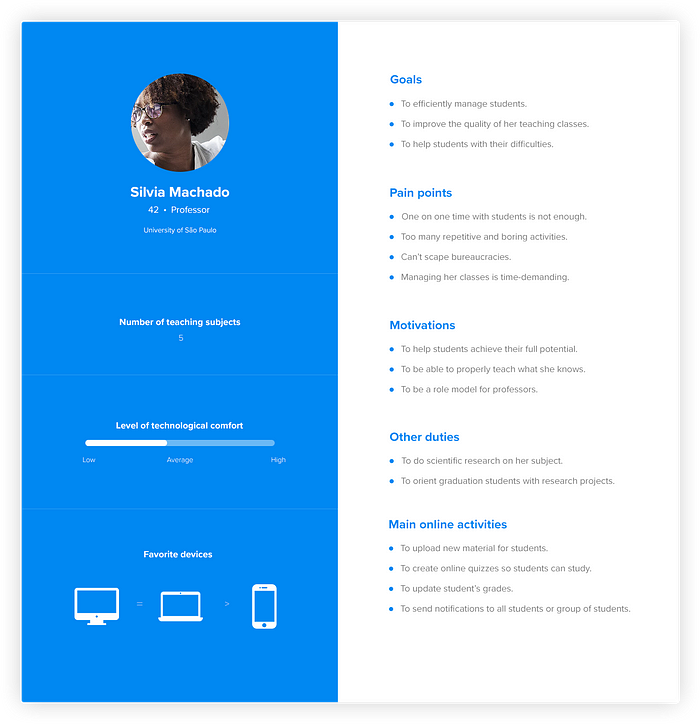
Personas — And the user spectrum.
A large amount of information about users was collected. It can be overwhelming to try to make sense of that many information. That’s why I created personas to help with the visualization and assembling of the information gathered. They were useful, especially because there are many possible archetypes of students and professors so understanding how this spectrum looks like was not only interesting but helped me to prioritize certain patterns of students and professors behaviors I would design for.
I started by defining what kind of information each persona should display, what is relevant and what is not — those decisions were backed on the data I was able to collect. After some iterations, I was ready to start filling the blanks and creating my user personas.
In the end, I’ve come up with 4 different archetypes but I won’t be designing with all of them in mind. In the case of the professor who isn’t willing to cooperate by actually learning how to use the new platform and thus making his classes better, I simply don’t have the time to try and find ways to include this persona on the product. I’m assuming he will get some marginal benefits and that’s about it.
In my many attempts to understand the users’ spectrum, I ended up trying some different visual approaches like the one below. I’ve found it to be particularly helpful since it helped me to visualize overlaps between the main users.

I’ve used this same strategy for visualizing even more information. Because the overlaps are really common, I did the same thing to understand how their goals and motivations overlap, for instance.
I hope you enjoyed the journey so far. The next two parts will be posted in a few days. In Part II I’ll be talking about converging to a solution.
You can also read this case study in my portfolio (spoiler alert).
Thanks for your time! 👋

