Maintaining icon libraries in Design systems
Practical tips for Figma users
Icons are one of the core elements of interface design. A designer needs to have a well-organized library of icons that can be easily updated and extended. In the case of design systems, it is also critical to have a smooth process for updating icons in the code.
Many excellent articles describe the work with icons, but in most cases, it is mainly about creating the icons themselves.
In this article, I’ll try to break down some aspects of the organization of the library as such, as well as share some techniques that will help avoid several problems with its support of the icon library in Figma in design systems.
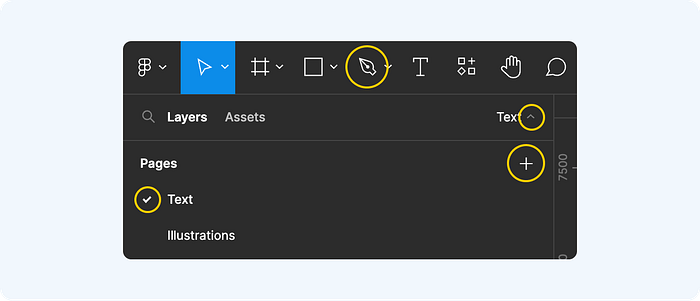
Library setup
Keep icons in Figma along with all the components or consider a separate library?
Both approaches have their pros and cons. But in general, it all depends on the size of your design team and the maturity level of the design system.
Keeping everything in one file is often easier if you have a small team and are just starting with the design system. Designers using a design system can get confused when it’s broken up into many separate Figma libraries. Things can get worse when your designers often create different libraries for their personal needs.

On the contrary, if the team is large and you have well-established processes — a separate library would allow more flexibility:
- It is easier to share rights: the library of icons can be handled by a separate team. This can significantly simplify and accelerate the work.
- Creating versions: you can maintain a separate version system for icons and easily roll back if necessary.
- Support for different icon libraries: you can support multiple libraries for different platforms and products and use different libraries with the same components (using Figma’s standard Swap library function).
In addition, a separate Figma library for icons can greatly simplify rebranding: if you have an established Naming Convention and you stick to it in every new version of the library (meaning you have 1–1 mapping between old and new icons), you can simply swap the library in case of an icon style change. And then all the components and final designs will get the new set automatically.
Fonts or SVG?
Font icons have been around for a long time (the first commercial font icon sets appeared back in the 1990s). And they are still widely used today. Many of you have heard of (or even used) FontAwesome. In mobile design, the Material Symbols (a font version of Material Design Icons) set is very popular. Apple develops and promotes SF Symbols. So, what is so good about font icons?
First of all, the simplicity of integration: just install the desired font and the whole set of icons is available to you at once. And then you can browse the library either in the standard font viewer (which comes with any operating system):
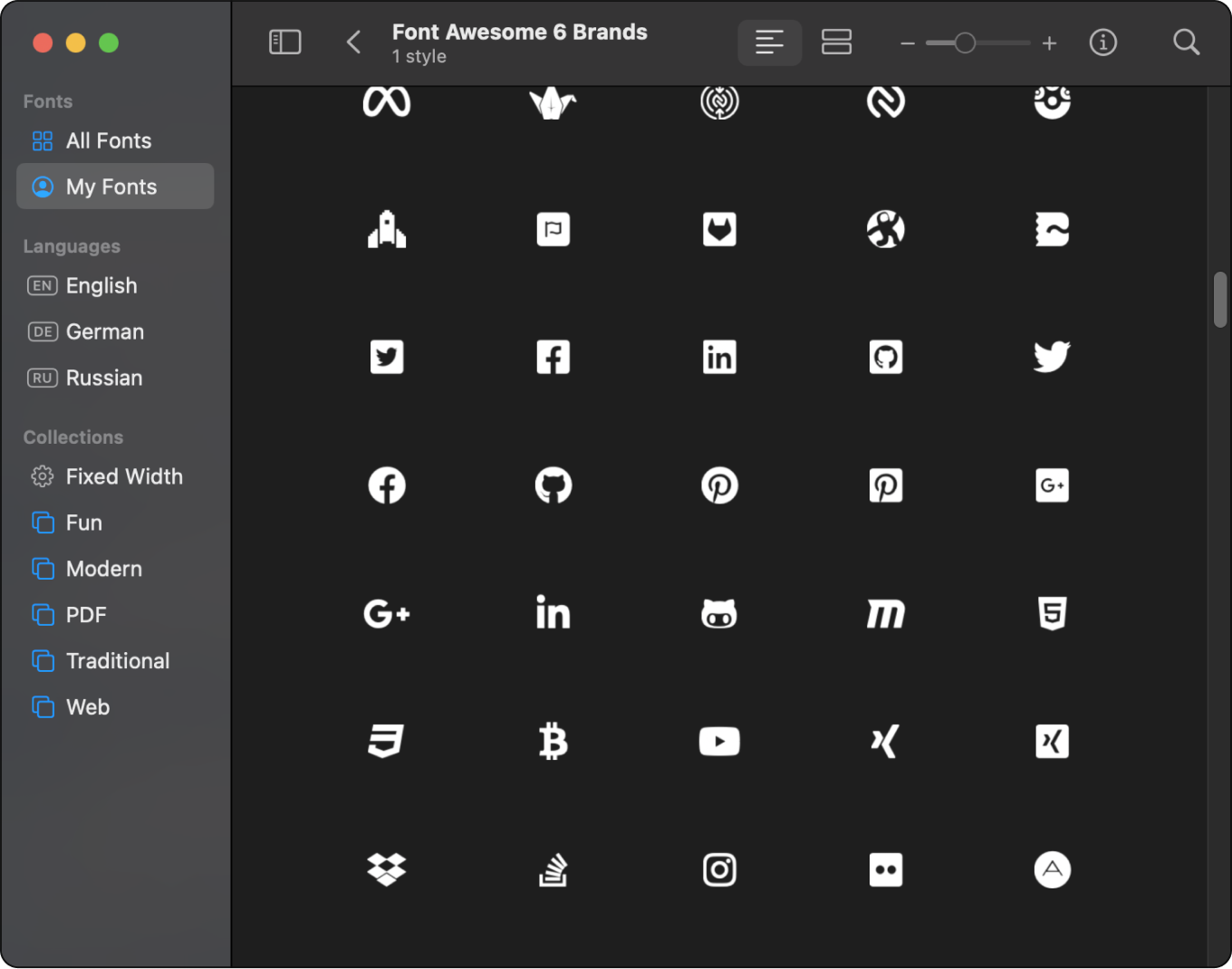
Or use a plugin for Figma. There are quite a few of them. For example, Symbol Icon Browser allows you to simplify viewing and using three basic sets of font icons at once.
At the same time, using a library of icons in a font format can, in most cases, significantly save on size compared to a set of separate files (eg, SVG). In some cases, font icons help greatly simplify the work with design components: due to the fact that the icon can be managed as plain text, the task of scaling and alignment of the icon relative to the text is much easier.

However, despite all these advantages, I most often find that designers prefer to use icons as separate image files, which are combined into a library set. Why is this the case?
In short, adding new icons to font sets is not an easy task. So most often you have to limit yourself to what the set already provides. Although for most projects this is more than enough, the possibility of adding new icons to font sets is still there.
For example, if you use Font Awesome you can simply pay Fonticons (the owner of Font Awesome) to add new icons to your library:

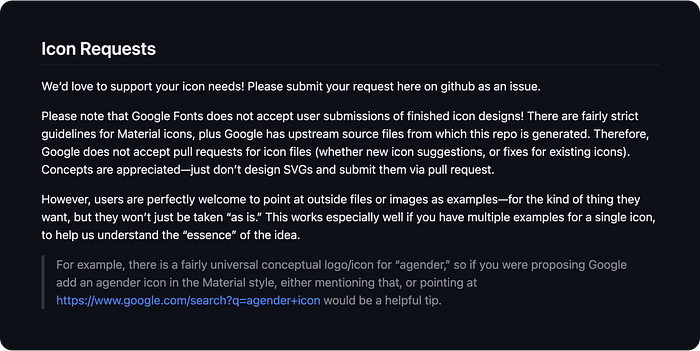
In the case of Material Symbols, Google says it will do it for free. All you need to do is send a request via GitHub-issue. With some conditions:
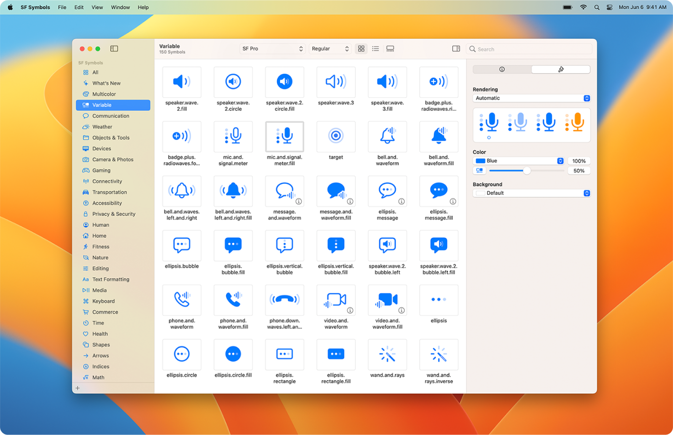
If you use SF Symbols, you can do everything yourself through a special application.
However, when you use this library, you are tied to the Apple platform, as this font set is not available outside of it. If you don’t want to be bound to some already existing font set — you can build your own using free services like fontello.
Anyway, the process of adding icons to the font set looks a bit more complicated than working with SVG files. After all, in the case of SVG, the final asset for developers can be prepared without leaving Figma and without the need to use additional tools and services.
If you need a little more flexibility (for example, so that each designer can create his own icons) or if you want to animate icons in code — SVG is probably the best choice.
On the other hand, if the basic set is enough for you, or you create a project for one platform (such as Apple) — the use of font icons may be a simpler and more convenient solution.
What about the size of the icons?
The size of the icons has changed over time as technology and the devices on which they are displayed have changed. The first icons were designed for small, low-resolution screens. With the advent of larger screens and increased resolution came the need for higher-resolution icons as well.
When creating designs for mobile devices, things get a bit more complicated: you need to take into account the different screen densities. That before the widespread use of SVG led to the need to store icons in several sizes at once. For instance, when you made icons for Android in the base 24x24 (usually) you had to prepare them in addition in other sizes to support different devices: 2x (48x48), 3x (72x72), or even in “weird” variants, like 1.5x.
All of this is mostly just about the need to adapt the same icon for different screen resolutions so that the icon looks sharp on every device. With the transition to SVG (Apple only added SVG support in 2020 in Xcode 12) the problem has essentially gone away (although I still occasionally come across projects which use PNGs “the old-fashioned way”). However, in design, we often need to use icons of different sizes in the same layout.
In most cases, it comes down to just scaling the icon. Sometimes this may not be enough: some icons may look not good when simply scaled. Adaptive icons can solve this issue. They allow for each “optical size” to select the necessary stroke width and icon shape. Some modern font icon sets allow you to work with adaptive icons.

There is another, alternative approach to adapting icons to different sizes — Responsive Icons. In 2013 Joe Harrison proposed to adapt the level of detail to the size of the icon. And what is important, he proposed not just an idea, but a ready-made solution prototype.
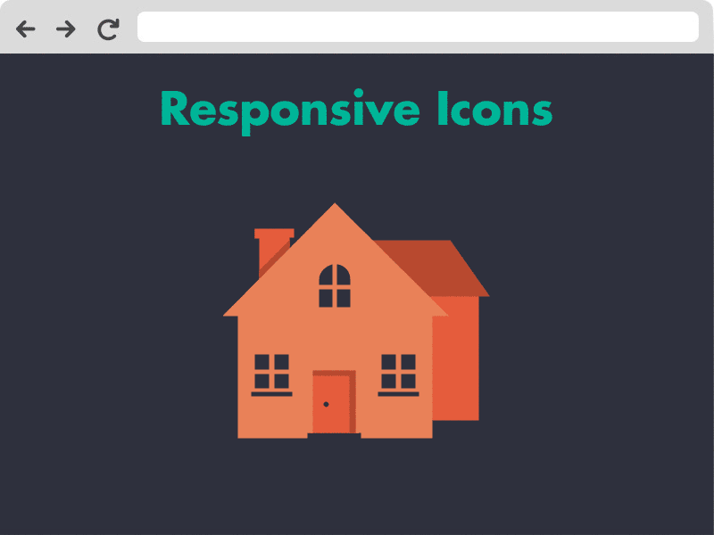
The project received a lot of exposure after launch, gaining 20,000 hits on it’s first day. The project was written about in Smashing Magazine, UX Mag, Designmodo and other articles, and sparked debate within the design community regarding the use of responsive elements such as icons on websites of the future.
The main problem with this approach is its complexity. More precisely, it is labor-intensive in terms of design. After all, for each icon, it is necessary to manually draw several versions of it for different sizes and different levels of detail. This also greatly complicates the creation of guides, as each size may require a different grid and other rules.
If you have a large team of illustrators who can quickly prepare new icons in different sizes — Responsive Icons is the best approach, in my opinion. Since you can achieve a high level of user experience.
However, if you have to keep the icon library up to date yourself (in addition to maintaining the design system) — I would focus on a single size. For example 24x24dp.
Icon component setup
Let’s consider the most common setup for organizing icon components:
- One basic icon size (let’s say 24dp). Other sizes are obtained by simple scaling.
- Flatten strokes and shapes. If it is important, when scaling icons, to maintain proportionality in stroke width.
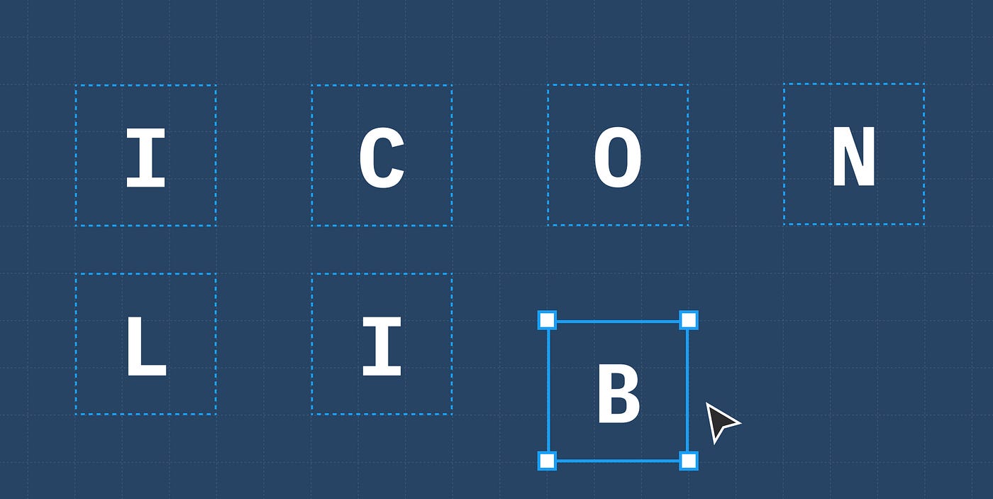
Separate components for each icon. - Handover to code in SVG format.
To make sure everything runs smoothly in such a setup, there are some simple rules/tips.
Consistent layer setup
Designers often ask, “How do I keep the color on an icon after I change them in a component?”.
You need to make sure that the layer setup inside the icons is consistent. Meaning:
- layer name
- letter case
- amount of layers and order
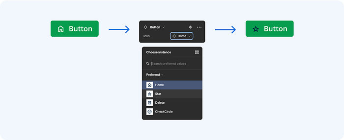
When you swap components in a layout in Figma, it retains the properties given to instances only if the internal structure is exactly the same.
When we set the color of the icon, it is not the component itself that is colored (since it is just a container), but the shape layers inside it (otherwise the icon would be just a colored rectangle). And Figma “remembers” the color settings by the layer names. We can say that for Figma this is some kind of a variable to which a color value is assigned.
When we swap the icon Figma expects a layer with the same name (the same variable) in the new icon. And if the name does not match — Figma uses the default color (the one specified in the original component).
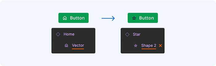
And Figma is case-sensitive in layer names:
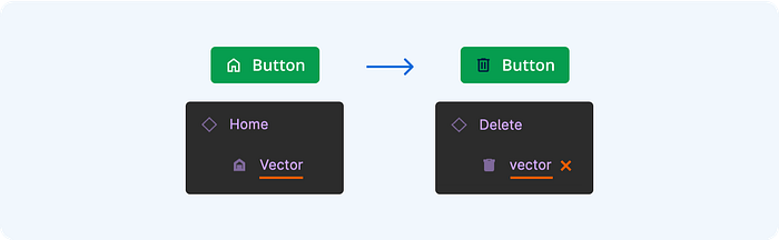
And also to the number and order of layers:
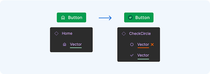
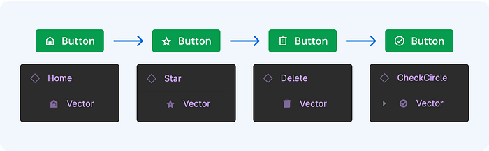
With a consistent structure, everything works as it should:
Union shapes
Often icons consist of several elements-shapes. Keeping each item in a separate layer will result in different icons having a different number of layers, which can lead to problems when replacing icons.
Figma has a very simple solution to this problem — you can combine several shape layers into one via Union selection:
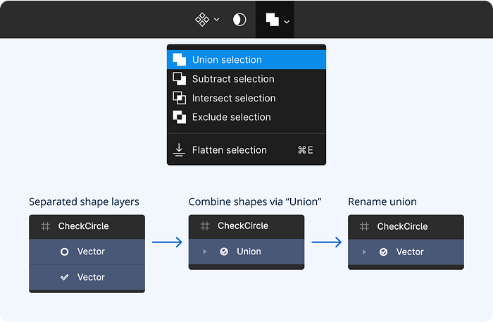
Inside the union, this keeps each shape as a separate layer. But at the same time, it is considered a single flat shape. In essence, Union selection is a kind of “wrap”. I discovered that Union selection helps also to solve another problem.
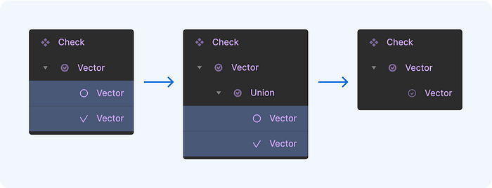
Suppose you change the style of icons:

Usually, icons are drawn separately and then added to the library. When it comes to adding a completely new icon, it’s pretty simple — create a new component for it and add it to the library.
However, when in the design system you need to change an existing icon that is already heavily in use, a simple substitution of a component may become a breaking change. Figma assigns each component (and even each layer element) a unique ID. So the new component (even if it gets the same name) will get a new ID and we’ll need to replace it in each design because all instances of the icon will refer to the old ID.
Okay. What if you replace the image inside the main container frame of the component? Since the component ID stays the same, connections to all the instances will be kept. And all of them will get the update automatically. However, there would still be one problem — saving the color settings of the instances.

The layer name stays the same. However, we also mentioned above that each layer has its own unique ID. And it’s important for Figma that this ID doesn’t change when you change the icon. Union selection helps to achieve that: you can “wrap” the icon shape in Union selection. And then, you can easily change the shape inside this wrapper as often as you want.

Just keep in mind, that you must do this from the beginning. Because if you do this procedure exactly before the change and someone already is using this icon — the trick will not work.
Flatten strokes and shapes
Most of the time, icons are drawn with strokes. This allows you to stick to a single-stroke thickness. Besides, in Figma, you can use rounding effects. This is very convenient for drawing complex icons. However, if you keep the strokes “as is” in the final icon components, you might face various scaling issues:
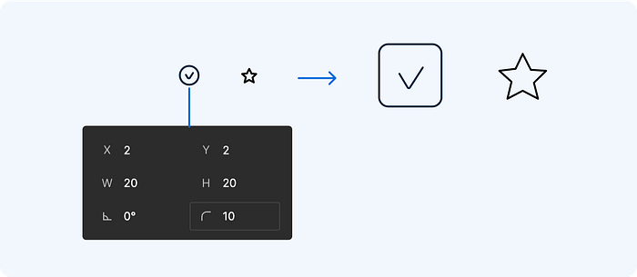
If you use Adaptive icons, this behavior may be expected or even necessary. However, more often, it is necessary for icons to scale proportionally. In addition, when exporting to SVG, rounding effects and different stroke drawing mode combinations (Inside/Outside/Center) can lead to unpredictable bugs.
Therefore, it is recommended to apply flattening to all icon strokes and shapes.
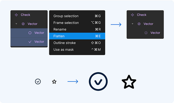
Unfortunately, this simple method doesn’t always work and Figma simplifies only the effects, and the lines remain strokes. Then you can use a little trick: put elements inside the Union selection wrapper into another Union selection wrapper. And then apply Flatten to this additional wrapper (not to the layers inside it).
Set constraints to “Scale”
The final touch is to set the correct scaling parameters: it is necessary to set the Constraints to Scale in both directions for all the icon layers:

Duotone Icons
Duotone icons are not something new, but they have become very popular in modern design, where they can add a sleek and modern look to a website or app. In 2021 Apple added rendering modes to the SF Symbols 3, making it possible to use multicolor icons in Xcode.
However, working with SF Symbols is still quite a complicated process. Also, as mentioned above, this library is not available outside of the Apple ecosystem. So if you need to support multiple platforms and want to have a consistent UI, then to use Duotone icons you might need to use open font icon libraries like Font awesome (which also provides Duotone icons) or implement everything manually in SVG. By using 2 layers for 2 tones.
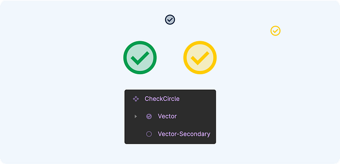
You just need to keep in mind that if you use monochrome and Duotone icons at the same time, just swapping between them will be problematic — the color settings for one of the layers (second tone) will be reset.
This article is in no way intended to be an ultimate guide. Rather, it is a set of practical tips. And I will be glad if you will find these tips helpful.
Thanks for reading! Let’s stay in touch! Connect with me on LinkedIn and follow me on Dribbble and here on Medium for more design-related content.

