Making your button design ‘clickable’

A button is an important UI element that will heavily affect your interaction design. Buttons have the power to compel users to convert, to carry out an action. Buttons are a middleman between user and product, and are charged with keeping the conversation between person and machine going.
How do users understand an element is a button? The answer is simple. Visual cues help people determine clickability. It’s important to use proper visual signifiers on clickable elements to make them look like buttons.
Everything in life has a few ground rules that should be taken into. Button design is typical in that it looks fairly easy but comes with lots of seemingly small factors the designer must consider. These are some tips to follow in your next UX design.
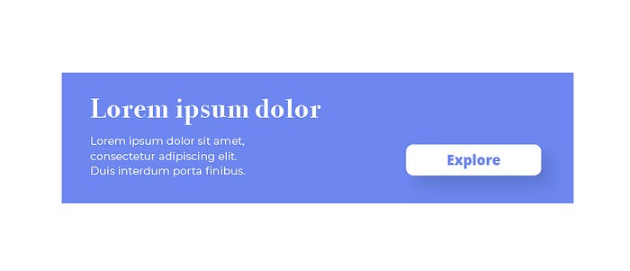
Make it look ‘on-point’
Here’s why you need to stop and wonder if that button actually looks on-point and clickable. As the designer, you are very familiar with your creation. You will know every small interaction you will add on your design. Users, on the other hand, have never seen your product and have no idea what it does or how it works. You can’t be sure that people will recognize that button for the fancy link it is, and it’s up to you to leave no room for doubt in their minds.
And so, try to use shapes and styles of buttons that we are all familiar with. That includes square buttons, rounded squares or other forms of buttons that people can find in other common interfaces. We understand that every designer wants to be original in their work, but it’s no use delivering something truly unique if people can’t use it.
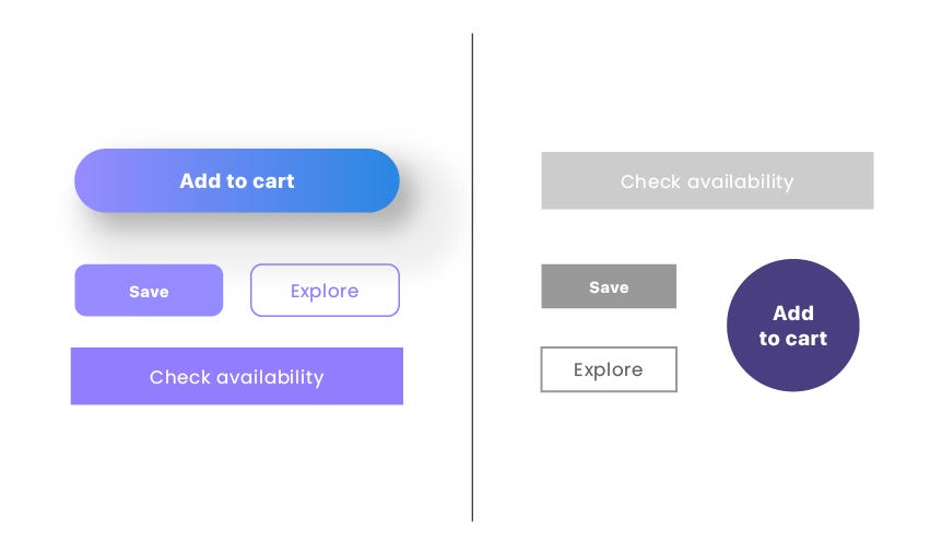
Make it visually differentiate on primary and secondary actions

The primary action is an action that allows the user to accomplish their most common or most important goal. Secondary actions are any actions that are less important. When in doubt, the default action is the primary one. Be sure to give prominence to the primary action button by making the secondary action appear secondary, visually.
Make it easy to find
The placement of buttons matter. Users have an idea of where your buttons will be. Again, they have used many sites and applications before yours and gotten used to certain button placement patterns.
Just like we are all used to a certain type of button design in terms of shapes, users also have an idea of where buttons should go in any given screen. We open a webpage and expect to find the button immediately–no one ever enjoyed looking around for a button to press.
The reason why you don’t want to fight people’s notions of where buttons should go is that usability calls for predictable design–including button design. You want your product to make sense to users, ensuring good discoverability and learnability. That means by reflecting people’s expectations on your design, you make it easier for them to navigate the product for the first time and come to learn the way it works or what it can do for them.
You need to have a coherent button design that shines through in every single screen of your website, no matter what feature they relate to. Once you have a style you can replicate in all your buttons, establish the standard place for buttons within your website. Follow logic and common user’s expectations. Don’t make them guess.
Size matters
The first element of button design to consider when designing in button design is size, it means deciding just how big you want each button to be. You should consider how large a button is in relation to the other elements on the website page or especially the size of your button is particularly important for mobile app designs. At the same time, you need to make sure that the buttons you design are large enough for people to interact with. Making a button too big will lead to a visually charged screen, while a button that is too small cannot be clicked on by a normal finger.
The clear implication is that you don’t want a button to be any smaller than 10mm–unless you’re willing to risk the usability of your design on the chance that your users have very tiny fingers. A good rule of thumb comes from the MIT Touch Lab. Studies by the Touch Lab say that making your button a minimum of 10mm x 10mm is a great place to start. Aim to establish a visual hierarchy in your button design. That means that the most important functionalities, the primary conversion of any given screen, should be the biggest button in sight. That also applies when you have two opposite buttons–make the positive outcome button seem more important by making it slightly bigger than the negative one.
Don’t make one button for the whole things
Offering users every single functionality on the same screen may sound like a good idea, but that’s a trap. People feel like they want to have all the options on their hands but in reality we don’t appreciate the wave of decisions to be made. We should never give users too many options that will lead them to freeze and feel overwhelmed.
Sure, placing all the buttons on the home screen seems cool enough–except that your product isn’t an airplane flight deck or book a hotel. There’s no need for you to compromise product usability just to save users a few clicks. Try to find ways you can get users to reach the desired outcome in a logical way, using your button design as a tool. Investing some time into a proper frame of information architecture is a good place to start.
Conclusion
Designing for the CTA button is a critical part of creating user interfaces on websites or mobile apps. It’s how you help users take the steps to accomplish their goals. Poor button design can result in users taking the wrong action, taking no action, or being uncertain about what to do next. You should pay attention to how you design your buttons will streamline any user workflow and help users feel more certainty before they click.
Contributor: Deta Ayudhia S

