Making better app login screens — a UX case study

As a final year Engineering student studying at IIIT Vadodara and interning as a designer at Pay1 for my final year B.Tech Project, it was a great opportunity for me to prepare this case-study.
Pay1 is a tech platform focussed on empowering the unorganized retailers of India. The firm is revamping its product by focusing more on the user experience which is challenging as their targeted users are mostly from 2nd, 3rd and 4th + tier cities and creating user experience according to them as well as cohesive with the existing trends is quite difficult.
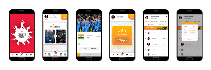
First, I started by checking the login screen of the existing app of the product then drew a task flow accordingly for my understanding. I also visualized screens of different apps, shots on Dribble, Behance and read a few case studies.


My initial observation was “ All the apps almost have the same kind of stuff ” the only difference I noticed was in the layouts and the colors they used. So, my mentor gave me the advice to observe every small detail and find out “ Pros and Cons ” in order to figure out the interactions according to different users.
“A small thing can make a huge difference”
A simple formula for all the people who are confused how to start something “The answer simply lies in the question itself that is to ask a lot of question’s” The 5W1H method.
From this input, I drew a few login screens and interactions.

Research
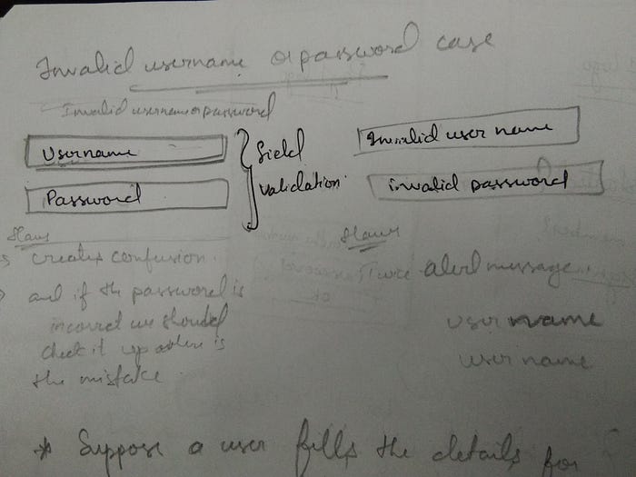
I made a list of a few questions and concluded feasible solutions. I elaborated every solution into a case for better understanding. I used the 5W1H (What, When, Why, Where, Who and How) method to simplify my solutions and to have a larger perspective on this problem. It would also be beneficial for the higher stakeholders from the Product Department to understand the small details as well as the pros and cons of every login screen.
Case-1 Preference given to the Sign-Up button
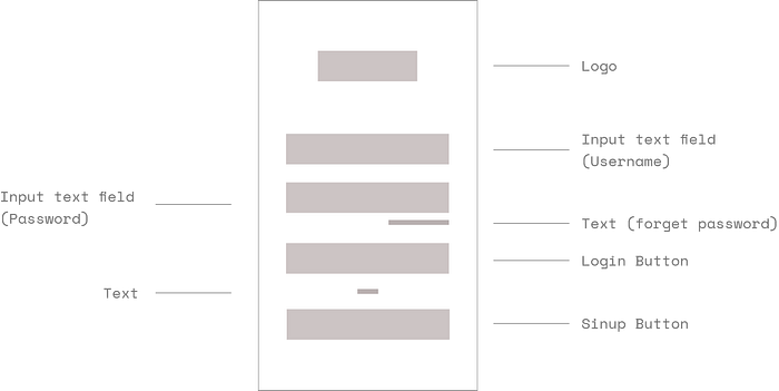
Case-2 The preference is not given to the Sign-Up button
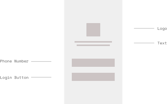
Case-3 Login by using only the phone number
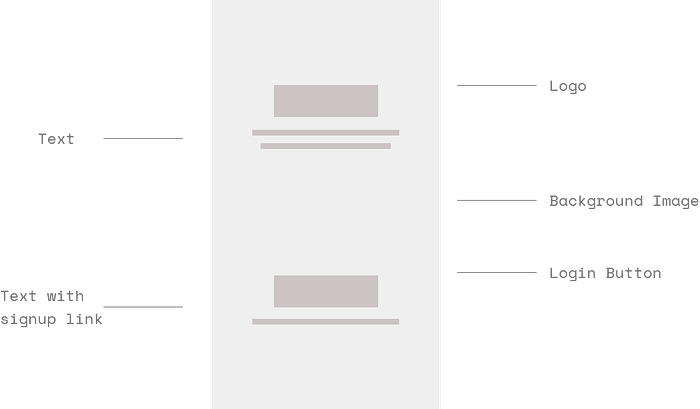
Case-4 Using a background image on the screen
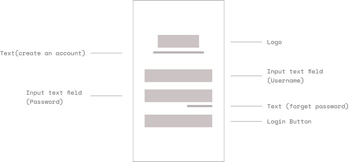
Case-5 Everything in one screen
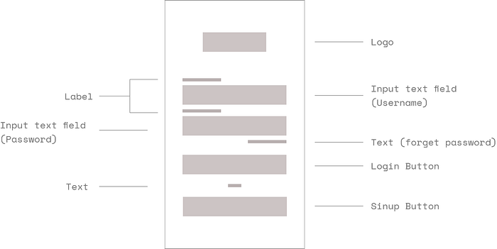
Case-6 Adding a label to the placeholders
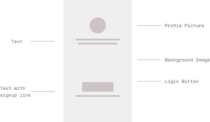
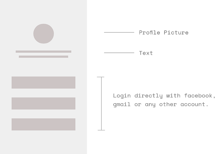
Case-7 Adding a profile picture instead of the logo
Case-8 Login directly with Facebook, Gmail or any other account.
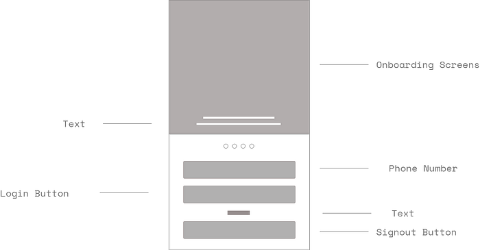
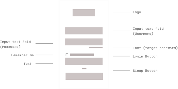
Case-9 A busy screen with all the elements.
Case-10 Adding checkboxes
These checkboxes Occupy a lot of space instead we can set these as default and not adding on the screen.
Conclusion
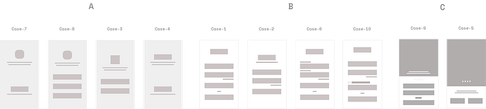
Group A: Simple and clear screens but the concentration is more on the profile picture, background image rather than helping the user.
Group B: These are busy screens, helping the users to concentrate on all important elements but at the same time creating confusion as the user has to focus on everything only in one screen.
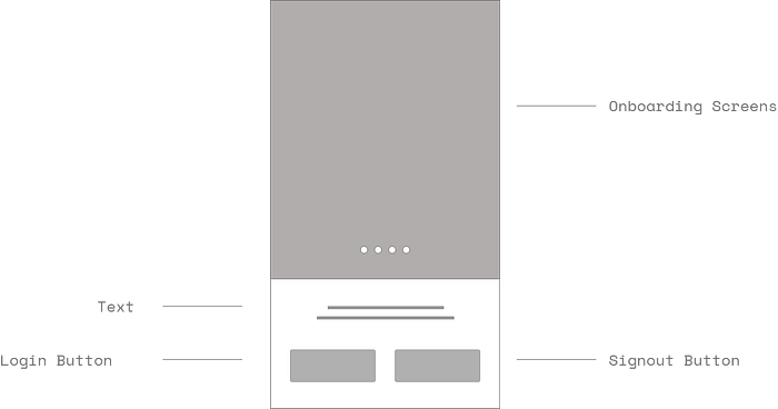
Group C: The last two screens are a lot busier than Group B screens but these are helpful for first-time users as the onboarding screens help them to understand what exactly the Pay1 app is about and how to use it.
I understood that different screens are preferred according to different users and nothing is wrong or right as everything adds to our learnings, which helps us to create a better user experience.
As an intern, all the cases and solutions were ideated on just my learning experience and input from my mentors Krunal Ghorpade and Keya Arati.
I would really like to know your feedback on this case study as there is always room for improvement.