Making the complex compelling
From annual reports to impact assessments. Organizations great and small pour energy into the development of data-rich resources. Often these end up pushed to PDF and uploaded onto a WordPress. Studies show that no one is reading.
The rationale — anyone interested will find it and want to digest all the details this way just as they would if they picked up a physical copy. But, what if more focus went to considering how people actually absorb complex information? Here I set out three simple user experience innovations that can make the complex compelling.
Why planning pathways always pays off
The PDF mantra endures as many communicators see interactive design as the fancy stuff they can go without. It assumes that substance requires length and length alone will convey expertise. Yet, this does not stack up with everything psychology tells us about the currency of attention.
Gaining awareness long enough to be interpreted, understood, and related to is a growing challenge. Some studies have even shown human attention spans decreasing from 12 seconds to 8 seconds. Despite the data, organizations pump out text-heavy assets as if their topic is so interesting it supersedes human nature.
However, paying attention to the human mind when delivering any information should be fundamental. Attention is closely related to how information is encoded and turned into memories. Presenting information with respect for our thresholds of attention embeds information in our working memory.
In this regard, campaign groups have led the way. Daisy-chaining is the process of planning out the interaction pathway of a user, usually stringing multiple campaign actions together in quick succession. For instance, after signing a petition a user is redirected to a donation or social share to amplify their impact. This is a clever way of directing user attention towards small scale requests that feel like a natural progression. Rather than overwhelming them with a full menu of actions all at once. This is exactly how Change.org were able to raise 11 million dollars off the back of the a single petition.
However, whilst daisy-chaining preserves attention you can go further in applying these pathway lessons for making the dense digestible. How easily information can be retrieved from memory can be enhanced if we we’ve encountered that information in an engaging way — now entire products and business models are based on leveraging these insights.
In essence, interfaces that promote direct user engagement as a requirement for revealing information give users extra help in remembering information. Interface functionality matters.
Three ways to go from complex to compelling
№1: Conversational applications
Words like chatbot, virtual assistant, and conversational agent are interchangeable these days. In essence, these are apps that simulate a conversation between a human being and computer. Be it through text or voice interactions. Chatbots can have levels of complexity, based on the questions and answers programmed in.
You can program in all kinds of depth and plan out pathways to lead users on based upon their questioning. Simple and flexible they enable you to convey insights in a digestible manner.
Take the case of Veuve Clicquot’s Clicq’bot. The company built the world’s first digital sommelier. The tool helped users pick the right product and provided details about its sourcing all through a natural feeling conversation. More than this, it could also provide an industry history and reveal their sustainability efforts. A lot of complexity, it a streamlined manner.
Conversational applications work if they are designed around making information delivery a social experience. The lessons of behavioral science tell us that when we make something social we encourage people to make a commitment to others.
At a small level, following through on a conversation once it’s starting, is honoring a social commitment and today people are emotionally closer machines than ever before.
№2: Responsive narrative micro-sites
Building bespoke offshoots of a main website can often been a recipe for disaster. People put a lot of time and energy into cultivating content around keywords for SEO and establishing a solid search presence. Not to mention the familiarity uses have built up all aspects of the interface to date.
However, a micro-site can be more effective in communicating a campaign message than burying a PDF under a resources tab. I’m not talking about building traditional micro-sites — yet more static pages that are interlinked just under a different title. Instead, push for the responsive kind that will bring your information to life through a dynamic story that evolves at each step of user interactions.
After all, making something attractive — that is grabbing attention with images, colour and personalisation — is another core element of behavioral science. Consider how campaign content can be presented with more than just text and make use of thing like jump pages — primary navigation hubs different element so of your content. Seek a rich experience that blends embedded video, GIFs, layers of content, and animations that dynamically tell a story.
Without a doubt a great example of this was DangersofFracking.com by Linda Dong — a compelling build since folded down that warned people about the dangers of fracking. The landing page presents a single drop of water which falls from the sky as you scroll down.

You then followed the drop as it landed on the full journey of fracking. Along the way, encountering dynamic content with facts and stats about the process and its dangers. Before finally wrapping up in a single, clear, call to action. It’s a case study in removing distractions, limiting navigation, and building an cohesive story that evolves as a user clicks and scrolls.
№3: Call and response design
This final method is one I’ve termed call and response design. It seemed the best way to capture the kind of experiences that are based on simplified quiz questions — working at a hyper-low level of difficulty and intended to direct a user towards single outcome inline with your message.
Pulling on sense of competitiveness these nudge people on the social level and challenge them to test their knowledge. They will present the call to action in a timely way after someone has invested energy in the experience. A kind of reciprocity is fostered through this interactive design that can boost receptiveness to your appeal.
A great example of this was the ONE campaign — where call and response design turned a collection of complex and inaccessible data into a rocket fuel for growth.
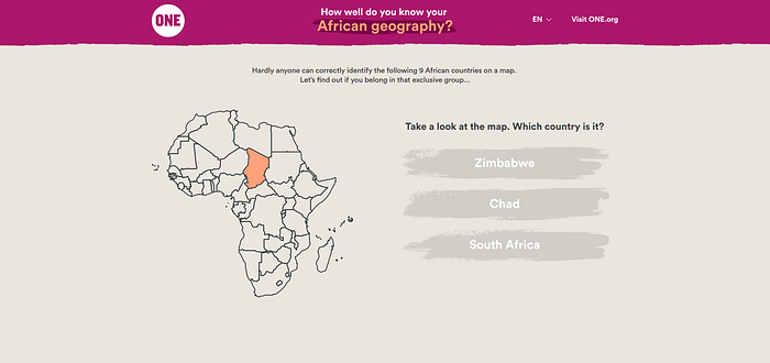
Using this method they invited people to test their knowledge of African geography by guessing the names of nine countries, before linking these countries back to the issue of girls’ lack of access to education. All of it unfolded step by step requiring user interaction to progress the story.
The result was near 3 million people completing the quiz and absorbing the same core messages that could have gathered dust in a PDF. A great example of how designing engaging content can broaden the reach of complex messages.
Making the complex compelling takes intentional design
Making the complex compelling is no easy task, but it all begins by working backwards from an solid understanding of the human mind. Pushing beyond PDFs is not just a struggle to take up for the fun of it, or for our belief in creating something beautiful through our work. Mixing in planned interactivity into how you design the delivery of information has deep value rooted in how humans absorb, process and encode information.

