Slack mobile redesign: making work simpler, more pleasant, more productive
Case study of a redesign concept for Slack Mobile App.

Project 3 came and passed in a blink of an eye. Definitely it was one project I enjoyed the most thus far. Let’s dive straight into it, shall we?
Brief -
We were tasked to work in a team and identify problem and/or opportunities with an existing Mobile application.Timeline & Deliverables -
Two weeks
Digitised interactive prototype and a 15-minute client-facing presentation.
After some discussion, my teammates and I decided to work on Slack, a workspace collaboration hub.
Understanding Slack
Here’s what we know
If you haven’t know, Slack is an acronym for Searchable Log of All Conversation and Knowledge, a collaboration hub that brings the right people together with all the right information and tools to get work done. Launched in 2014, Slack is the fastest-growing business application in history. Millions of people around the world use Slack to connect their teams, unify their systems, and drive their business forward. From Fortune 100 companies to corner markets, Slack helps people communicate better.
– www.slack.com/about
Slack was initially used as an internal communication tool for an online game - Glitch. It then evolved into a collaboration tool for businesses (including big brands like Airbnb & Target) and interest groups.

Slack ecosystem has also expanded rapidly ever since. It is also one of the favourite tools for developers as they get to choose from over 1500 app plugins that integrates into Slack, or customise it by writing their own code.
Today, Slack has 8 million daily users and 3 million paid users.
–
After knowing what Slack did great, we moved on to find out how can we improve Slack iOS usability.
We did a heuristic evaluation on Slack mobile in order to get a clear understanding of how the app function.
We also tapped on the LEMERS method to evaluate Slack app against its competitor Flock and Stride (which are also workspace collaboration tools), to see who Slack is up against with.

From the table, it was very evident that there’s some work that needs to be done.
User Research & Analysis
What users are saying?
Our team did user interviews with 9 slack mobile users. The questions focuses on their engagement with Slack mobile, their experience using Slack mobile and on what they expect out of a workspace collaboration tool. Here’s the summary of our findings:
- While most users use both Slack desktop and Slack mobile, majority of them uses Slack mobile on-the-go.
- Most users use just the channel & chat function.
- Majority uses Channels for project and Chats for personal use.
- Only 5 out 9 knew about the integrated app function (app plug-ins) and only 2 out of the 5 knew how to use it.
Also here’s what some users had to say:
“I don’t know if it’s me but I feel stupid using Slack.”
“I will end up googling everything I don’t know about Slack.”
With the information we gathered from the user interviews, we listed them out on post-its and did an affinity mapping to identify the trends.

After spending close to 4 hours of mapping and re-arranging, here’s a summary of what we’ve gathered:
- Users want to navigate between chats and channels quickly
- Users want to find things easily and efficiently
- Users want their files to be kept organised
- Users are unaware of the app plug-in functions and they don’t mind learning about it
Based on all these data and trends we identified, we made sense out of it and formulated our user personas; Jonas Oh(left) & Tina Wang(right).


Joans Oh:
An entrepreneur with a paid Slack user account and uses Slack to connect and communicate with his team for better workflow and efficiency.
Tina Wang:
An office lady working in a recruiting firm with a free Slack user account. Ensures important documents are readily available through Slack for her teammates and likes her things to be neat and well-organised.
Prioritising and Prototyping
Solutions to the problems
After coming up with our user personas, we proceeded with the re-designing of Slack mobile app. We came up with a list of scenarios of our user’s frustrations and how we would go about solving it.
Overarching Issue
Slack is actually a great app and already has solutions to problems that the users are facing but what went wrong was how the features were positioned. While Slack’s bubbly and bright UI made it stand out amongst other more corporate looking interfaces in the market, it was at the sacrificed of the usability of the app. Users are not using Slack to its fullest potential due to their lack of knowledge. The app not being intuitive enough has also shortchanged its capabilities.
Our Solution
- To first identify and understand the needs of the users and ensure their basic needs are met.
- Improve the User Interface (UI) to ensure key elements & functions are easily accessible within the app.
- Lastly, educate users and encourage exposure on Slack mobile.
With our solutions, we came up with a list of features to improve on, based on the needs of our personas. In consideration with the tight timeline we had, we made use of the MoSCoW method and did a feature prioritisation.

The categories are understood as:
Must – Crital and cannot deliver on target date without this
Should – Important but not vital
Could – Wanted or desirable but less important
Won’t – Won’t have it this time
With that, we proceeded with our Mid-Fi prototyping for our new Slack mobile app.

Findings/Observations
We tested our prototype with 6 users. Though we gave them what they wanted (according to our findings from our affinity mapping), we later found out that users want to learn, but yet at the same time, don’t want to learn. They are not receptive to learn. They only want to learn through bite-size.
With that in mind, we made some iterations to our design.
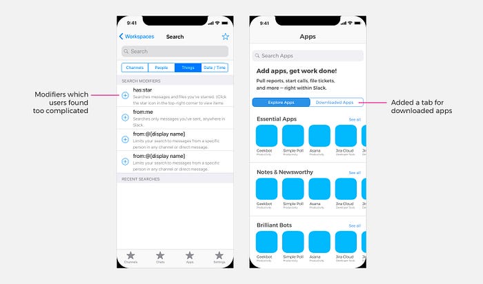
Below are Left: Search bar is already catered to individual panels and there is no need for the first tier filter. It looks way to complicated. Hence for this iteration we decided to remove the modifiers.
Right: Added a tab for downloaded apps and instructions on how to use app plug-ins as users were lost after downloading the plug-ins.
Final Design and Interactive Prototype

On the current Slack app, Chats and Channels are on the left panel, and within the panels, additional swiping is required. Hence to make it more intuitive and conventional like any other messaging app:
- Introduced different tabs at the bottom of the screen;
- Separated chats and channels (from our user interview, users want to navigate between chats and channels quickly);
- Arranged Channels and Chats in chronological order and
- Introduced a tab for app plug-in.


With channels and chats are separated, arranged in chronological order. Users can navigate through the app more efficiently.
Search function is also simplified to reduce cognitive load for novice users while power users can still make use of all search modifiers they know of.
Lastly, users will be brought out of the current Slack Mobile app when they want to discover and download any app plug-in. Our re-design enables users to discover and explore all available app plug-ins under the Apps tab, as well as to install any app plug-in directly on Slack Mobile itself.
Usability Testing
With our prototype in place, we conducted a quick usability testing.

There’s a noticeable time difference in all three users who tested both the current app and our redesigned version. Decrease in amount of time spent searching for certain function on the app equates to more time for users to concentrate on tasks at hand. This translate to increase in efficiency, which meets the user goal.
Next Steps
With every project, there’s always room for improvement. Given more time, we would love to develop a more functional prototype and conduct more usability test to discover more issues with our current development and iterate them.
Slack is an app with a large user pool. Unfortunately, most users are not aware of all the features that Slack has to provide. We hope that with our re-design, it will help to bridge the gap between both business and user goals, allowing users to use Slack to its fullest potential at the same time.
Here’s a shout out to my teammates Michelle Bridget and Min for all the support and hard work throughout the 2 weeks! I’m glad we managed to pull through together as a team!
If you are interested in our interactive prototype, click here!
Thanks for reading! :)


