Making your design systems dynamic
Once upon a time, I was designing a page using a library of components created by my colleagues. A fairly run of the mill task, placing the image, text block and card components to steer the user journey.
When it was implemented by the developers, I noticed a couple of the cards were behaving differently. Some had the buttons a fixed distance from the bottom, others flowed up and down with the amount of text. Before contacting the developer leads and chewing a few heads off, I thought it best to get a refresher on the rules set up for that component.
The library was set-up as a Sketch file, and it looked great, but I noticed something quite interesting. There was actually no rule set for how the buttons should behave. All the examples in the design had the same amount of text and no notes on the expected behaviour. No wonder the dev teams interpreted it in different ways. They were both right, in a way.
Limitations of our tools
In this case, the fault rested with the design team. By designing in paper and Sketch, we didn’t think of the components as dynamic and adaptable. Because the tools we use ultimately come from print, they are mostly geared towards static designs. There are some exceptions starting to appear in the wild, such as Framer X and InVision Studio which are starting to address this issue (more on that later). But for now, I’ll focus on our mindset and how we need to make the effort to change.
It’s all too easy to think of the wireframes, mockups or prototypes as the final product we deliver. That is not true.
However amazing your tool of choice might be, it’s all too easy to think of the wireframes, mockups or prototypes as the final product we deliver. That is not true. What we are responsible for is the final product, and how the users interact with it. In this sense, you could design an entire product on napkins and the back of coffee receipts and still have a great product in the end, with amazing UX. This may be an exaggeration, but my point is that we need to think beyond our tools.
This way of working and, more importantly, thinking has its drawbacks. The most evident of which is the absurd number of variants brought about by a lack of flexibility.
Too many variants


Because we only think in terms of static pieces, there is a tendency to create variants of components every time their usage changes a little bit. In the example above, cards were designed for every variant and every width.
Not only does this make the design system itself very cumbersome to maintain, but it’s also far too easy to miss things. For instance, nowhere does it say the cards can be used in other contexts, such as alongside text, or cards with other widths, so the devs could interpret it literally and only implement rows of equal cards.
That would be ridiculous, right? Obviously, the cards were designed to be dynamic elements. The thing is, others can’t be expected to read your mind, or anyone else’s. If the design system guide isn’t clear, then all is fair game.
The way around this issue is to make sure everyone understands a common set of rules. What this means in practice for designers is that we need to think about how the systems work and the rules they need to follow for that to happen, rather than just drawing it out.
As odd a concept as it might seem to design abstract rules as opposed to visual assets, it shouldn’t be that unfamiliar to us. After all, we design in our heads before we put anything to paper or screen. Design is about ideas, not the tools we use. Besides, nobody wants to maintain a file with a million button variants.

Rules, not variants
As designers, if we are to start thinking in terms of dynamic components, how can we create the rules for a coherent design system?

Using tools like Figma, Framer X and others, we can already tell them to keep this shape 10px from the left at all times or to keep this user photo centred and 50px from the top at all times.
However, this isn’t reflected in the design systems I’ve seen. Most tend to show beautiful mockups of the components with few to no rules explaining the use and behaviours of the patterns, even if they include dozens of variations.
Our hubris makes us care more about creating beautiful images than beautiful end results.
That makes the system too susceptible to failure under the barest of strains. When that happens, we can’t really blame the developers or project owners. It’s our own fault.
This isn’t to say I hate pixel-perfect designs, they are certainly necessary in a lot of cases. But they are not enough. For instance, the case I presented earlier with the button cards could have been avoided with a simple note saying the button is always 10px from the bottom and 10px from the right.


Tidying up, making sense
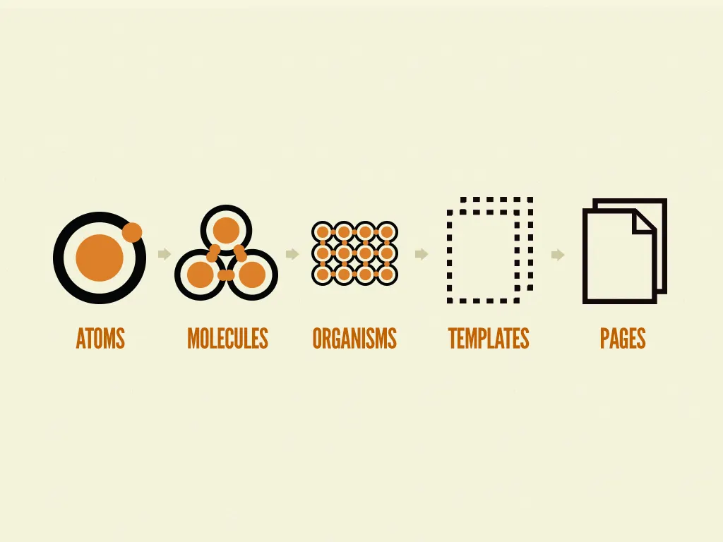
If you’ve ever built a component or pattern library, or just used one, you know how convoluted they tend to become. And here I am, suggesting we add more information to the pile. As I’ve mentioned before, I’m a fan of Atomic Design, and I’m confident it can help out with this problem as well.

If we are designing, let’s say, a button, we should consider the atomic rules that apply to it, not just the visual component itself. This way, the component specification includes rules such as padding, spacing, minimum and maximum sizes and positioning.

This way, if we then include the button within a larger design, it’ll necessarily obey the rules by default. For instance, in the card example above, we’d only need to define that it stays pinned to the bottom right, the sizing and margins would be implied as they were previously defined in the button.
TL;DR Atomic rulebooks
In conclusion, we can make our work more consistent and easier on ourselves by taking the time to create smarter design systems. In order to do this, we need to:
1. Keep your eyes on the prize
Your output is the final product’s experience, not what you do in Sketch, Axure or whatever other tools. These are just means to an end, so any quirks they might have shouldn’t really be excuses for anything.
2. Design systems, not wireframes or mockups
A user experience is most consistent when it relies upon a design system. This abstract system of rules is what we are ultimately designing, the deliverables we end up with simply follow them. The wireframes, mockups and prototypes are merely the symptoms of the underlying cause (the system).
3. Build systems with rules, not screenshots
Systems built on rules rather than particular cases are more adaptive and resilient. It’s not enough to design wonderful elements that we can then upload to our Dribbble pages. We need to consider the not so pretty ways in which they will need to be applied.
Graphic designers have been doing this for decades with logos and identity systems. It’s unthinkable to design a logo without monochrome, vertical, horizontal, large and small variations, amongst so many others. This is because it is expected it will be misused, faxed, photocopied 5 times, watermarked and pixelated in PowerPoint presentations. This is why their designs are sturdy. Where along the way have we forgotten this?
