Managing and upgrading a UX design team’s toolkit

 Team structure and team culture are two of the fundamental requirements to define the set of tools that would transform your team into masters of working with a digital product. In this article, I want to bring to you the mistakes and learnings that Youse’s UX team has had since we started Design Operation's initiatives.
I will tell you how we updated our set of design tools, what the pain points were that lead to the tool change, how we reduced the design tools annual cost by almost 65% and how we improved collaboration work within teams.
Understanding the context
My first task as a Design Operations Lead at Youse was to roll out retrospective meetings with the teams I would work with: UX and engineering. This allowed me to deeply understand the things that were working just fine and the problems each of them was facing. Also, they would give me insights on how to fix those problems. Then I had a list of potencial future items that I could work on.

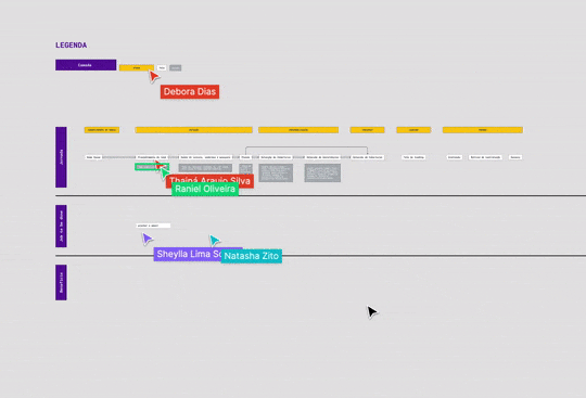
In September of 2019, we were 11 people between designers, researchers, illustrators, and marketing specialists. The retrospective meetings gave me all the tea that was going on around file management, local component libraries, duplicity of development specification and the high variety of design deliverables.
Until then, the UX team was working with mainly four design tools. Sketch, for designing high-quality prototypes, Marvel App, for building interactive prototypes and getting feedback from stakeholders, Zeplin, for delivering specification to engineers, and Google Drive for file versioning.
The principal problem that was important to point out was the necessity of manual updates from each of these tools: Upload files on Google Drive, update specs on Zeplin and the prototypes on Marvel App. Of course, things would not get updated in all of those tools all the time. Also, there was not a central component library, so designers would have local Sketch libraries that would not be updated automatically when needed. That means the specifications founded on Zeplin could be different from branding standards.
Those signs were essential to try Abstract to fix all the pain points. Abstract, if you do not know, is a version control system tool for Sketch which also allows you to centralize design systems and development handoff specification in one single place.
Everything looked perfect, until the problems started.
Pain points and learnings adopting Abstract

At first, the team was really open to try a new tool with the promise that the problems listed out would be fixed. However, other problems started to show up:
- Abstract works basically as a git repository, which developers are really used to, but designers are not. The team needed to learn and apply that on a daily basis.
- Engineers were having a lot of trouble trying to use Abstract to get the specification they need in real time. Also, the assets would not be available for download sometimes on the file formats they needed.
- The new tool would make designers’s laptops really slow. It was more one tool the team needed to use.
However, we also could build and share all design definitions, including tokens and components for all web and app interfaces. That helped all team members to design solutions faster.
After less than three months adopting a new tool, it was clear that we needed to change again. The decision we took a few months back did not match our needs as a team.
✨ Pro Tip #1: Get used to failure. It will happen. That is the reality working with digital products. Your objective should be to fail faster to learn faster. Design emerges from a problem, from uncertain times, from chaos.
So, it was the time to change our main interface design tool from Sketch to Figma and stop using all of the previous set.
Changing to Figma: first steps

It was important here to validate the context we have working with Sketch, Abstract, Marvel App and Zeplin on Figma. The team should be able to run usability tests, design illustrations, manage the design system and work with marketing deliverables. We validated that before shifting the team to use Figma. It was important to guarantee that we would not fail again.
✨ Pro Tip #2: Whatever is your context or the change you and your team want to run, make sure that the current context would work. It is important to guarantee that all the capabilities and possibilities will be covered. That can also be used for an introduction to the next context to your team and something to convince stakeholders for the new change.
A few modifications were needed. Figma and Sketch are two different tools, and each of them has a unique way to apply design definitions, such as color, typography and so on. Although, the difference between tools were not something really difficult to deal with.
Another important thing we did was to not change the main design tool at once. During our weekly meetings, the team and I analysed who had experience with Figma before and which squad would be good to validate the new tool.
✨ Pro Tip #3: Start small. The same as a digital product, validate all your hypotheses in a controlled scenario with a minimum number of people. So, it will be easy to collect feedback and make future changes if needed. Also, you will have experienced people to help the whole team to the new tool when the shift happens.
Doing that, we could improve our component library collecting real qualitative feedback before turning Sketch off. We also ran a few Figma workshops for all team members. The objective here was to have a controlled scenario far away from product stakeholders to play with the new upcoming tool. That helped the team improve their confidence with Figma settings.
A few weeks later, we changed the official interface design tool for all team members to Figma with a validated and stable structure of design tokens, components and illustrations. So, the new files and interfaces would be all synced and linked with Youse’s Design System since day one. With that, we stopped working with four main tools (Sketch, Abstract, Marvel App and Zeplin) to only one.
Learnings and benefits so far
At first, the main benefit we had was from our funds. Working with only one tool, we reduced the cost from four design tools by almost 65% using only Figma in 2020. Nowadays with the COVID-19 situation, all teams at Youse are working remotely. Not only the UX team, but product, engineering, marketing and all other teams are working from home. It has been really important to use a web-based application as Figma to keep all stakeholders aligned on our daily basis in a really positive way.
Today, we do our work in a more collaborative way and aligned with all stakeholders online. Now we manage and control the changes of our Design System, we have all the UX, marketing and illustration files at one place and developers can find the design handoff with a single link using Figma. Also, laptops have been performing faster using only one tool.
However, as Jessy J says, nobody is perfect. We still have a few problems using Figma until now:
- There is no offline support. We are completely dependent on internet connection to work. But, with remote work even more common, that is not a Figma's only problem.
- We are still validating the best way for us to organize Figma files. We are at the second stage of structuring that. We made it by collaboratively collecting feedback from the team and making the decisions together. When it gets stabler, I will write about it too ;)
I hope that the tips and learnings we have faced can help you and your team decided on the best new tools for your specific context. Last but not least, remember that there is no magic answer when we talk about team culture, internal processes and business needs.
What set of tools do you and your team work with? Are you happy with them? What pain points do you face every day? Which ideas do you have to change that? I would love to hear about it in the comment section.
Special thanks to Janessa Murao ❤


