Cryptocurrency payment UX process
A digital currency payment system learning exercise
Cryptocurrency is a hot topic right now, both in and outside the tech world. More people are downloading wallets, buying Bitcoin, Ethereum, and other digital currencies. Many see it as an investment, but is anyone actually buying anything with it? It’s currency after all, and you buy things with currency.
This article continues where we (Joseph Guerra, Brandon Fancher, Garren DiPasquale, Sam Shaibani) left off with our crypto wallet MVP.
We pivoted to building a digital currency payment system called Marché.
That’s French for merchant. Fancy, oui?

Marché is a website to buy a single item: the genesis block coffee mug.
Our objective is that users experience an intuitive and seamless digital currency payment checkout. We wanted to share our three part process explaining what we’ve done and what we’re doing next.
Part One: Learn some stuff
Our biggest assumption was that people who owned digital currency were willing to spend it. We knew there were products out there offering a similar solution, but we didn’t know if they worked well, or if people were using them.
Earn.com Survey
Joe sent a survey through Earn.com to understand usage and motives around digital currency. Earn is a great tool to target our technophile persona, since they reward responses in cash or Bitcoin.


We learned that the majority of people surveyed (93%) use digital currency as an investment. Most people (83%) are willing to buy something with digital currency, yet only half (49%) have actually done so.
The last question was open ended to allow for more detailed feedback regarding “what would make you spend your digital currency?” We categorized each response into the following chart:

The results conveyed that convenience (28%) was the most important. Then, feeling like it was a good deal, price stability, merchant acceptance, and buying things that you could only get with crypto. These results prompted additional questions.
How might we make buying more convenient? Less screens? QR codes? Gratifying animations? Visibility of system status?
Convenience seems like something that we (and other problem solvers and app builders) can solve, by focusing on user experience.
We were surprised that few survey respondents mentioned fees, taxes, privacy, and feeling cutting edge. Perhaps those are lower order needs, after convenience. Emphasizing these qualities of cryptocurrency may increase ease of use, security, and satisfaction among those looking for convenience in their digital currency purchases.
These results justified continuing to understand the digital currency payment process in Marché.
And if you’re curious, here’s the original response data.
Competitive Analysis
In a competitive analysis exercise, we set out to find e-commerce websites accepting digital currency payments to understand their checkout process. We explored Coinbase Commerce, Purse, PayBear, and Etsy.
In an effort to understand how the checkout process was designed, I found a shop on Etsy that accepted digital currency and simulated a purchase. I put an Ethereum sweatshirt in my cart, followed the steps, and successfully completed a checkout. It took me to a confirmation screen and sent an email, without having entered any payment information. There was nothing left to do or see, so I continued living my life.
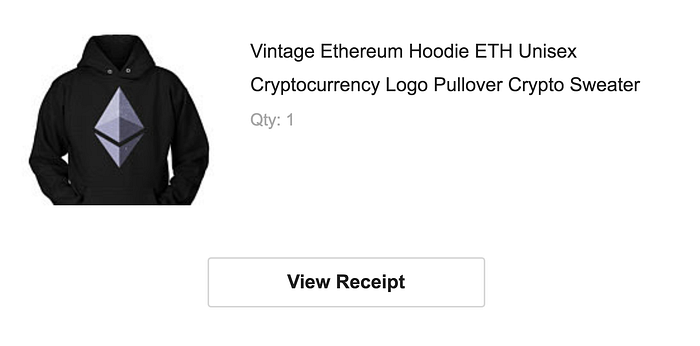
A few days later I received a shipping confirmation stating that the Ethereum sweatshirt had been shipped. There was no contact from the seller. I’m not even sure if he knew I hadn’t paid. Woof.
We know the merchant had to specifically opt-in to accepting digital currency, but it certainly didn’t offer enough information on how to collect the payment.
As advocates for non-evil design, we reached out to the seller and explained the situation. As expected, he had no idea. It wasn’t clear on his end that the order hadn’t been paid, or I’m sure he wouldn’t have sent me free merch. He direct messaged me a wallet address and I sent my payment through BitPay.
We’re sharing this knowledge in good faith and to discuss proper design. Please don’t abuse the payment system to receive free merch. Be a good human.
Etsy Google Form Survey
After going through this process, we wanted to gather feedback from other sellers on Etsy to learn about their experiences accepting digital currency. We set up a simple 5 question survey and sent it out to other shop owners.
The results showed us that it was a poor process without a native digital currency payment system built into the checkout process, but that merchants were still willing to continue accepting digital currency.
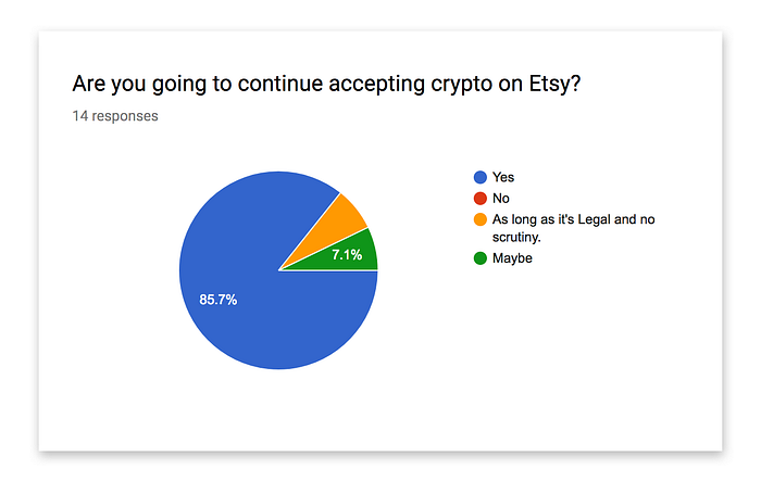
This validates the path we’re on for Marché, because that’s exactly what we offer. The ability to scan and send a payment directly from the site, during checkout.
Talking to Merchants
As a lean way to spread the word and gather feedback about payment acceptance, we spent time talking to merchants in our local coffee shops and farmers markets. Since digital currency is about true peer-to-peer payments, there is significance in testing in a farmers market, or farm-to-table, environment. All human-to-human, without a middleman.
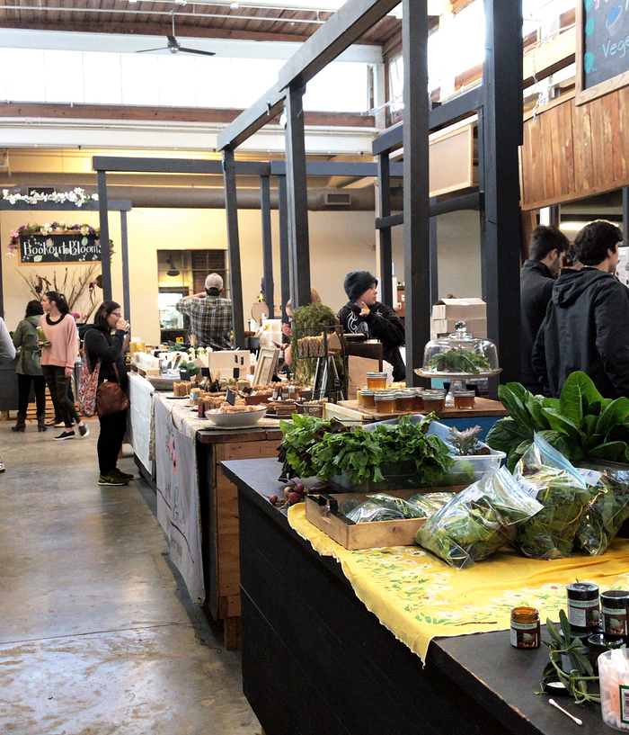
Almost everyone we talked to used Square Point of Sale systems to accept Apple Pay and Google Pay. We asked, “Do you accept Bitcoin?”
They either said “No”, or “Is that on Apple Pay?”, or “What’s Bitcoin?” We briefly explained what digital currency is, and the benefits for both consumer and merchant.
Thinking back to the Earn survey, how might we encourage merchant acceptance? There’s lots of room for improvement there, with visibility and market momentum. But how might we educate on the benefits?
Part 2: Build some stuff
We wanted to understand what that transaction process would look like, so we built a functional prototype. This was also our technical proof of concept, to prove that we could build a payment system tool.
Turns out, it’s possible when you have blockchain unicorns on your team, like Brandon Fancher. He built a functional version of Marché for us to test with users.
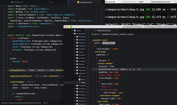
Marché is a React web application that sits on Node and Express, hosted on Heroku. It uses the Bitcore-wallet-service, hierarchical deterministic (HD) wallets, and BIP39 mnemonics to process real Bitcoin Cash (BCH) payments. We chose Bitcoin(BTC) to start, because it offers very low transaction fees, but the technology stack allows us to easily switch to Bitcoin Cash.
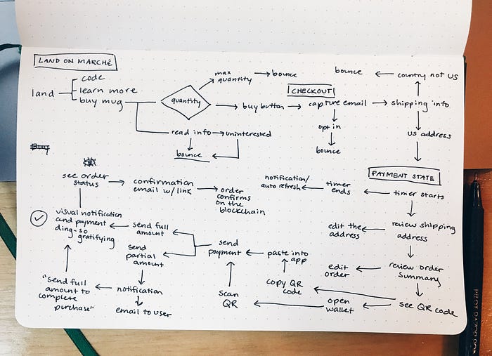
Flow Chart
Joe and Brandon created a user and technical flow, meant to capture key stages of user interactions. This high-level view helped identify opportunities for UX improvement, and specifically, where we could make the process more convenient. It’s expected to change over time.
Part 3: Interact with real humans... and cats. meow
We tested Marché with people (and cats) who were familiar with digital currency and had working knowledge of how blockchain transactions work.
Since our ultimate goal is to design something easy enough for mom and dad to use, we needed to test and receive feedback from people who understand the complexities and touch points of transacting with digital currency (first). This was our technophile persona, and early adopter MVP segment.
This is why we intentionally chose the genesis block mug as the product to showcase. To entice crypto enthusiasts.


With the functional prototype, we invited people to morning coffee to conduct usability tests for Marché. Even though it wasn’t fully functional yet, it was a learning experience for all of us and revealed some interesting findings.
The Workarounds
It’s a completely different exercise to usability test a digital currency transaction from a designers standpoint. Ideally we would put the product in front of people and observe, but this testing had to be a little more hands on.
We couldn’t ask people to spend their own money, so I gave them my phone with a BitPay wallet set up with enough Bitcoin Cash to complete a transaction. This wasn’t the perfect scenario because we weren’t testing the usability of BitPay, and if someone hadn’t used it before, there was a learning curve.
We needed to do this in order to expose the full transaction process, knowing it gave us somewhat skewed results. Which was okay, because we gained a lot from doing this so early in the process.
Checkout Flow
When testing the checkout process we recognized there was some confusion around what personal information Marché did, and didn’t, ask for.
In today’s world, users know to enter a shipping address, and then immediately confirm if the billing address is the same or different. When our users didn’t see the billing address step, they thought we forgot to add it in.


We didn’t forget. When transacting with crypto users don’t need to enter a billing address because there isn’t one. There is no address attached to your digital currency wallet.
This showed us there needed to be more education and clarity throughout the steps. And that the lack of this information, and education explaining why, actually lessened the users’ perception of security. Interesting, huh?
BCH to USD
We also observed some confusion when users saw both the Bitcoin Cash amount and USD equivalent. Marché was forcing users to think, is this a good rate? Why do I see 2 costs? Should I wait for a better rate? In a traditional checkout process, like Amazon, users see the USD amount and continue on, without thinking.
Even people who understood the concepts around digital currency didn’t connect the dots during our testing session. Not because they didn’t know, but because it was different than what they are used to seeing when they purchase with a credit card. And it tells us that even people who are familiar with the space, still encounter these usability issues. There’s more work to be done.
Next Steps
We learned a lot from sending out surveys, building a functional prototype, and usability testing with people, and that’s the purpose of an MVP, and UX product process.
We plan to launch Marché, promote it, and see how real users do on the website. And yes! We’ll ship mugs to people who complete their orders.

