UX Collective

We believe designers are thinkers as much as they are makers. https://linktr.ee/uxc

Follow publication

Member-only story

Mastering frame nesting in Figma

Chuck Rice
UX Collective
Published in
8 min readNov 8, 2020

A page design, left, visualised using shadowed rectangles, right.
Visualising the Frame nesting used to achieve the design shown on the left.

Putting a Frame inside another Frame sounds like madness, but it’s a core prototyping technique you’ll need to learn for truly immersive prototypes. Not only is it key for basic interactions like scrolling, but also for some advanced techniques needed for a scalable Design System. I’ll give you an overview of what they are, why they’re helpful, and how to get started with Frame nesting.

Anatomy of a nested Frame

Example using coloured Frames demonstrating the layers, left, and UI view, right, in Figma.
An arbitrary example of nesting some Coloured Frames.

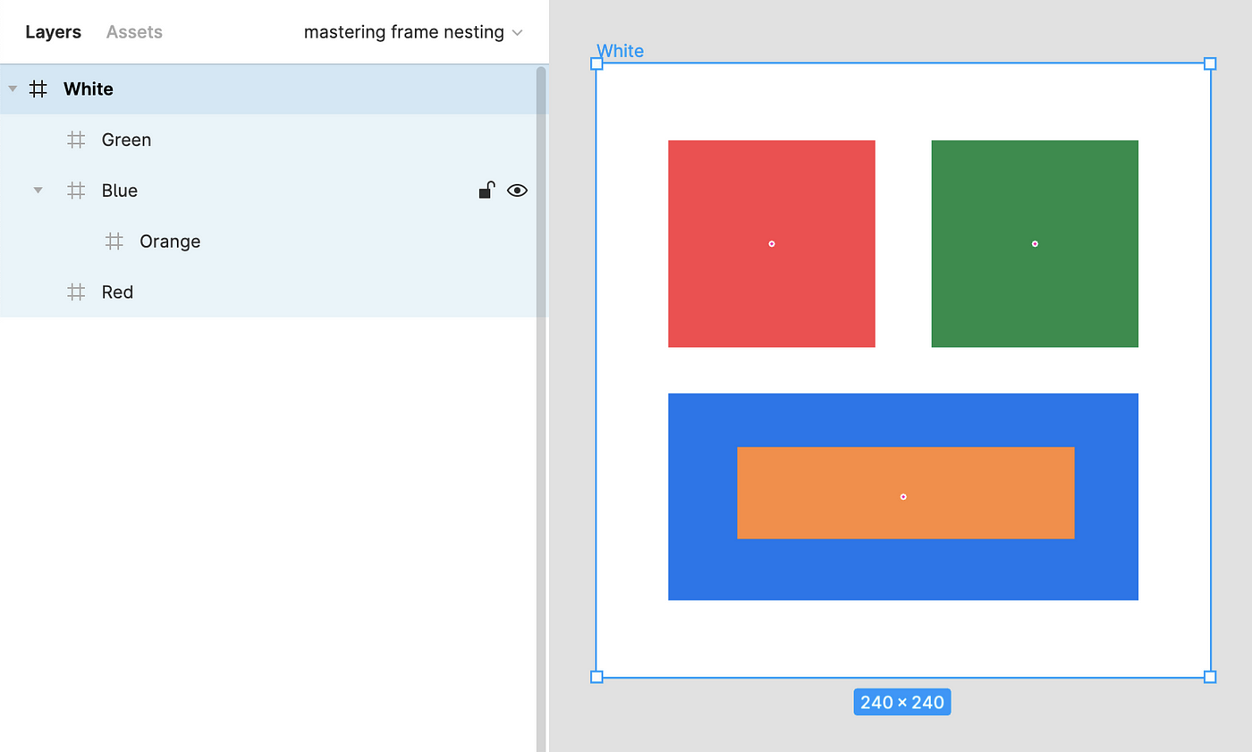
In order to remain illustrative I’ve created a basic example above in Figma using coloured Frames. They are arranged at three levels of depth:

  • Top level — this is the parental Frame in White, and is the selected Frame in the screenshot
  • Middle level—inside the White Frame there are three further Frames: the Green, Blue, and Red Frames arranged as squares and a rectangle
  • Bottom level—in the third level of depth, as indicated by the depth of indentation in the…

Create an account to read the full story.

The author made this story available to Medium members only.
If you’re new to Medium, create a new account to read this story on us.

Or, continue in mobile web

Already have an account? Sign in

Written by Chuck Rice

Sr. Product Designer, DevX and Design Systems @ Moonpig 🌙🐷 • Figma Community Advocate • 🎓 Educator: chk.fyi/LearnFigma • 400k+ Medium views

Responses (8)

Write a response

This is the most helpful figma article I've read yet!!

--

Thank you for the article! I also added a rectangle wider than the cards (with white fill) that lays behind the horizontal cards so that when I scroll cards to the very right, there is still a little margin on the right.

--

For your "Frame nesting tutorial" part, can't you just use the option "Fix position when scrolling" for the header and footer elements?

--