Mastering typography in design systems with semantic tokens and responsive scaling
Creating efficient, consistent, and flexible typography for digital platforms using modern design system principles.
When designers no longer have to reinvent the wheel for every project, the entire process becomes much smoother and more efficient. This is the beauty of a design system, it makes the whole process smoother and faster. As weibel explains, beyond just saving time, it’s about working more effectively, keeping all the parts consistent, and making sure users have a clear and organized experience [1].

At the heart of this approach is typography, which is how we make text look and feel. It’s more than just selecting fonts; as Abhishek emphasizes, it’s about carefully arranging words so they are easy to read, visually appealing, and engaging to the reader [2]. It sets the tone for the overall design by creating harmony and consistency throughout every element of a digital product.
A strong typographic framework simplifies development and makes products easier to maintain. By integrating typography into a design system, teams can effortlessly scale designs across desktop, tablet, and mobile, ensuring a consistent visual language. As vinney notes, this is a key aspect [3,4].
Key typographic principles in design systems
Effective typography within a design system is guided by several key principles, including usability, clarity, and hierarchy.
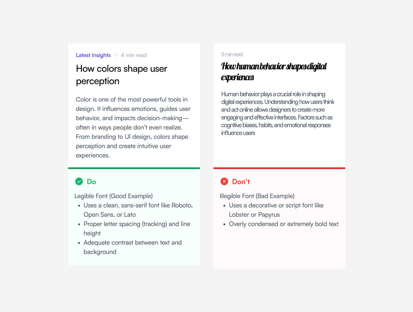
Usability: Usability in typography refers to how easily users can read and interact with text within a digital product According to abhishek, this is a key consideration in design systems [5]. When typography is well-designed, users can engage with content smoothly without distraction. For example, the Nielsen Norman Group emphasizes that factors such as clear font selection, appropriate sizing, balanced spacing, and strong contrast are crucial for reducing cognitive load and promoting smoother navigation.

Clarity: Clarity in typography ensures that the textual content is communicated effectively and is easily understood. Achieving clarity involves selecting highly legible fonts with distinct letterforms, ensuring characters are easy to differentiate.
Additionally, proper line spacing (leading) prevents text from appearing cramped, improving readability and reducing visual strain. By prioritizing clarity, typography improves both user experience and accessibility, making content more engaging and easier to navigate [6].
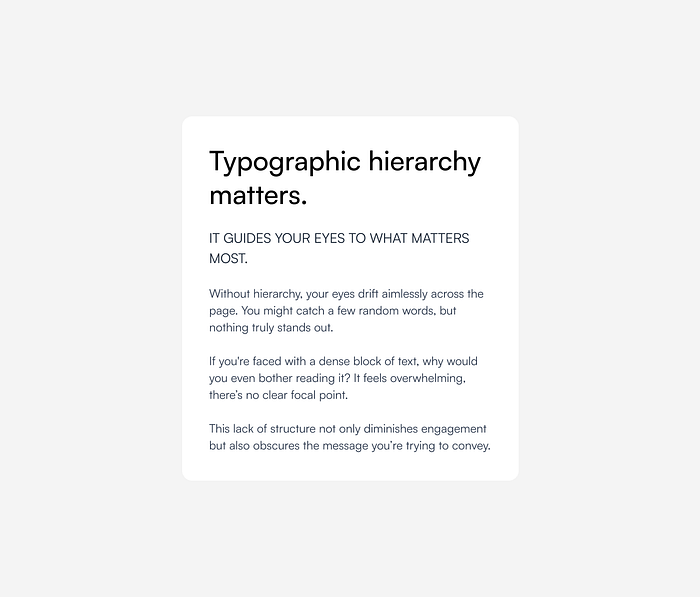
Hierarchy: Hierarchy is another critical typographic principle in design systems, playing a vital role in guiding users through information and highlighting key elements within the content. By implementing a clear typographic hierarchy, users can quickly scan content and understand the relative importance of different sections and pieces of information. To guide users effectively, this visual structure is achieved through deliberate variations in font size, weight, color, and the placement of text elements, a point also made by oliver in their discussion on font size in web design [7]. Design systems often employ a defined type scale to ensure a consistent and effective visual hierarchy across a product.
Typography and accessibility in design systems
Designing for accessibility ensures that digital products accommodate users with disabilities, from mild impairments to severe limitations. However, accessibility guidelines don’t cover every potential usability issue. For example, if a font choice makes text difficult to read, that’s a usability problem rather than a strict accessibility violation. When users struggle with readability, assuming contrast isn’t the issue, the challenge often lies in the legibility of the typeface or the clarity of the overall layout [8].
Understanding typography readability and legibility is key to designing accessible interfaces. Readability refers to how easily words and sentences can be understood, while legibility focuses on the clarity of individual letterforms. Making intentional choices in these areas can significantly improve the reading experience for all users.
To ensure text remains accessible:
- Font Size: Body text should be at least 16px for comfortable reading, and text below 9pt should be avoided [9].
- Color Contrast: The Web Content Accessibility Guidelines (WCAG) recommend a minimum contrast ratio of 4.5:1 for small text and 3:1 for large text to support users with low vision.

- Spacing & Line Height: A line height of at least 1.5 times the font size and adequate spacing between letters and words improve readability, particularly for individuals with dyslexia or low vision [10].
- Text Resizing: Users should be able to scale text up to 200% without loss of content or functionality [11].
- Screen Reader Compatibility: Avoid embedding important text within images; instead, use actual text to ensure compatibility with assistive technologies.
Establishing primitive tokens for typography
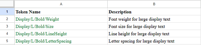
Primitive tokens lay the groundwork for a cohesive typographic system by defining key properties like font family, weight, size, line height, and letter tracking. These core tokens ensure that typography remains consistent and scalable across diverse platforms and screen sizes, serving as the basis for more detailed semantic tokens.
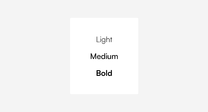
To begin, a font family token specifies the primary typeface (for example, “Satoshi” or “Helvetica”). Next, tokens for font weight differentiate between various levels such as regular, medium, and bold, each represented by a specific value.
Instead of using fixed font sizes, the system employs scalable font size tokens that allow text to adapt fluidly across different devices. Similarly, line height tokens preserve readability and visual balance, while letter tracking tokens manage the spacing between characters for optimal legibility.
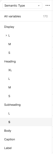
In Figma, you can set up this system by creating a collection called Primitive Type to house all these primitive tokens. Within this collection, organize categories as shown in the image below for a clear structure. Additionally, consider creating a central unit category that standardizes all unit values across the design system. This approach not only ensures consistency but also makes it easier to update and maintain typographic values throughout your projects.
Naming conventions for typography tokens
Typography token naming conventions are designed to be hierarchical and modular, ensuring that tokens remain clear, scalable, and adaptable across various platforms and screen sizes. Typically, the naming structure follows this format:
[Category] / [Size] / [Style] / [Attribute]
Each component of this structure serves a distinct purpose:
- Category (Type Role): Defines the text’s purpose, such as Display, Heading, Body, or Caption.
- Size: Indicates the type scale, often using labels like XL, L, M, or S.
- Style: Specifies the text styling, such as Regular, Bold, or SemiBold.
- Attribute: Identifies the typography property being defined, such as weight, size, line height, or letter spacing.
Understanding semantic typography tokens
Semantic tokens in typography are design tokens that provide meaning and context to the fundamental typographic properties . They act as an abstraction layer over primitive tokens (which store raw values like font names or sizes), defining how and where these properties should be used within the design system [12]

Why use semantic tokens in typography?
Using semantic tokens offers several key advantages :
- Consistency Across Platforms: They ensure that typography remains consistent across different platforms like web, tablet, and mobile, providing a unified user experience .
- Effortless Updates: Updating typographic styles becomes seamless, as changes to a semantic token automatically apply to all elements using that token. For instance, modifying the font size for all “Bold Heading Large” elements only requires updating the Heading/L/Bold/Size semantic token.
- Flexibility and Scalability: They make theming and customization easy, allowing typography to adapt to different brands or contexts without changing the core values
- Improved Collaboration: By establishing a shared language between designers and developers, semantic tokens streamline the design-to-development handoff process.
Key components of a semantic typography token
A semantic typography token encapsulates several essential properties that define its visual appearance and usage:
- Screen Variants: Although not always explicitly included in the token name, tokens can be designed with different values for various devices (e.g., web, tablet, mobile). This ensures responsive typography that adapts seamlessly to different viewport sizes.

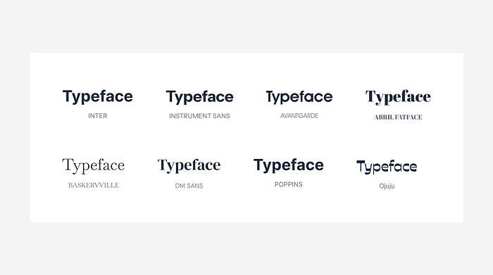
Font Name (Typeface): This specifies the font family to be used, ensuring consistency throughout the design system. For instance, a token might define “INTER” or “OJUJU” as the chosen typeface.
Size: The font size is defined using units such as pixels (px), rems, or ems. Relative units like rems are often preferred for accessibility, allowing users to adjust text size according to their needs.
Letter Spacing (Tracking): This property sets the horizontal space between characters, typically expressed in em, percentage (%), or pixels (px). Proper letter spacing can significantly enhance readability, especially for headings or text in all caps.

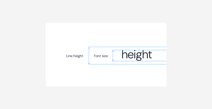
Line Height (Leading): Line height, or leading, is the breathing room for your text, it makes your content both easy to read and visually appealing.
In our typography system, we use a smart ratio-based approach to determine line height. Depending on the type scale, we adjust the ratio: a tighter 1.14 ratio works well for larger text like displays and prominent headings, while a 1.5 ratio is ideal for smaller text like body copy and captions.
Once calculated, these line heights are rounded to the nearest 4px. This step helps maintain a structured layout.
For example:
- For a large heading with a 48px font at a 1.14 ratio, the line height comes out to roughly 56px.
- For body text with a 16px font using a 1.5 ratio, the line height is 24px.
This flexible, ratio-driven approach lets us adjust line height based on text size and purpose, ensuring optimal readability and a balanced visual experience on all devices.
Weight: This defines the boldness of the font, with typical options including Regular, Medium, Bold, Semibold, etc. Font weight helps establish visual hierarchy and emphasizes important text elements.
Establishing a typographic hierarchy
By defining distinct type role for different content levels, designers enable users to quickly understand the importance and relationships between various pieces of information. To achieve a clear hierarchy, start by categorizing your text into the following groups:
- Display: Large, attention-grabbing text used for key visuals or standout messaging.
- Headings: Primary titles that introduce major sections.
- Subheadings: Secondary titles that further break down content.
- Body: Main text for paragraphs and detailed information.
- Captions: Smaller text that supports images or supplementary content.
- Labels: Brief descriptors for form fields, buttons, and icons.

Applying semantic labels for hierarchical text styles
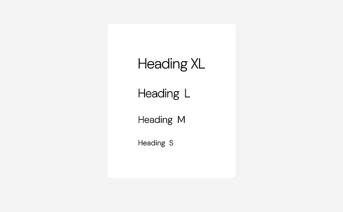
Once you’ve defined your type role (Display, Heading, Subheading, Body, Caption, Label), the next step is to apply type scales using semantic labels such as XL, L, M, and S. These labels indicate different size variations within each category, allowing for a more granular control over your typographic hierarchy. By assigning these size-based semantic labels to your text elements, you ensure that each component reflects its relative importance and role within the overall layout, while also offering flexibility in visual emphasis.
For instance, within the Display category, you might have:
- Display-XL: For the most impactful, attention-grabbing text. Think of the main title on your page.
- Display-L: For slightly less prominent display text.
Similarly, within the Heading category, you could have:
- Heading-L: For primary section titles.
- Heading-M: For slightly less important headings.
And for Body text:
- Body-M: For your standard paragraph text.
- Body-S: For smaller body text variations.
This systematic approach not only reinforces consistency across your design by using a defined set of sizes but also streamlines the implementation process for designers and developers.
Establishing semantic typography tokens in Figma
Here’s a detailed process for setting up semantic typography tokens in Figma:
1. Create the semantic type category
Start by defining a semantic type category to house all typography-related variables. This category should include predefined responsive breakpoints for desktop, tablet, and mobile, as modes ensuring typography scales seamlessly across different devices.

2. Define the font name variable
Within the semantic type category, add a string variable for the font family. This variable should reference your primitive token for the font name and should be applied across all breakpoints.

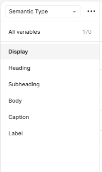
3. Organize by type role
Define a type role group. This group categorizes text styles based on their function, such as:
- Display (for large, attention-grabbing text)
- Heading (for section titles)
- Subheading (for secondary headings)
- Body (for main content text)
- Caption & Label (for small text elements like footnotes and form labels)
4. Establish type scales within each type role
Inside each type role, create a sub-group for different type scales, such as:
- XL (Extra Large)
- L (Large)
- M (Medium)
- S (Small)
These sub-groups set up a clear type scale hierarchy, providing a flexible and consistent framework for typography usage within your design system.
5. Set up variables for typographic properties
For each type scale (XL, L, M, S), define the following key typographic variables using your primitive tokens:
- Font Weight: Assign predefined values such as Regular, Medium, Bold.
- Font Size: Set scalable font sizes appropriate for each type role.
- Line Height: Define line heights optimized for readability based on font size.
- Letter Tracking (Spacing): Adjust spacing for improved legibility based on type scale and case.
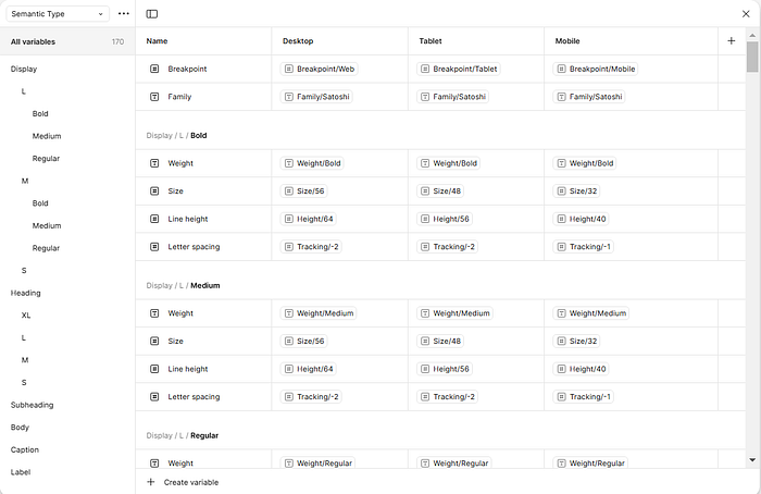
By referencing primitive tokens, these variables ensure consistency and flexibility while maintaining design system integrity.
After setting up your semantic typography tokens in Figma and defining the core typographic variables, the next step is to bring these elements to life by applying them to your text styles.
Applying semantic tokens to typography styles
This guide outlines how to apply semantic tokens to your typography styles, using “Heading XL” as an example. The process ensures that your text styles are both consistent and adaptable across various breakpoints (Web, Tablet, Mobile).
Begin by creating a type scale reference that outlines the various type scale you need , we would be using XL. (Note: The initial sizes and values can be arbitrary, as they will be updated later.)
Update the names of each text style to match the semantic token convention defined in Figma. For example, rename the style to “Heading/XL/BOLD.” This semantic naming links the text style to its function (e.g., headings, subheadings) , scale and font weight.
Utilizing a plugin like “Styler” allows us to generate figma text styles based on our renamed elements.
By selecting each style and running the plugin, we create the initial text styles for “Heading XL.”
Right now, the Heading XL style doesn’t have the correct font sizes, weight, tracking or line heights. To fix this, I rearranged the order to prioritize the Bold variant, then clicked on “Edit Style” to update the settings.
Currently, the values for font weight, size, line height, and letter spacing appear arbitrary. To standardize these, we’ll apply the predefined structure. First, update the font family to match the semantic type token. Click on the variable icon (the settings icon) to access the field where you can make this change.
Next, we update the font weight. An efficient method is to copy the text style name from the layers panel and paste it into the token search field. This approach eliminates the need to manually scan through tokens, streamlining the process.
After selecting the Bold weight, you can apply the same process to adjust the font size, line height, and letter spacing by choosing their corresponding semantic tokens.
Once the Bold variant has been updated, we apply the same process for the remaining font weights, medium and regular. Initially, we set arbitrary values, but after applying the semantic tokens, the values have been adjusted accurately. The updated styles now perfectly reflect our intended design.
Next, we need to adapt the typography style for our breakpoints , web, tablet, and mobile. To achieve this, we apply variable mode to the typography style. Since we’ve already established breakpoints using semantic tokens and created distinct modes for each, this approach allows for seamless switching and consistent typography across all devices.
With the new settings in place, you can now switch between desktop, tablet, and mobile modes. Next, duplicate the typography scale twice — one copy for Tablet and one for Mobile — and apply the variable mode for each. The image below illustrates this process.
Now, for Heading XL, I can easily switch between Web, Tablet, and Mobile modes. The benefit of this approach is that it consolidates the Heading XL style into a single category within the text styles, rather than creating separate categories for each breakpoint. This streamlined method makes toggling between breakpoints quick and efficient.
A strong typography system ensures consistency, scalability, and accessibility within a design system. By leveraging clear tokens, teams create a flexible foundation that adapts seamlessly to different screens and user needs. Prioritizing readability, hierarchy, and responsiveness not only enhances the user experience but also strengthens collaboration between design and development, making typography a cornerstone of both usability and visual language
References
[1] Weibel, A. (2025, February 5). What is a Design System and How Does it Work? Salesforce. Retrieved from https://www.salesforce.com/blog/what-is-a-design-system/
[2] Abhishek. (2021, October 7). Role of typography in design systems. Strate School of Design. Retrieved from https://strate.in/role-of-typography-in-design-systems/
[3] Vinney, C. (2024, October 31). What is a design system and why is it useful? UX Design Institute. Retrieved from https://www.uxdesigninstitute.com/blog/what-is-a-design-system/
[4] Understanding typography in design systems. (n.d.). Retrieved from https://www.qed42.com/insights/understanding-typography-in-design-systems
[5] Abhishek. (2021, October 7). Role of typography in design systems. Strate School of Design. Retrieved from https://strate.in/role-of-typography-in-design-systems/
[6] Establishing a Visual Language: Typography. (n.d.). Design Systems. Retrieved from https://www.neue.world/learn/design-system/establishing-a-visual-language-typography-a-detailed-discussion-on-choosing-and-using-typography-in-a-design-system
[7] Oliver. (2021, September 21). What’s the right font size in web design? Pimp My Type. Retrieved from https://pimpmytype.com/font-size/
[8] Typography and accessibility. (2023, January 10). The Interconnected. Retrieved from https://theinterconnected.net/kirabug/typography-and-accessibility/
[9] Typography — Material Design 3. (n.d.). Material Design. Retrieved from https://m3.material.io/styles/typography/applying-type
[10] Understanding success criterion 1.4.4: Resize text. (n.d.). W3C. Retrieved from https://www.w3.org/WAI/WCAG21/Understanding/resize-text.html
[11] Understanding variables, styles and tokens in design systems. (n.d.). Retrieved from https://figr.design/blog/figma-tokens-in-design-systems
[12] Design tokens — tokens — foundations — SAP digital design system. (n.d.). Retrieved from https://www.sap.com/design-system/digital/foundations/tokens/design-tokens/
Glossary
Breakpoint: A specific screen width at which the layout and styling of a website or application adapt to provide an optimal viewing experience across different devices (e.g., desktop, tablet, mobile).
Design System: A set of standards, reusable components, and guidelines that help teams design and develop digital products in a consistent and efficient way.
Font Family: A group of related typefaces sharing similar design characteristics
Font Size: The size of the text, typically measured in pixels (px), ems, or rems.
Font Weight: The degree of thickness or boldness of a typeface (e.g., Regular, Medium, Bold).
Hierarchy (Typographic): The visual organization of text on a page to guide the reader and indicate the importance of different content sections.
Letter Spacing (Tracking): The horizontal space between characters in a line of text.
Line Height (Leading): The vertical space between lines of text.
Primitive Tokens: Fundamental design tokens that store raw values
Readability: How easily words and sentences in a block of text can be understood.
Relative Units (ems, rems): Units of measurement in web design that are relative to other values, allowing for scalability and accessibility.
Scalability: The ability of a design system or its components to adapt and grow effectively as the product evolves and expands across different platforms and screen sizes.
Semantic Tokens: Design tokens that provide meaning and context to typographic properties.
Text Styles: Predefined sets of typographic attributes (font family, size, weight, line height, letter spacing) that can be applied to text elements to ensure consistency.
Type Scale: A defined set of font sizes used throughout a design system to establish visual hierarchy and consistency.
Type Role: A categorization of text styles based on their function or purpose within the content (e.g., Display, Heading, Body, Caption, Label).
Usability (in Typography): How easily users can read and interact with text within a digital product.
Variable Mode: A feature in design tools (like Figma) that allows for defining different sets of values for design tokens.
WCAG (Web Content Accessibility Guidelines): A set of international standards and recommendations for making web content more accessible to people with disabilities.


