UX Collective

We believe designers are thinkers as much as they are makers. https://linktr.ee/uxc

Follow publication

Match the visual fidelity of your design to your progress addressing the UX

If you show something shiny, they’ll assume it’s done

Kai Wong
UX Collective
Published in
7 min readDec 29, 2021

A table filled with paper sketches of varying completeness and fidelity.
Photo by Marvin Meyer on Unsplash

One irony of being a designer is that the shiny interfaces you put in your portfolio aren’t what you work on daily.

Your portfolio pieces are the end result of a lengthy design process. Generating that level of visual fidelity at any other point usually leads to trouble.

This is especially true if you work with people that aren’t familiar with UX Design.

I usually show low-fidelity prototypes instead of polished design drafts until much later in the design process.

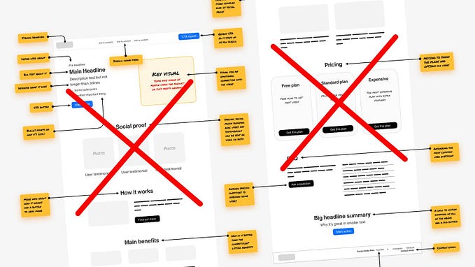
It doesn’t seem like it should be this way. After all, there shouldn’t be anything wrong with creating beautiful and polished interfaces.

But the problem comes with the polish Designers often put into our prototypes. Since we pay a lot of attention to the details on the page, we can accidentally mislead stakeholders into assuming that the design is almost done.

This is the case even if we label it a work in progress. To understand why this might be, let’s turn our attention to the world of game development.

The problem of work in progress

How many times have you seen art for a video game that seems eerily similar to the final product?

Video game concept art of a map called Museum. It looks like a painted art piece, with a number of details such as horse statues, a cloud moon at night, mood lighting, and more.
https://fuelstains.artstation.com/projects/NeZJD

This is called ‘concept art,’ but in reality, it’s a misunderstood measure of progress like polished Design prototypes might be.

In truth, there are two different types of art.

Actual concept art is sketches that are done quickly at the beginning of the process for generating designs, exploring ideas, and giving art direction.

Somewhat detailed but otherwise sketchy piece of 5 different people holding different weapons in certain poses. The faces are smudged and hidden while things like weapons, poses, and armor are more detailed.
https://game-ace.com/blog/video-game-concept-art/

Then there’s promotional art, which is done a lot later during production, made to look beautiful and generate hype for your product.

Create an account to read the full story.

The author made this story available to Medium members only.
If you’re new to Medium, create a new account to read this story on us.

Or, continue in mobile web

Already have an account? Sign in

Written by Kai Wong

7xTop writer in UX Design. UX, Data Viz, and Data. Author of Data-Informed UX Design: https://tinyurl.com/2p83hkav. Substack: https://dataanddesign.substack.com

Responses (3)

Write a response

What are your thoughts about this approach when designing within an existing system? Sketches and low fidelity prototypes seem to be more essential while designing for a brand new asset, or, as stated in your article, for complete redesigns, but I…

--

But in those cases, what you should polish isn’t the fidelity of the design: it’s your comfort level with speaking about the methods.

And even more than the methodology itself, being able to communicate how this solves a serious problem within the current product's structure truly ensure that stakeholders understand why these methods are being initiated.

--

Lastly, you might find that maintaining multiple design artifacts, sketches, and prototypes for multiple projects can be troublesome.

Or boring, and maybe not as gratifying as building high-fidelity prototypes.

--