🍔 McDonald’s kiosk ordering system — a UX case study
Few weeks ago I went to McDonalds to have my lunch with my family. They (McD) installed 3 new ordering kiosk in the fast food chain. My father and brother were the ones taking the order and I am observing their interaction with the kiosk. Both my father and brother have trouble navigating through the menu, especially the food selection process. I will breakdown each of the problems they encounter during the ordering and payment process in the next section.
The Problem 😠
- The first problem I have seen them encounter was food selection. The selection process involves carousel on the left side of the screen. Fortunately, people knew they were more than what it has to offer and start to swipe up (to scroll down) to view more selection but there is no indication that it is scrollable.
- The 2nd problem is customisation of a meal. Apparently it is the hardest part. Once you selected your burger or set meal, you can customise your burger size and types of sides and drinks. When my father tried to change his drink he is only able to see 6 options until I took over the ordering process and “figured” out that I can scroll up to view more selection. This interaction actually surprises my parents. The machine also didn’t cross out the unavailability of my butter corn which I need to change to fries (I guess they just didn’t update the menu)
- The 3rd problem is payment. After all that has been done it is time to pay. I find it weird that they have the option of paying with the kiosk or pay in front of the counter (the traditional method). I see no reason for us to walk over to the counter and pay for the food we just ordered with the kiosk. Interestingly, my father picked “pay at counter” which actually trigger another interesting experience issue. After he picked that option the display tells us to get a number plate which is hanging on the side of the kiosk. We thought that it was our order number and the staff will send the food base on the number but we were wrong (not entirely). The screen shows our number is 53 while the plate we took is 175 which is very misleading. After paying we got a receipt which has another number(157) and waited for almost 45 minutes for the food to be ready. It is not a good experience at all for a fast food chain to implement a new order and payment system which is ironically slowing down the entire process.
- The 4th problem is the number calling system. People here are used to wait for their food to be prepare within minutes and bring them themselves to their tables. They have the numbering system to have staff send food to the customers but in the end they are calling out the numbers and also showing the numbers incorrectly on the screen. If I didn’t pay attention to the number calling and try to make sense of it (because we have 2 different numbers) I won’t get my food.
- After selecting checkout, you are ask to get a table number and insert the table number back to the system.
Research 🔎
The method I used was observation. My parents and brother are one of the personas I can take note of. I also walked over to observe other people using the system. I found out that some people won’t have big issues if they are ordering 1 item at once because it just flows through. I noticed that the problem arises when they wanted to order multiple items and sometimes finding it hard to go back to the previous step which was what we were facing when ordering. Some people still chose “Pay at counter” option but in the end they need to line up to wait for the cashier to arrive (yes, the cashier wasn’t even there to wait for you to come and pay).
Day 1 On-site research


My brother and father first experience the ordering system.
Day 2 On-site research
I went to another McD branch after a week to observe the behavior of other users.

The bad thing about this branch is that it requires a staff to standby by the kiosks just in case customers are confused with using the system.
Day 3 On-site research
The next day I went to the same branch with my mother but this time I test the system myself. She filmed the entire process. (which is insightful and funny)
Analysis 💭
User Personas


User Story Boarding
This is a storyboard I have created from the understanding of the 2 personas above. The character in this storyboard is called Jhen.


Ideate and Sketching ✏️
Before I started sketching options, I Googled about kiosk system available in fast food chains and found out KFC will also be implementing. I can’t find any videos on how it work but I did found out a promotional video of McDonald’s promoting their new kiosk system. I find it weird that the video contains a waitress guiding customers to use the system. The article is *here.*


Primary needs I defined
- Clear food organisation for seamless food selection
- Easy food customisation
- Seamless and clear navigation which users can go back to previous step
- Efficient checkout process to save customers waiting time
Low-fi Wireframes 📝
Base on the sketches I have drawn, I came up with some wireframes of the ordering flow to give myself a better view of what the better system can potentially look and feel. This will also help me to identify problems in the flow and do corrections.

Testing & Iterating Wireframes
I created more versions of the same type of action to compare between them.
- Food Type Selection Revealer
- Desserts & Sides Selection
- Food information page
- Drinks customisation page
Food Type Selection Revealer Comparison
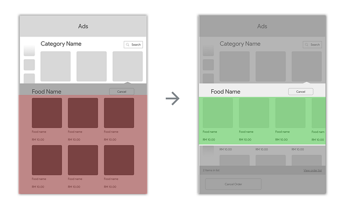
More organised and focused on the new options for the customers to swipe and reveal.
Desserts & Sides Selection
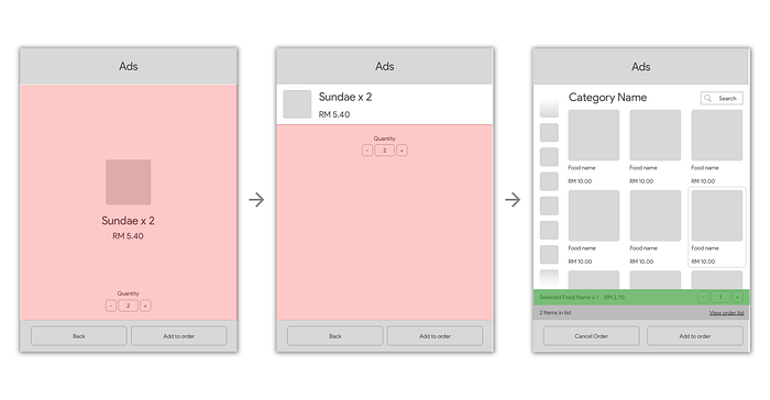
Came up with 3 versions of it and in the end I selected the 3rd version (far right). This is because the first 2 versions has too much unnecessary white space and customers cannot see other choices to change.
Food information page
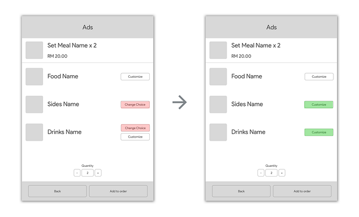
The one on the left is also the current interface use in McD branches and I thought it was ok to continue with the design until I further examine and realise that it doesn’t require 2 different types of buttons to direct customers to 2 different pages where it can lead to 1 page.
I merge 2 buttons into 1 and keep it as Customisation button because in the next page it can customise both size and variations.
Drinks Customisation page
(the idea was scrapped in the end when designing High Fidelity)

This part is the new drinks customisation part and one of the most complicated flow I have designed. The wireframes are later abandoned in the high fidelity part because it does not support customisation of drinks temperature and too many page transitions. The new design enables customer to customise their drinks in only 1 page.
High Fidelity Design 🖥
I created the entire high fidelity design in Sketch and import into Figma (easier prototype sharing)
Main menu & Food selection
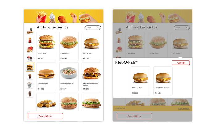
I represent the food in cards and also added yellow border highlights when category is selected. I also added a search area on the top right corner.
Drinks customisation

This the part I mentioned that completely replaces the one you saw in the low fidelity section. Customer will see their pre-selected drink and if they want to select another drink they can do so and a confirmation button will appear to indicate there’s a change.
Desserts & Sides
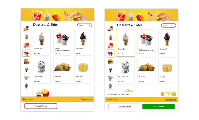
When a customer decides that he/she only wants to order desserts or sides they won’t need to see multiple different pages. They choose the food and an item counter will appear at the bottom because some of them don’t require customisations at all.
Order list & payment types

Changed some button wordings to encourage clear actions and message. I also reorganise the payment types to indicate clear possible actions.
Thank you pages (Take Away & Dine In)
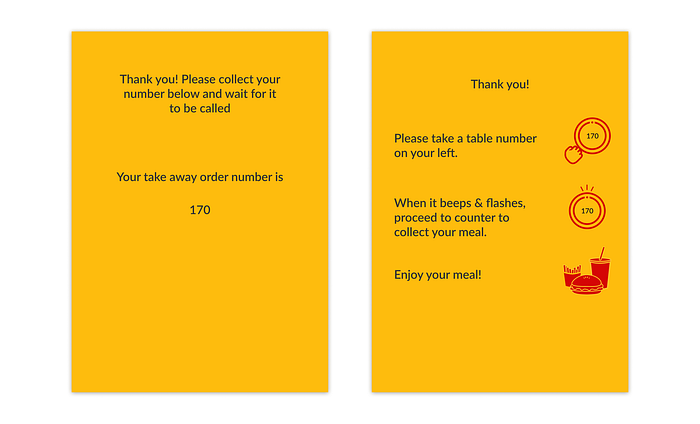
The Mini-Redesign of Dine In Meal Collection Experience
The steps shown in the Dine In Order screen is completely different from the actual or current system. I re-imagined it to be much more efficient so I decided to change process of having customers getting a table number and inputting back into the system.
I figured that they can implement a table number system where customers get the number while the system automatically tracks the number and they just need to wait at their own respective table until the device flashes and beeps the customer can proceed to counter and just collect their meal.
This system eliminates the process of having customers to key in the table number into the system and having staff to find and locate the table number in the place (it will be harder if the place is packed)
Lesson Learned 😎
- Testing and Iterating in every stages of the design process — Initially I expected the project to be smooth as the user personas and story boards gave me a some good insights on how I should sketch the solution out. I ended up changing a lot of things in sketching, low fidelity wireframe and even high fidelity design. Basically iterating throughout the process.
- The importance of setting up the design environment — I didn’t jump straight into high fidelity design after completing low fidelity designs. Instead, I researched about colours and typography usage for systems. I built a system style guide for it and it saves me a lot of time while iterating.
What would have been better 🤔
- Better research methods — I have done my user research without a lot of solid methodologies except for using user personas and user story boards. I gathered the knowledge of users’ behaviour mostly through observations and Facebook comments from my friends and experience (which was bad in reality)
- User Testing with the people — I showed my high fidelity to some of my developer friends and they gave some good feedback which I implemented into the final design of the system. I think I should have shown to more people who is not developers and engineers and see what they think about the flow.
Post Case Study/ Impact ⭐
This started as a personal design project to improve my design skills, I have never imagine that I can see a few of my components being implemented after presenting to HUGE. Although the changes weren’t a lot but it improve the experience as I observed people using the system. They are less confused and the lines are cleared faster.
Spotlight
After the release of this case study. I got invited by HUGE Consultancy who is the firm that designed the Ordering Kiosk to do a short presentation to the team.

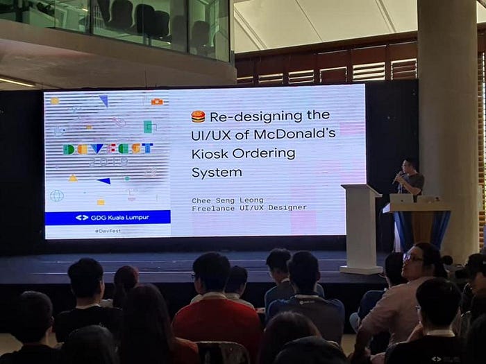
I also gave a talk on this case study in Google Devfest KL 2019 back in December. It was my first talk on design!