Meetup: A Usability Case Study

Meetup is one of the world’s largest network of self-organized clubs and community groups. It helps people connect face-to-face with other people who have similar interests and hobbies.
Being a passionate Meetup attendee myself, I wanted to answer these three questions:
#1. How are people currently using the Meetup app?
#2. Are users facing any usability issues while using the app?
#3. If yes, what can I do to help solve these issues through design?
This is a UX case study that explores those various questions.
Note: I do not work for nor am affiliated with Meetup. This is a passion project, enjoy!
The Process
I divided my game plan into 5 distinct phases, cheers to IDEO’s human-centered design thinking process.

My Goal
Redesign the app to solve for current pain points.
1. Empathize with Users
There are two types of Meetup members. Those who want to host their own group and those who want to attend. In my case study, I wanted to capture both sides.
Understanding the User
In order to get me thinking about all the different possibilities of why someone would use Meetup, I created a list of possible users, situations, motivations, and outcomes (aka. the Jobs To Be Done framework).
This would help me understand the mindset and background of the user’s behavior, needs, and goals to help formulate the various tasks I would be asking them to complete.

Provisional Personas
Based on the exercise above, I crafted two provisional personas. These personas are purely based off of my assumptions and serve to inform my design decisions during the initial phase of design & research. I’ll be validating or invalidating my assumptions during user research & testing.
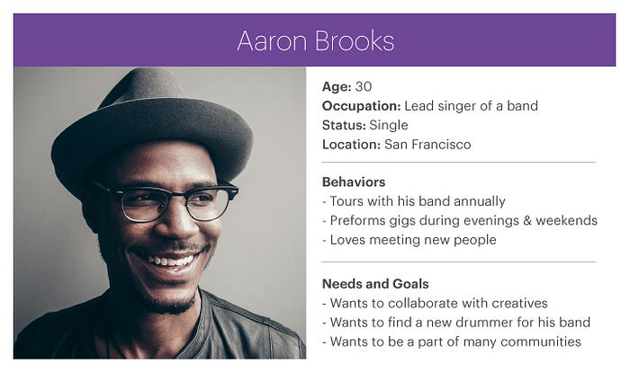
Persona #1: “I have awesome things to share and want to host my own Meetup.”

Persona #2: “I’m here to meet people who love music as much as I do.”
Guerrilla Usability Testing
Usability testing is a very quick way to understand obstacles faced in an application from a user’s perspective. In order to improve the app, I first had to gain insights by observing people using the app while recording their interactions.
I wanted to target a location that Meetup users would likely be hanging out at. While keeping Jane & Aaron’s personas in mind, I headed over to Yerba Buena Park, San Francisco.
Performing a usability test with 5 people will help you uncover 93% of what is possible to discover, so I found 7 brave participants who would be willing to participate in my experiment.
I came up with scenarios that tested for the following topics:
- Group creation
- Scheduling an event
- Finding a group and/or event
- Joining + RSVP’ing to a group and/or event
All of the users I tested were from the ages of 26–35 and considered themselves tech savvy iPhone users who have never used the app before.
2. Defining the Problem
After I had completed my initial round of usability testing, I reviewed the footage and wrote down any obstacles they came across on post-it notes.
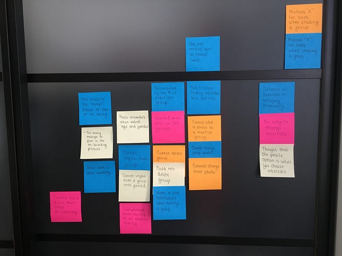
Through affinity mapping and analysis, I focused on addressing the top 4 issues that were most painful for the user. Here is what I came up with:
Pain Point #1: Event Creation
While creating an event, 7/7 users would cancel out of a help screen to discover that they canceled out of their creation, losing all their data.
“How frustrating. I thought this would take me back to the previous page!”

In addition, some were unclear about what ‘title’ and ‘description’ meant.

Pain Point #2: Customization of Interests
7/7 users could not discover how to customize their interests after the initial onboarding process.
“I’m really surprised that you can’t change your interests in the profile section.”

Some users also didn’t realize that ‘Groups’ and ‘Interests’ were buttons. Others were confused by why ‘RSVPs’ did not link anywhere.

Pain Point #3: Button Comprehension
7/7 first time users could not comprehend what the plus icon on the event card represented until after they tapped it. Once users discovered that the plus icon was a join button, they quickly tapped the icon again to find out that they could not undo their request. This dilemma describes one of the 10 usability heuristics of UI design.
“But I don’t want to be a part of this group!”

Pain Point #4: Tagging Limit
When creating a group, 3/7 Meetup organizers tried to tag more than 15 interests to discover that there is a 15 limit tag. However, there is no indication of that limit until the user presses the ‘Start this Meetup’ button.
“This super annoying, you should have told notified me earlier!”

I also noticed hesitation from users when they were done with selecting their tags. Fearing they would lose their data, users had to tap ‘cancel’ to finish the group creation process.

3. Ideate Solutions
After identifying the pain points, I was ready to start solving these issues.
UI Sketching
Sketching is a great way to get your thoughts on paper without being committed to a single design. I came up with a few potential ideas that could be possible solutions to the pain points.
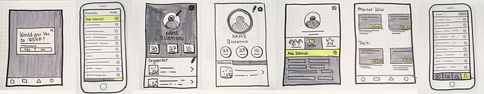
I chose to wireframe most of my sketches, then narrowed down my top solutions based on peer feedback.
4. Prototype
Once I felt ready to create hi-fi versions of a few of my proposed solutions, I transferred my sketches into Sketch.
I drafted a click through prototype of my proposed design solutions using InVision. With this new prototype, I could test on a new crowd to see whether my design was effective or not.
Addressing Pain Point #1: Event Creation

Proposed solutions:
- Moved ‘Title’ to the first input and rename to ‘Meetup Name’
- Modified start and end time signifiers to make accessible for those who have color blindness.
- Removed the option to exit creation mode from the tooltip screen.
- Moved the “back” button to the top left of the screen, where users expect it to be.
Addressing Pain Point #2: Customization of Interests
The current way to edit your interests is to select a category from the homepage, then like or dislike a topic within a category. However, during user testing, 7/7 people went straight to the profile section when asked to edit their interests.

Proposed solutions:
- Under profile, create a section to add or remove interests.
- Make labels look interactive.
- Make ‘RSVPs’ consistent with ‘Groups’ and ‘Interests’ by making it a clickable button.
Addressing Pain Point #3: Leaving a group

Proposed solutions:
- Replace the icon with the word ‘Join’. Then give the button the ability turn on and off so that users can undo their request. This way, users know right away the expected behavior of the button without having to guess or take action.
Addressing Pain Point #4: Tagging Limit

Proposed solutions:
- Create a countdown that addresses interest limit when selecting the interests.
- Change ‘Cancel’ to ‘Done’ so that users feel that they’ve saved their changes.
5. Validation
To validate my proposed design solutions, I had to test my prototype on 5 additional people. Through testing, I discovered some of my redesigns weren’t performing as intended.
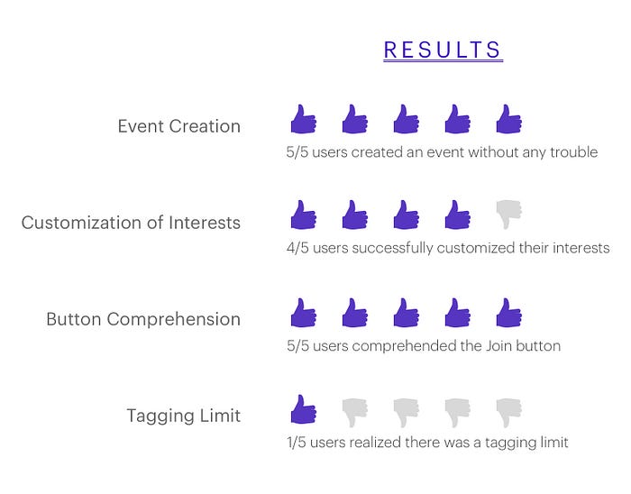
Iteration
As clear as I thought my initial designs were, it turns out that people were still struggling with the tagging limit.

People realized that they reached their limit once the alert module appeared, but it still was not clear that there was a limit in the first place. As a redesign, I decided to make the title red and bold when the interest limit was approaching.

After testing this pain point with 5 additional users, 5/5 comprehended the interest limit after the redesign.

Thanks for reading!
As a product designer, this case study taught me how to keep the people I’m looking to serve in the heart of the design process. Although some of my solutions may seem like small changes, it’s important to note that I made the smallest changes that could allow for the maximum task success rate.
Meetup has since updated their app to account for some pain points that I discovered earlier. The Meetup app you see today may not be reflective of the screen captures you saw in my prototyping phase.
I’m always open to meet other passionate designers in the field or those who are interested in learning more about UX.
Feel free to leave comments below or get in touch by email: jessicachen.pdx@gmail.com

