You're reading for free via Michael J. Fordham's Friend Link. Become a member to access the best of Medium.
Member-only story
Mental models and the evolution of an idea

One problem I always wrestle with when designing a new user interface is trying to balance innovation with usability.
For some projects, making the application as easy to use as possible is of the highest priority, but how could we do that?
One method is to utilise mental models when designing.
What is a mental model?
A mental model is essentially a set of expectations users have about how your product will function and behave based on their usage of other products. For example; let’s imagine we’re making a new social networking site, you’ll probably want to implement some sort of method of 'liking' a post or giving it a heart. This is because other popular social networks like Facebook and Instagram have created this sort of functionality and users now begin to expect a way to react to a post (other than commenting). We — as designers of this social network — know that our user’s mental model will likely be imprinted by their usage of other social networks, and so they will understand what liking a post does before they have even done it on this new theoretical site.
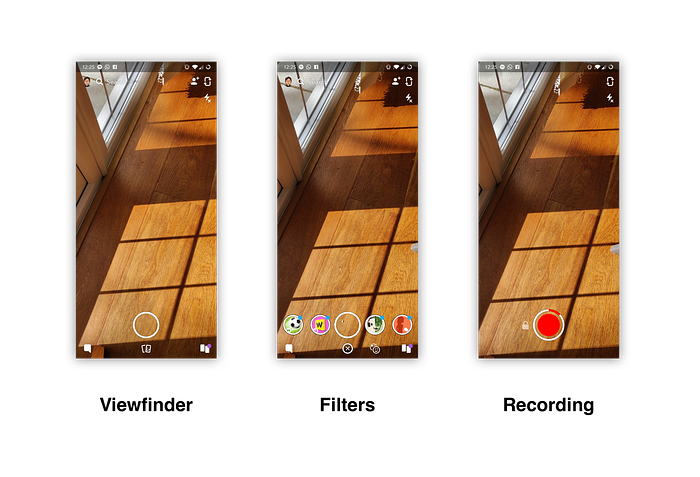
Another example of a mental model could be with Snapchat. When they first released their disappearing-image sharing app, users of it generally had a mental model built around how we share images from the viewfinder of our cameras to things like Facebook Messenger or WhatsApp.

However, Snapchat pushed the boundaries of our mental models and started making interactions like holding the shutter button to record video - rather than taking a photo - the norm. Tapping the screen now not only focuses the camera but brings up an array of filters that can be applied to a scene or person.
While these things sound small now, they were a leap for a user’s mental model at the time. However, what was remarkable was how quickly everyone caught on and quickly understood how this new system of taking photos worked. This innovation evolved the user’s mind and their mental model.
This idea for quick interactions when taking and sharing photos/videos could be linked back to Darwin’s Theory of Evolution by Natural Selection:
each slight variation [of a trait], if useful, is preserved
In UX terms, a trait could be the behaviour of taking a video by holding down the capture button in the viewfinder. When comparing this behaviour with swiping through different modes on your smartphone’s camera app, Snapchat’s idea is clearly quicker and more pleasant. It was more useful. So it was preserved.

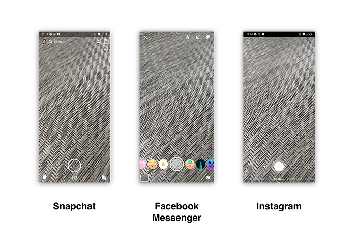
Now, what you’ll find in other apps that allow image-sharing (like Facebook Messenger or Instagram), is a very similar experience to the one Snapchat created. You can tap the screen to bring up filters, and you can hold down the shutter to record video. Designers of these apps would have looked at the mental models of their target users and found that they now expected this type of behaviour — all because Snapchat had an idea mutation, and it was better fitting for the environment (in this case: smartphone users).
When should we break away from a mental model?
Coming back to the original problem when designing (innovation vs usability), it is a tough decision to reject the way we behave with a product now in order to attempt to improve the experience in a completely different way. But that isn’t to say we shouldn’t.
Every so often the mutation of an idea or concept can introduce new and far better ways of tackling a problem, so the best thing we can do is ensure we don’t choose the first thing that comes into our heads. Instead, invite many people with varied perspectives and experiences to share their ideas about a solution and then test those ideas if you can to see if any show a markable and significant improvement on what is the standard right now.
We want to occasionally break away from the mental models accepted by everyone in order to keep things fresh, and avoid the market stagnating. This doesn’t just apply to user interface design either, it can relate to any product.
For example; notches on smartphones. Generally, the latest phones released right now will have an area at the top of the screen which houses the camera and earpiece (as well as some other sensors), and will mean we don’t have a full-screen experience. As users, we generally accept this and in most cases now expect to find this, so it isn’t a deal-breaker. However — when someone comes up with another place to put the camera/earpiece/sensors — and can provide a seamless full-screen device with no significant loss of functionality with the peripherals, it would be easy to see consumers enjoying that design a lot more and the new expectation being not having a notch.
Realistically though, any idea we have for major interaction changes should be extensively tested with a user group matching the target demographics. In most cases, we’ll find that consistency with current trends and designs will be the easiest to use, however you may stumble upon a new idea that users absolutely love.
Then, you might change their mental model.


