Designer’s Field Guide
Metric Display Standards
Best practices for presenting numbers that change with time

Change over Time
Technical people monitor metrics — numbers that report change over time — to keep systems running smoothly. This is not news.
What is news is that as streams of data continue flow into and alter every aspect of modern life, UX designers are increasingly being asked to create experiences anyone can use to monitor systems they care about.
The framework is simple:
- Define a set of measurements — metrics — that report useful things about the status of a system.
- Capture the value of these metrics at regular intervals and store them as a time series: a data set indexed by the metric name and the exact time each new value was recorded, called a timestamp.
- Compare the current value for each metric to past values to show how the system is changing, or trending, over time.
Of course, just watching the metric change is not enough; people also need to take actions in response to the behavior they see.
Therefore, the best metric experience
- shows users the latest value,
- how it has been trending,
- and enables them to take actions directly from the display itself.
The rest of this essay explains a general framework for designing these kinds of experience.
The concepts are organized like this:
Metric Tile
  Layout
  Object Model
  Tile Variations
  Branding
  Overlays
Usage
  Dashboard
  KPI Banner
  Compact Layout
  Inline
Interactivity
  Messaging
  Drill Down
  Triggers
  Alerts
Caveat: Standard vs Custom
This article describes a standard object model and data presentation that provides a dependable level of utility, usability, and accessibility for all metrics in any use case. Of course, the thing about standards is that something that works pretty well everywhere works perfectly well nowhere. A smart custom metric display will always provide a better user experience than a standard one for the same use case.
So what is the point of reading an article about a standard metric display if custom is better?
Well, first, I’ll make a pitch for the usefulness of understanding a few basic concepts that help you think through the solution to any metric design problem. As an analogy, consider how helpful basic math concepts are for dealing with all kinds of things. For example, I use the same grammar school arithmetic and touch of high school algebra to build all my various spreadsheets for managing money, estimating projects, or tracking physical exercise.
The second argument for being familiar with metric standards is to do with the trade offs that are always a part of product development. Is the time, expense and risk involved in developing a custom display over a standard one worth the expected return on that investment for your organization and your customers?
While you’re pondering that question, let’s run through metric display basics.
Metric Tile
The canonical metric display is a tile: a data visualization that must show the most current value of the metric and is infinitely more useful if it also displays a comparison of current and historical values.
Layout
The standard metric tile lays out current and historical values as separate zones stacked vertically.

Object Model
The object model for the metric tile has both required and optional elements.
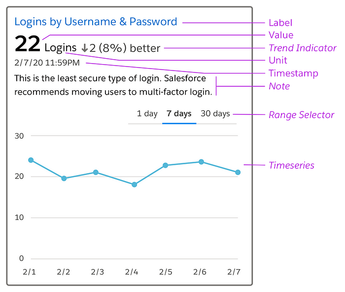
Label
The metric label must be an end user recognizable version of the metric name. Metrics tend to be stored in back end systems with cryptic names that need to be converted to a form that is meaningful to an end user before appearing in the metric tile. The label text should also function as the link to the detail view for the metric, discussed later under Interactions.
Value
The value is a number representing the most recent reading for the metric available. It is critical that the value is displayed immediately adjacent to the label, following a natural reading order, and without any elements other than white space separating them.
Unit
The unit is a name defined by standards, regulatory agencies, or common sense that identifies the kind of the thing the metric is measuring. The unit must be displayed because knowing the unit is critically important to assessing the meaning of the metric. For example, a hot tub water temperature reading of 100 has entirely different implications if the unit is Fahrenheit or Celsius! For common quantities with well known units, it is fine to use an abbreviation.
Timestamp
The timestamp establishes the recency and relevance of the value. It should report the time when the metric was actually measured, not when the metric was received by the application displaying the metric.
Trend Indicator (optional)
The trend indicator uses text and a directional symbol to communicate which way the metric is trending. The amount of change can be given as an absolute value, a percentage, or both. The directional convention is up or positive when the metric increases in value, down or negative when it decreases, and pointed right for no change.
The trend indicator has two tricky bits:
- Compared to What? To report a trend you need to compare a current value against a previous value. For example, stock trend indicators compare the current value against the value at yesterday’s market close. Unfortunately, most metrics don’t have a well understood previous value so you will need to choose a reasonable option such as 1 day ago or 1 week ago, or immediately previous, and accept that your viewer may need to consult documentation to know which you’ve chosen.
- Which Direction is Better? A second complexity arises if you want the trend indicator to communicate whether the change is good or bad. In this case your application will need to know, for each metric being displayed, whether to consider an increase good or a decrease good.

If your tile includes a time series (discussed below) the trend indicator becomes somewhat redundant and so — given the complexities and clutter it creates — may be best removed from your display.
Note (optional)
The note is a text string that provides additional context for understanding what the metric means, why it is important or anything else about it that a user might find helpful. Including a note is useful if your end-user views the metric display infrequently. If your target persona is an expert then suppress the note and save screen real estate.
Time Series (optional)
The time series is a line chart showing the behavior of the metric over time. The value of the most recent data point displayed in the time series should match the latest value reported in the region above.
A time series is extremely useful because it conveys the metric’s range, rate of change, and cyclical patterns all at once, intuitively in the same display. Unfortunately, a lack of the back end services required to store the historical data and render it to the screen may make it impossible to include a time series chart in your application.
Range Selector (optional)
The range selector allows the user to set the time period displayed along the x-axis of the time series. For performance reasons, allow only specific time ranges for which the data can be cached. Obviously, if a time series is not being included in the display, a range selector would not be included either.
Tile Variations
The optional and required features of the metric display may be combined in a variety of sensible ways depending upon use case and technical constraints as shown in these examples.

Branding
In general, avoid decorating the metric tile with marketing pixels. However, in cases where product requirements insist on branding, limit it to the label region where it will not interfere or distract from the data visualization.

Overlays
Overlays are great for visualizing comparison and correlation.
There are two kinds of overlays.
Metric on Metric
The metric on metric overlay can be best understood by imagining 2 or more transparent tiles are sitting on top of each other, aligned on the time axis of the trend line display.

A metric on metric overlay tile includes:
- a title that is explains the grouping or purpose of the overlay
- a legend that enables differentiation of the lines in the trend display.
The scale for the y-axis can be tricky with this kind of overlay. If the values of the metrics being overlaid share the same order of magnitude the scale range can represent the range of the actual values. However if the value range of the metrics differ by 1 or more orders of magnitude the scales must be normalized. Do not be seduced by the idea of using multiple y-axes except possibly if your user is a scientist.
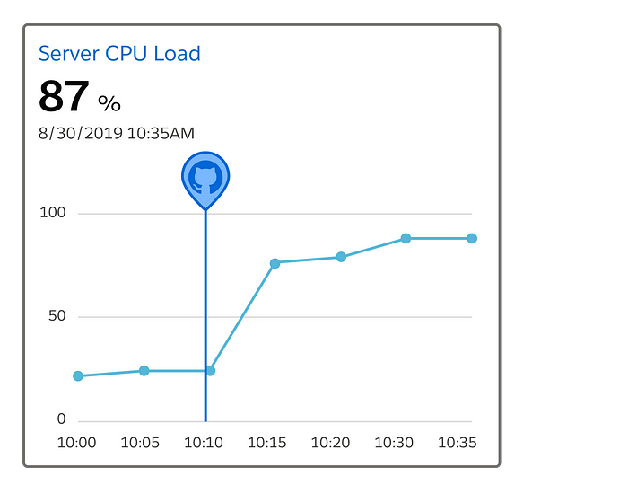
Event on Metric
The Event on Metric overlay displays markers for events on the same timeline as the metric. Events are things that happened that have a timestamp, but no scale. This kind of overlay is a powerful way to demonstrate or explore whether there is a temporal correlation between the event and the behavior of the metric.
For example, the overlay below shows a code check-in event overlaid on a time series of CPU Load, a common hardware performance metric. In this made up example, it looks like perhaps the check-in introduced a bug that is causing CPU load to rise.
Usage
Now that we’ve fully described the metric tile let’s discuss the most common ways that this basic unit is used in interfaces.
Dashboard
A metric dashboard contains an overall title and, within a clear visual boundary, a tabular display of tiles with uniformly sized rows and columns.

A dashboard presentation works well for two different use cases:
- To display an index of all available metrics which the user can search, browse, and filter to select metrics of interest.
- To display a predefined set of critical metrics that a group of users have agreed to use to manage a specific business process.
Each of the tiles in the dashboard must be synchronized by time and share the same background variables. Background variables define context; quantities that are not displayed in the tiles themselves, but influence the reported values. As a somewhat silly example, if you had a dashboard that displayed metrics to do with e-commerce, the viewer will assume — and you should ensure — that all tiles display values coming from the back end of the same e-commerce website!
The dashboard layout should be responsive. Use max-width & min-width rules on the tile to drive the number of columns displayed at each break point:

KPI Banner
A KPI (Key Performance Indicator) Banner is a special case of the dashboard that appears as a single row (or column) of tiles displaying only latest value information, no time series.
The common use case for the KPI Banner is to display, compactly, the latest value for a set of metrics critical to evaluating success or failure of some business process.

Popover
The popover usage offers opt-in access to metrics from a more general display.

Inline
Inline provides an extremely compact metric presentation directly in the context of free text or lists. The inline case will either display a simplified version of the current value region of the metric tile, or a simplified version of the time series region (commonly called a sparkline) but not both at the same time.

Interactivity
Users needing to respond to the change they see in your metric display will very much appreciate being able to do so quickly and intuitively directly from the display itself.
Messaging
Perhaps the most basic action a person takes in response to noticing an unexpected metric value is to share the discovery with someone else to get confirmation that there is a problem, or to ask them to fix the problem.

Drill Down
Regularly checking a metric you care about gives you an intuitive sense of what normal and anomalous behavior patterns look like and what you can do to influence them. However, before responding to a change, it is nice to be able to review the underlying details to be certain what is going on. Users expect to be able to navigate from the metric to a separate detail display.

Triggers
Metrics are signals communicating the state of a system or business process. When a metric is understood well enough to be partitioned into ranges of “good” values versus “bad” values, then it can be used to create triggers that initiate automation — including alerts — whenever a metric rises above or falls below a threshold value.
The most intuitive interactive model will enable the trigger to be set directly on the display.

If technical or accessibility considerations conflict with a direct interaction model, providing the interaction in an adjacent zone in the interface can also produce an excellent experience.

Alerts
Simple, clear, standardized metric displays are powerful tools for building consensus among collaborators, understanding cyclical patterns and initiating actions when something isn’t right. However, despite their utility, almost no one wants her monitoring experience to start with a metric display!
Instead, people want their monitoring entry point to be real-time alerts coming on high visibility channels like text or chat that grab their attention. People want these alerts to be important. And finally, if the alert requires a response, people want to able to jump directly from the alert to the kind of richer display we have been discussing here.
As a designer you want to think of alerts and metrics as two sides of the same coin: when your product requirements include the display of metrics your UX strategy must also include a plan for alerting.
Thanks to Chris Simmons and Alan Weibel for editorial help. Thanks to Tracy Potter for helping me get this metric standard project going.

