7 UI patterns from designing a habit-tracking app — a case study

Micro Habits is a habit tracker app (iOS) inspired by a book called “Tiny Habits” — BJ Fogg. It helps users to develop any new habits by starting them at a very tiny level and gradually increasing them. The key is in attaching the new habit to an existing habit. I led the user interface design and the illustration side of this project.
Below are the few UI patterns I’d like to show you based on usability testing and my learnings.
The tab icons
Navigation UI patterns are a shortcut for good usability. Tab icons should be easy to scan. Users should be able to understand what exactly happens when they tap on an element. Text labels are used to provide short and meaningfully definitions of navigation icons. Below are the three options we tried and tested for tab icons. Option A was chosen over option B and C because
- Less cluttered, not heavy on eyes.
- Easily distinguishable between an active and inactive state.
- Solid icons are easy to recognize than outlined one.

Habit cards
While choosing the colors for the habit cards, we tried three 3 options to see what works best based on the given context and target audience. Option B was chosen over option A & C because of
- The color of the cards is subtle, functional, and playful.
- It passes the WCAG color contrast ratio.
- Text is legible and covers the major target audience
- Users can also categorize habits based on colors.

Reward messages
“You are doing great!” — Don’t you just love to hear a compliment like this? We’re all human, and this is the way we are wired. We thrive on accomplishment. This kind of message on completing the task can greatly improve the user experience and encourage users to complete more tasks.
Idea is to display these messages right after the user completes the task. Below are a few options we tried. We chose to go with the first option as it was minimal, simple yet rewarding.

Text boxes
Using solid text fields is good, but they’re still not the best practice. The solid gray fill makes text fields look like they’re in a disabled or inactive state. This confusion takes more cognitive effort and slows down their form completion time.
On top of that, solid text fields make input and placeholder text harder to read. When you have gray text on a gray background, the color contrast isn’t strong. Many low vision users will have a tough time reading the text and could exit from the app. If the form had a mix of active and in-active fields, low vision users will have difficulty noticing the difference.
In the below options, I’d recommend going with option B which clearly indicates an active text box.

Add / edit habits
Below are a couple of more screens where the user will be creating or updating a habit. Users can also select predefined habits from the given suggestions.
The CTA button is initially disabled unless the user fills in all the details to avoid all kinds of unnecessary errors and messages thrown at the user. They also convey useful visual information to users that the form is not yet completed or the option is not yet available.

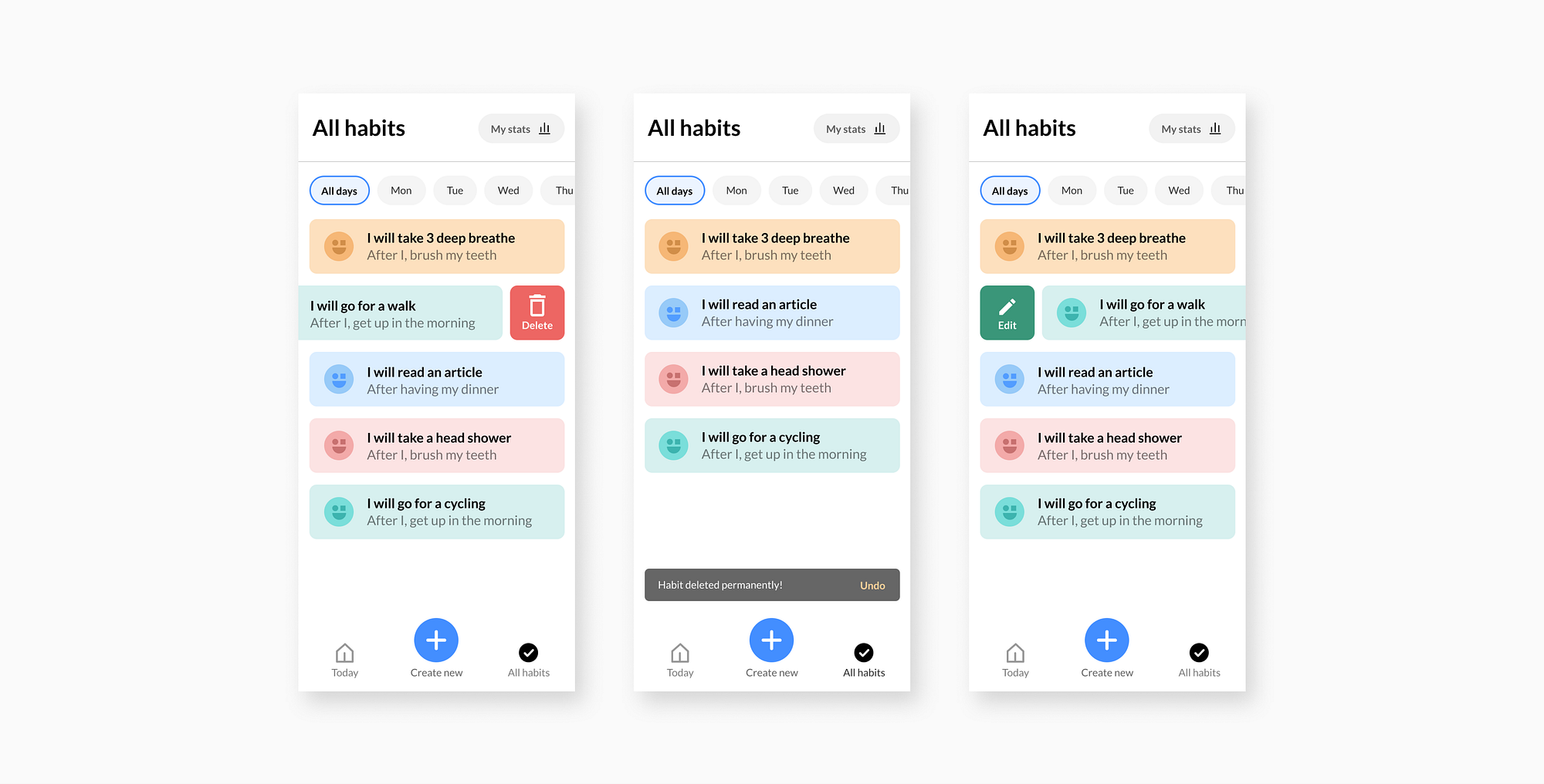
All habits
In the below-shown screen, users can quickly delete or edit the habits by swiping right or left. Alternatively, they can also directly click on the habit cards to delete or update the content.
On deleting the habit, a toast message will be displayed at the bottom of the screen for a couple of seconds, so users can undo the task if they have clicked accidentally results in the best usability practice.
Empty state screen
Empty states are moments in a user’s experience with a product where there is nothing to display. The below screen occurs with a new product or service when there is still nothing to show. They can help drive product engagement, delight users, and reduce churn.
I was trying to find the mid balance between illustration and content. From the below screen, options A & B is better because illustrations are minimal and simple yet delightful. Users can primarily focus on the content and take action.

I hope you find this article helpful. Below is the quick look of all screens for the micro habit app.

I’m Karthik, currently a Visual Designer at ThoughtWorks with 4+ years of experience. I enjoy solving problems and passionate about designing clean, attractive and functional design solutions for the user. You can find me on Dribbble, Twitter & LinkedIn
Check out additional links for articles & references below.


