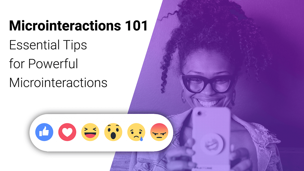
Microinteractions 101: essential tips for powerful interactions
In front of you lays a collection of important tips or best practices I gathered, analyzed and refined to help you focus on what matters when designing, implementing or considering the addition of microinteractions into the interfaces and products you work on.
I really wanted to print and hand out these practical tips to the audiences in my lectures but as a past student of the Environmental High school in Sde Boker and a sustainability supporter I decided to write this short introductory instead!
Simply Put, A Microinteraction is —
A single use, subtle visual cue that draws your attention to a change in status.
The Ten Microinteraction Commandments

The following tips or best practices for designing and implemting microinteractions we’re deeply insipired by Dan Saffer’s talk , Nick Babich’s wonderful article, and Pablo Stanley’s amazing piece — all about Microinteractions, thank you for these master pieces!
So, here are 10 tips, which I think will help web developers and designers make better Microinteractions:
- Make Functional Microinteractions
- Less is More
- Keep Longevity in Mind
- Create Visual Harmony with other UI elements and their Environment
- Bring the Data Forward
- Always Start with What you Know
- Use the Overlooked
- Speak Human
- Look Where a Microinteraction could Benefit your Product and Users
- Experiment
#1 Make Functional Microinteractions
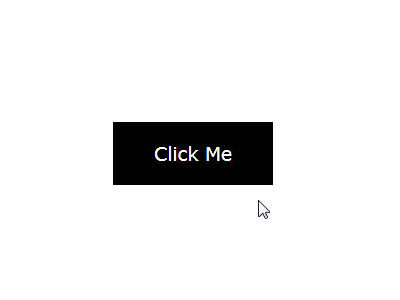
Make sure the animations fit a functional purpose and do not feel awkward or annoying. They most convey an action has took place by means of visual or other system/interface originated feedback to the user.
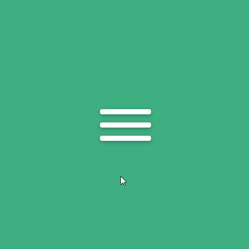
#2 Less is More

Termed by the US Navy in 1960 the kiss principle(keep it simple, stupid) is an ever lasting design principle stating stating that over-designing a microinteraction can be lethal and actually damage the user experience, rendering a frustrating and “painful” experience to the user. Imagine a pulse effect appearing from every click of a button wherever in your app. While at first it seems cool or interactive it could quickly become irritating and distracting. Thus, encumbering the user with more cognitive load — to put things simply, less is more when it comes to microinteractions.
#3 Keep Longevity in Mind
Microinteractions must survive long-term use and should be consistently enjoyable. Would yours stand the test of times? Or in simpler terms, would the user find the microinteraction in hand helpful and alluring even in the 5th, 8th or Nth time they interact with it? Having intuitive and to-the-point purposeful transitions along with simple and flat icons is the way to achieve this goal.
#4 Create Visual Harmony with other UI elements and their Environment
Microinteractions should match the general style of the application, supporting a harmonious perception of the product.
Utilizing the environment is crucial and conveys a more holistic approach that contributes to a smooth and seamless user experience. Taking it into consideration would mean aspiring to initiate and introduce microinteractions from within the area that the user had triggered an event from when possible. Growing from the that intearaction originating source onwards.
#5 Bring the Data Forward

Indications to internal product events that are “lifted” to the utmost access point of the app. For Example bubble icons positioned on top of an app icon in the operating system taskbar. Simply put, we make important and actual data in a user session more accessible and visible to the user, notifications for instance.
#6 Always Start with What you Know

Instead of starting from scratch begin with the known criteria. Who’s the user? What platform do they use? In which environment? Such behavioral data that you know about what’s going on in the product and about your users, could help guide you through the design and implementation processes and serve as your ux and product compass.
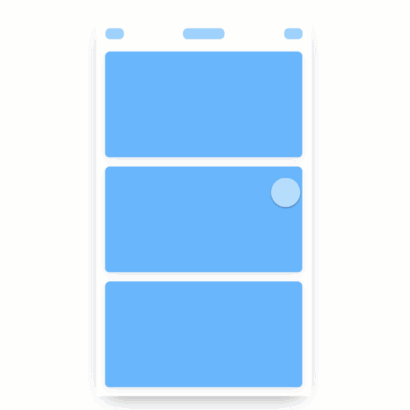
#7 Use the Overlooked
The parts of your app that already exist yeah exactly those! try to think how you can utilize them, or design and plan various states of their existence in the interface to introduce your desired Microinteraction.
A classic example as seen above is transitioning the clicked button from the state of a flat static button → to a progress bar that when accomplishing its purpose and reaching 100% → expands vertically and transitions in color(while changing the text) to indicate the initial action succeeded.
#8 Speak Human

From the more conventional and basic aspects of language and communication such as face expressions.
And on to more, audience or task specific conventions that fit your product’s specific type of end users or task in hand — like a login moment.
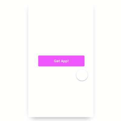
#9 Find where a Microinteraction could Benefit your Product and Users
Have a healthy level of doubt and raise questions about the existing product UX flows and patterns. Plan ahead when laying the foundations for future UX flows and consider whether any point of a certain flow could use a microintearction to provide an enjoyful moment, reduce user tension or anxiety in frustrating moments.
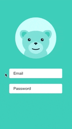
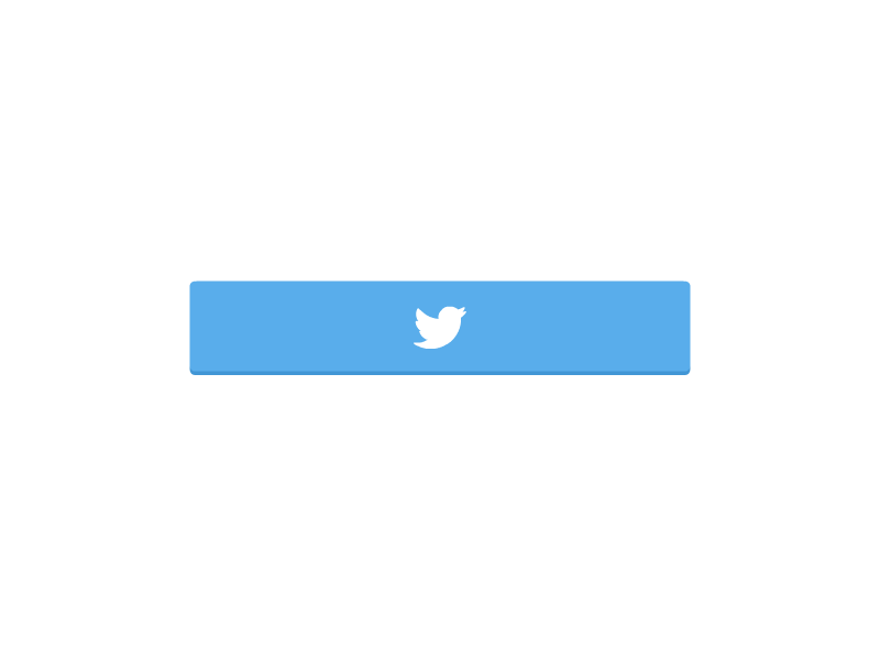
Some examples would be the loginCritter above turning the login experience to a more enjoyable experience, or this twitter share button below that surprises the user with a visual reward of releasing a pack of blue twitter birds to the air(that of course symbolizes peace, tranquility and positivity) — thus, encouraging users to do a non-trivial task such as share something to their twitter profile.
Or with some luck and planning, you could manage to stamp your brand’s signature by molding in the uniqueness of your company or company’s DNA via a powerful microinteraction that could potentially be elevated to become a signature moment.

#10 Experiment
Experimenting different Microinteractions in your app and collecting user feedback could improve your product UX and user satisfaction significantly, so start now.
Conclusion
“The details are not the details. They make the design.”
— Charles Eames
I hope the following tips would help guide you through introducing exciting and enjoyful Microinteractions to your users. And may we always have in mind that we have one very strong common ground with our users and it’s that we both are human.
Let’s create wonderful, alluring and memorable experiences for our users, have fun doing it and be successful in casting that fun into our delightful Microinteractions!
Video Lecture
I gave a full talk at Code Talks 2019 Hamburg, “Microinteractions: Little Things That Matter” — the talk’s goal was to empower web developers to take more initiative by stepping up and utilizing Microineractions to improve user experience in the products they build. To fill, what I call the “UX Void” and become better developers while doing so.
Now What?
More posts by me about Product Design, UX & Frontend:
How I recreated Facebook’s microinteraction for feature discovery
Medium Clap Recreated in Vanilla JS
Star Rating — Make SVG Great Again
Art of Code — Why You Should Write more Pseudo Code
Who am I?
I am Yonatan Doron, a Web Developer with great passion for user centric Frontend, and modular client architecture.
You are welcome to follow, tweet or message me freely with any questions, feedback or suggestions! — Twitter
Special Thanks
Big thank you to Dima Vishnevetsky and Ofir Ovadia for helping review this piece and for providing invaluable feedback, you rock! And thanks for Gal Maimon for the wonderful article cover, your aesthetics are spot on!