Mini tutorials: working with Figma button components

In Figma, UI elements are called Components. Built properly, they’re incredibly versatile and easy to update, but what are components capable of, and how do they operate? We’ll demonstrate their power by working with one of the most common UI elements of all—the button.
Why buttons?
Buttons are brimming with variables like height, width, label length, internal padding, state, and theme. By building a basic button system, we’ll learn the immense value of using Figma with a component-based mindset.
*Editor’s Note: This written tutorial was derived from a video tutorial created by David Luhr of Build UX.
Task 1: Build a Basic Figma Button Component
1) We’ll start by creating a new frame and renaming it Buttons in the layers panel.
2) Type your button label text. We’ll be using “Sign Up” for this tutorial.
3) Our typeface is:
- Roboto Medium
- Font Size 18
- Line Height 24
- Text Align Center
- Align Middle
- Resizing = Fixed Size
4) Once you’ve written your button label, double-click on the lower right corner of the text box so that it will automatically size to the smallest constraints of the text.
5) Rename the text layer Button Label.

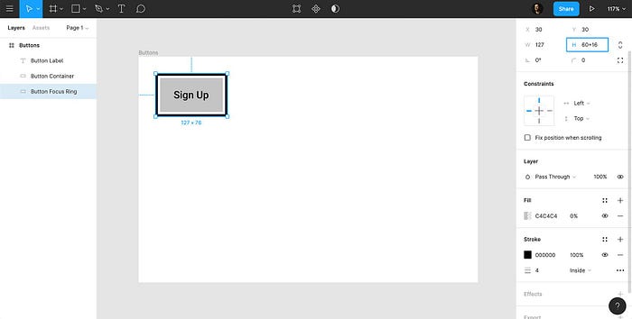
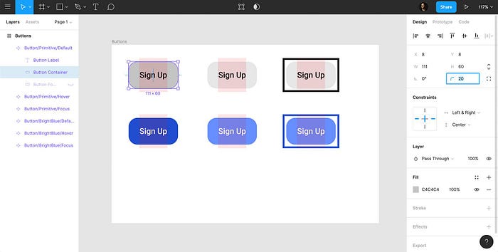
6) Make a rectangle, place it below Button Label in the layers panel, and rename it Button Container. Allow the color of the button container to remain the default gray.
7) Establish a fixed height for the button container. We’ll use 60 pixels.
8) Now, we’ll add internal padding to the button container.
- The width of the button label is 63 pixels.
- We need 24 pixels right and left padding. Combined, this equals 48 pixels.
- So, we’ll enter the width of the label (63 pixels) + total padding (48 pixels).
9) Select both the label and the container and center them with the alignment tools.

We have designed a rudimentary button. However, the internal padding of our button is not yet able to accommodate changing label lengths. In a later step, we’ll address the internal layout, which will allow our button container width to be flexible in relation to label length.
Task 2: Make the Button Interactive
To make the button interactive, we’ll add a focus ring.
1) Duplicate Button Container and rename it Button Focus Ring.
2) Make sure that the focus ring is beneath the button container in the layers panel.
3) Remove the fill of the focus ring, and add a black, inside stroke with 4-pixel thickness.
4) We also want a 4-pixel gap between the button container and the focus ring on all four sides, so we’ll add +16 to both its width and height.
5) Select and center align the label, button container, and focus ring. This is how our button, in its most simple form, will look in a focused state.
6) Select all three elements (label, button container, focus ring), right-click, and choose “Create Component.”
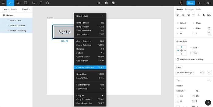
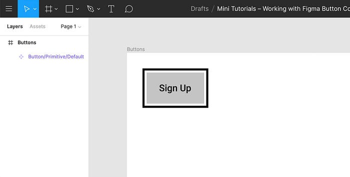
7) Rename the component Button/Primitive/Default.
- Button = Component Type
- Primitive = Variation
- Default = State
This is our primitive button. It won’t appear in our final design, but it will act as a foundation that all of our button variations will build upon. The advantage? If we need to redesign our buttons in the future, we only have to edit in one place.
Task 3: Establish a Button Layout Grid
1) Select Button/Primitive/Default, go to the design panel, and click the “+” icon next to “Layout Grid.”
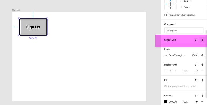
2) Then, click on the grid icon, select “Columns,” and enter the following values:
- Column Count = 1
- Width = Auto
- Gutter = 0
- Type = Stretch
3) “Margin” provides the padding inside the button container.
- Remember, we need 24 pixels left and right padding.
- We also need to consider the 4-pixel thick border and 4-pixel gap of our focus ring.
- This means that we’ll need a margin of 32 pixels.
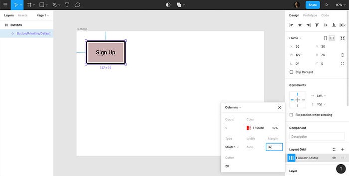
4) With the margin added, you’ll notice a red indicator area that shows the interior padding of the button container and fits the label width exactly.
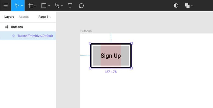
5) Now we must add layout constraints to each element of our button. Select all three layers within the component, go to “Constraints,” and pin them to “Left & Right” and “Center.”
6) At this point, you may select the component and drag it to any width you’d like. You’ll see that the layout works exactly as it was designed to.
7) If you make the button width shorter than the label, you’ll notice that the label breaks to another line.
Task 4: Adjust Button Width for Text Length
Let’s see how our button works with a longer button label.
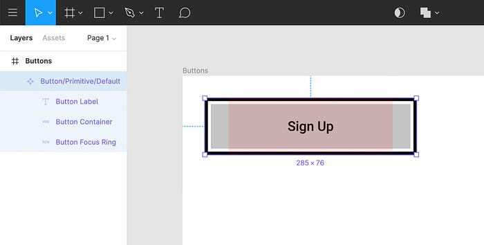
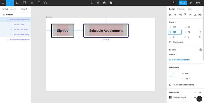
1) Go to the assets panel, drag in a new instance of the button, and type “Schedule Appointment” or something longer. What happens? The label overflows onto the next line—not exactly what we want.
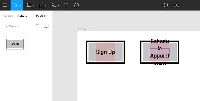
2) Go back to your layers panel, select the new component you just dragged in, and use the arrow keys to adjust the width to the precise dimension that fits the label.
3) When you do this, you’ll see that all the layout variables remain as intended—interior padding, label placement, 4-pixel stroke and 4-pixel gap of the focus ring. (Delete this duplicate button before moving to Task 5.)
By using a layout grid, you can create one button that can be used throughout all of your designs, and all you have to do is adjust the width for whatever length of label you need.
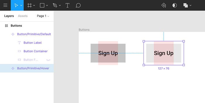
Task 5: Create Hover and Focus States
With our button default in place, let’s create primitives of our hover and focus states.
1) Toggle off the focus ring in your button default.
2) Hold the Alt key and drag out a new instance of the button default.
3) Make the button container a lighter gray color (#E7E7E7).
4) Right click, “Create Component,” and rename Button/Primitive/Hover.
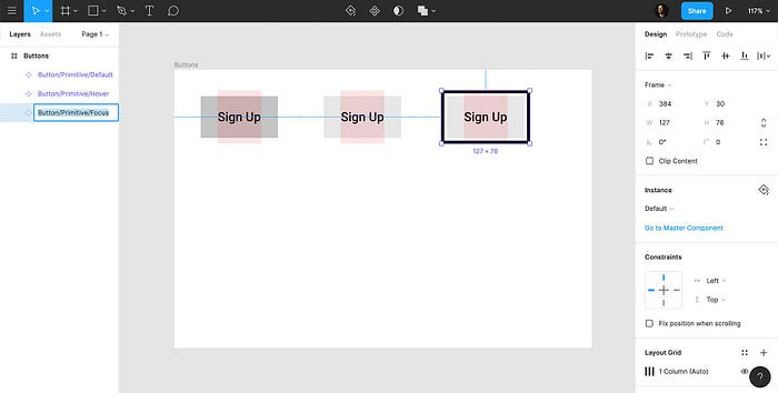
5) Drag out another instance of the default state, turn the focus ring on, and match the color of the button container to the color of the hover state container (#E7E7E7).
6) Right click, “Create Component,” and rename Button/Primitive/Focus.
We now have a handle on the button’s layout and how it functions in different states. From here, we can begin to add specific themes or styles depending on what we need.
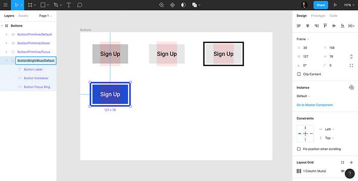
Task 6: Implement Button Themes
Now, we’ll create stylistic variations.
1) Hold the Alt key and drag in another instance of Button/Primitive/Default.
2) Change the color of the container to match the desired theme color (#204ECF).
3) Make the button label white (#FFFFFF), toggle on the focus ring, change the stroke to the desired theme color (#204ECF), and toggle off.
4) Right click, “Create Component,” and rename Button/BrightBlue/Default.
5) Drag out two instances of this new default button: One for hover state and one for focus state.
6) Change the color of the button container to match the desired theme color (#678FFF), right click, “Create Component,” and rename Button/BrightBlue/Hover.
7) Apply the same color to the focus button container, toggle on the focus ring, right-click, “Create Component,” and rename Button/BrightBlue/Focus.
You can use this same process for any number of themes that you need in your design.

Task 7: Behold the Beauty of Figma Components
Once you’ve made all of your themes, take a second to observe just how powerful working with components can be.
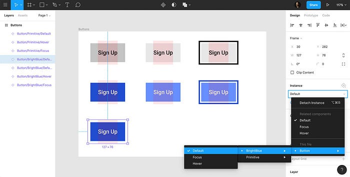
1) Select your Button/Primitive/Default, add a corner radius, and you’ll see that all instances of your button are updated automatically.
2) Then, go to your component panel. All instances of your button are available to be dragged into any part of your design.
3) Also, because we’ve used this naming convention, we can now swap out any button for an alternative instance/theme. To see this in action, drag in one instance of the button, then go to “Instance” in the design panel, select any instance you need, and it changes immediately.
Working within the framework of components allows us to quickly and efficiently manage our buttons across all areas of our design. Best of all, it doesn’t just work with buttons, it works with UI components of all types.
Originally published at https://www.toptal.com.

