Mobile UIs are Turning Upside Down
There is an emerging trend in mobile UI design: important interface elements move to the bottom of the screen.
It is very obvious when you look at how Apple Maps changed in iOS 10:

There’s a simple explanation for this: our phones are getting bigger, but our hands don’t.
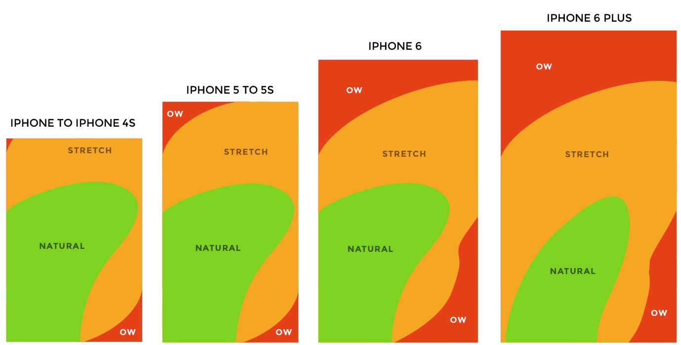
On the first iPhone you could somehow reach the back button in top left corner of your screen with your thumb, but on the plus size iPhones it’s virtually impossible.
There have been some intermediate hotfixes to this problem, like an edge swipe instead of back button and reachability feature in iOS. The problem with those is that they are not very easily discoverable and are suitable for more tech-savvy users.

Finally, more and more designers are adopting this trend and making UIs more “thumb-friendly”.
Address bar on Windows Phone Internet Explorer is at the bottom.

New beta of Chrome for Android allows to move address bar to the bottom.

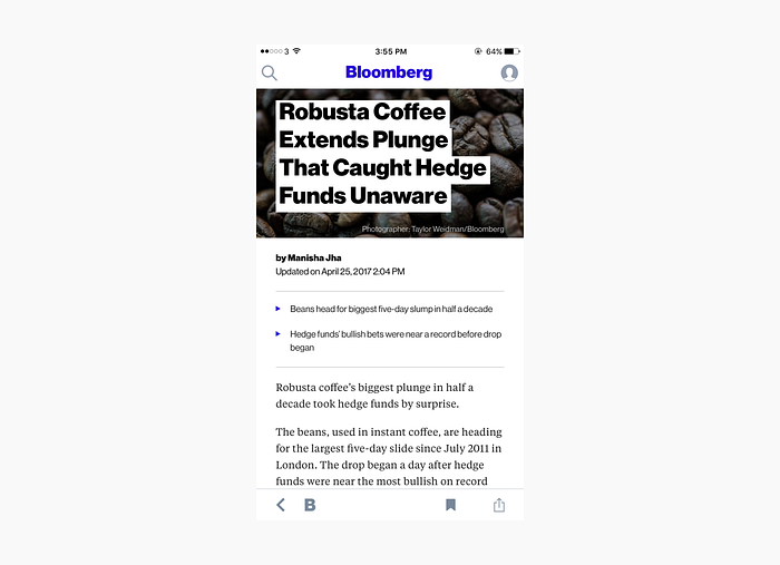
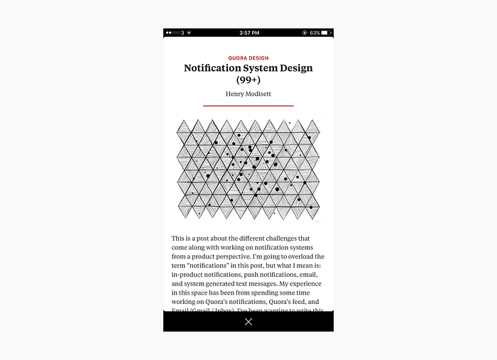
Bloomberg Business and Quora apps also have back button at the bottom.
Can you think of any other apps that are following this paradigm? Feel free to let me know in the comments or on Twitter.
This blogpost has been inspired by a few tweets on this topic I’ve seen recently.