Money Lover app — design challenge for a UX interview

“Thanks for sharing your experience with us, before we end this interview, there is something we would like you to do. It’s really just something we get potential candidates to do. It’s a short design challenge.”
Does this sound familiar to you? Has it ever happened to you?
Ever since I begun my search for a UX or Product design job, I have been to several companies, and a good number of them have issued me their design challenges. Now, if you have experienced one yourself, you would know it can be really dreadful or extremely exciting. I choose to look at it objectively as the company assessing whether I’m a good fit for them. So, a hirer called me and she did a phone interview with me. Before we ended the call, I was given a design challenge to work on for the next 3 days. Included in the email was her brief to me. Here is the brief,
Pick one of the 4 listed mobile apps below, and complete the items listed under deliverables.
Mobile App Choices:
- Seedly
- Grab
- Google Maps
- Moneylover
or your own choice. Please provide a rationale as to why you picked this app.
Deliverables:
1 x problem statement — business owner
1 x user persona/user story
1 x user journey
1 x screen flow
1 x wireframe (low fidelity)
1 x user testing structure (questions plus conduct of the test, don’t have to run the actual test)
Additional Notes:
You can deliver more if you wish. You need to make assumptions since you are the only person involved. State your assumptions clearly.

The description of the MoneyLover app:
“Money Lover app is basically a finances and expenses manager for individuals. It allows you to track your expenses over time and manage your monthly or annual budget. So throughout the day, you could pull out Money Lover after making a purchase and log it into the app.”
Here is my rationale for going with the MoneyLover app.

There were two distinct factors why Money Lover app was very attractive to me. I always have a strong passion for data-driven products. What makes it more compelling was the fact that I have always included Fintech as one of the fields I like to go into. So the decision came quite naturally.
The keyword here is assumptions. As a UX designer, we make assumptions and we validate them. But there are times where in this case, in a design challenge, the objective for the exercise is for the interviewer to see your thought process. They want to know how you would approach the challenge, why you choose it and what are you planning to change.
Step by step analysis
Here are some of the steps I took when I begin the design challenge:
- Download the app
- Do my own heuristics evaluation
- Check out the app reviews and did research on what others are saying about the app
- Who are the people that will be using the app
- What the app is trying to achieve for these people
- What are the experience pain points?
- How can we improve it?
So, I started my Evernote app (browser version) and I begin to document down all my thoughts. This gave me a structure and process to run through. I know it is a design challenge and I wanted the interviewer to be able to see that I can justify my decisions and how I derived my solutions for the problems.
My process

This is the double diamond process with an additional step where I added in ‘measure’ after ‘deliver’. I wanted to make sure there will be a step in place to validate the success of the feature change before shipping it.

In the fine print, I included this below this slide:
This scope is assumed to be part of the product milestone after MVP — to improve existing problems, bugs, and usability issues. It does not take into direct consideration of the strategic goals of the company due to the lack of information and resources in the context of this exercise.
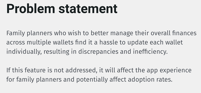
User problems
I went through the app and did my own analysis of some of the use cases for the app. I came out with one example of a potential problem. That led me to form several assumptions and what I could do to improve on it.

MoneyLover app allows users to create ‘wallets’ as accounts to log down their financial commitments, savings or plans. However, one key aspect that is missing here is the need for people who wish to use the app to manage several different wallets. This is very important for users who manage the family’s finances as a whole.
User Persona
With the problem statement, I came out with the user persona for the MoneyLover app.

User Flow
By taking one of the features to work on, I created the user flow for James to accomplish the task of adding a new transaction or editing an existing transaction.

User journey
I then map out the user journey for this existing flow and was able to log down the pain points where there is opportunity to improve the user experience for James.

The solution
In order to resolve these issues, one of the keys possible feature to implement at this time would be a master wallet. There are several factors for proposing this solution.

Visualizing the digital eco-system
I knew coming out with the solution alone wasn’t good enough. I wanted to document an abstract overview of the new eco-system. The new system will give power to the master wallet to have two types of control. On a global level, the mater wallet has control over matters that affect everyone but at the same time, this new system allows local control on an individual level. Therefore, users can actually control their finances individually and this means the app could be used by either one person who is in charge of all the finances or to have several users using the app concurrently.
Now, with more versatility, the app can appeal to more users. From a business perspective, it makes sense to have more users and at the same time while allowing users to have local control over their own finances.

New user flow
Now that we have the master wallet feature, what will be the new user flow for James?

The new user flow allows the user to update multiple wallets at the same time. The user is now given a choice to update the wallet he wants. This allows more versatility and also stops repetitive actions.
Screen flows
I created the wireframes and did a fast prototype of the design on Sketch and got the screen flows documented to help me explain my design.


Improvements made
Here are some of the key improvements made to the screens for this task flow.
- A new nested wallet dropdown menu to allow users to see which are the wallets nested within the master wallet
- Improved master wallet home screen that shows data visualizations of the total budget and how each individual wallet is performing on a month by month basis. This gives the user data to make informed decisions.
- Improved editing and adding transaction screens by having radio button menu to allow the user to choose which wallet to update
- Included modules that would show after completing the task so they know which wallet is being updated. The existing design doesn’t display this, so the user might not know or get an affirmation that a change or addition is made correctly.
You can check out the new MoneyLover prototype below:
User testing
Now that I have designed the new feature and the prototype, the next step is to proceed with the testing of this feature. Again, this is a design challenge, so the main objective here is to show that we can design and picture the dynamics of a testing environment. I designed the testing into two parts: moderated and unmoderated.


My learning
I think there were a few important things that I truly learned from this experience. Accepting the challenge and working on it can be scary at first, but with practice and experience, it can be a good test of your own capability. I had several reservations during the interview with the questions I asked of them and I wasn’t exactly comfortable with the overall UX maturity of the company. So, it wasn’t exactly a bad thing that I didn’t get the role. Here are some thoughts after the entire experience:
- Before accepting the challenge, make sure you can commit the time to do it
- During an interview, always make sure to ask questions back to the interviewer to find out more
- Always access the UX maturity of the company. Make sure you are comfortable before going ahead
- Keep an open mind and accept opinions and take it as a learning to improve your skills as a UX designer
- Most importantly, listen to your gut! If you don’t think the place is right for you, chances are, you will be miserable if you accept it!
I hope you like what you read. Some claps would be nice too :)
Thank you!