Must-have animations for Chatbots

A story of failing to get animations into the product
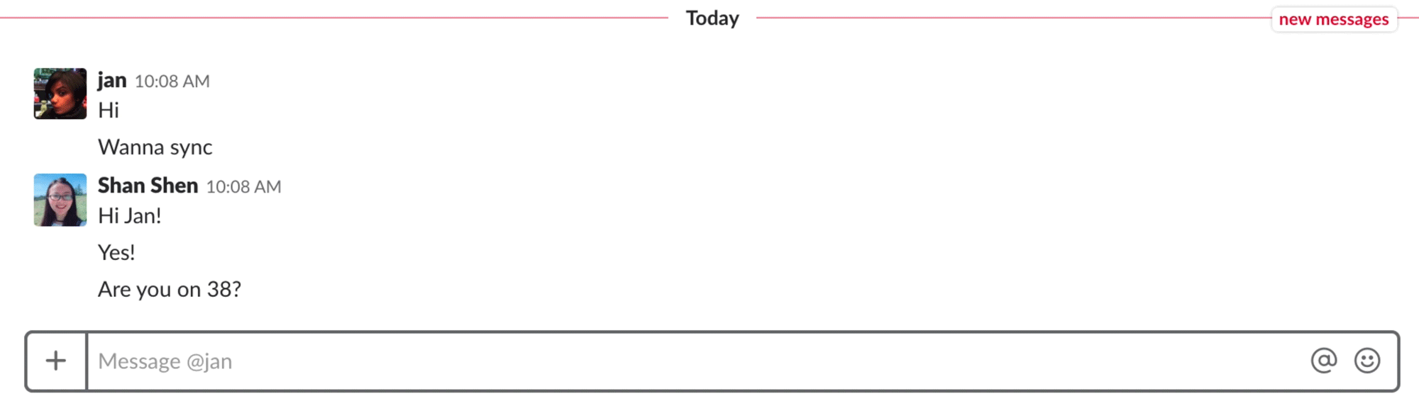
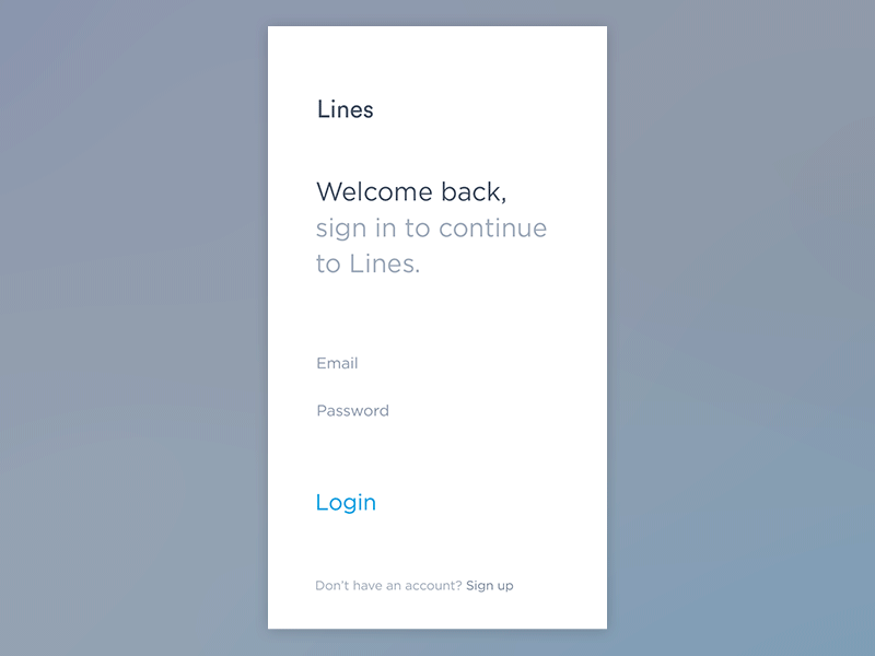
A few months ago, when I was designing the chat panel for a video conferencing desktop app, I included a “typing…” UI in the design mockup. During the design review, engineer colleagues told me that they couldn’t implement this animated UI.

I felt bummed about it.
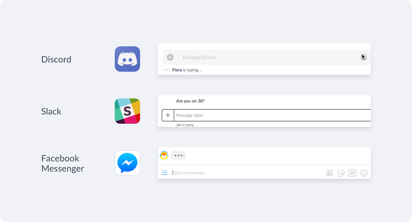
When I put this UI component in the design mockup, I didn’t think much about why we needed that UI. It’s such a typical UI indicator to imply when “someone is typing…”. Since most chat apps (Facebook Messenger, Slack, Discord) have it, then why don’t we?
I tried to push the idea to have this UI again with the engineers by stating that indicator creates an assuring feeling of receiving feedback. As a pending state, it alleviates the frustration, anxiety, and uncertainty on waiting for someone’s response. However, as many other product designers may also experience when working closely with engineers for implementing new features, I couldn’t get the design idea across and convince them how critical motion designs are as a part of the entire user experience. My colleagues pushed back and deprioritized the animation. In the end, the “typing…” UI didn’t get implemented in the product, and it resided in the design mockup forever.
What I learned
I learned that implementing motion designs and micro-animations takes extra engineering efforts. Animations are not a part of UX flows, which demonstrate critical functionalities of a product feature. Also, animations don’t generate specific metrics for product KPIs. It’s hard to measure and say an animated Gif or a splash screen contributed to a Net Promoter Score.

I also learned that I could improve communicating design ideas better in a more constructed way. I need to become an advocate and educator for my team to promote animations to my colleagues. I could include a section for motion designs in the design guidelines to introduce different types of animations, their use cases, and some examples of the Dos and Don’ts.
Animations have contributive values to the usability of a product. They connect screens and UI elements to create a fluid and coherent user experience. They provide graceful degradation when a product is not performing at its best, and they add playfulness and a sense of human touch to screen interactions.
Animations for chatbot designs 💬
Animations are a big part of the user experience for chatbot designs. Many software companies use chatbots to provide customer support and nourish the growth in the relationship with prospective and existing customers. When you visit a shopping website, if there’s a chat icon sits at the bottom right of the screen, it implies that there’s a chat service ready to bring you into a conversation.

Chatting with a user and getting the user to purchase something at the end, the design of a chat experience is thoughtfully fleshed out through creative copywriting, UIs and animations. Instead of having the user mess around with navigating, typing and searching to find what he/she needs, chatting is a more intuitive and personalized experience. So what kind of animation and motion effects are must-haves when designing a chatbot? What are the attributes of the animations that contextualize a fluid chat experience?
A list of must-have animations
1. A warm welcome to put a grin on user’s face
Having an animation or a graphic breaks the ice at the beginning of a conversation. When a chatbot characteristically introduces him/herself, it’s more powerful than just saying hi. It fills up the blank spot to help the user naturally familiarize its presence.
A “Do” example is Poncho — a chatbot that delivers weather forecasts. Poncho’s character is a cat, and it welcomes you by sending you gifs and illustrations, just a like a friend who shares emojis and funny gifts with you daily.

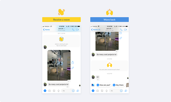
Oppositely, a “Don’t” example is the waving feature from Facebook Messenger, which is designed to represent the action of saying “hi” instead of saying “hi”. It receives critique as it’s a force interaction that requires a “wave back” response. It overuses animations to copy interactions that only make sense in face-to-face interactions.
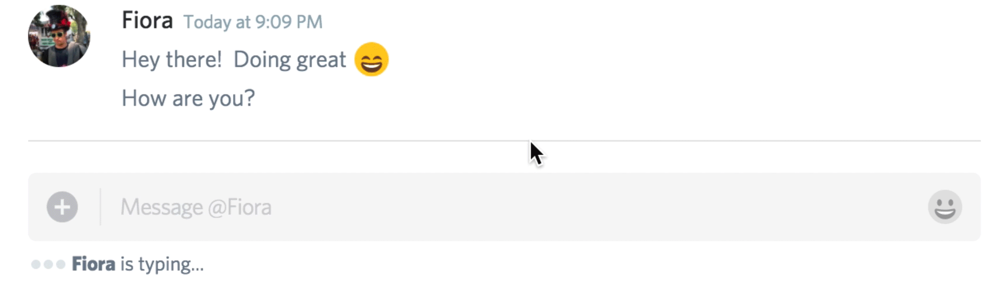
2. Indicator to reconcile frustration during pending
A good conversation flows. Different from in-person communications, it takes a few seconds for a message to be received and reviewed. These few seconds create blank spots with zero feedback to inform users what’s going on, and they block a conversation flowing from one end to the other. An animated typing indicator reconciles the curiosity and frustration when a user is in a passive pending state — waiting for a response.

To create the feeling of a constant presence for both ends is essential. The way we interact with a chatbot should be no different from chatting with our friends on messaging apps.
3. Cohesive transition in displaying content
When a user clicks on a card to view more detailed content, the transition from the main screen to the sub-screen helps users understand the in-depth correlation between screens. The transition for displaying content in a web browser to displaying content in a chat widget should be consistent.
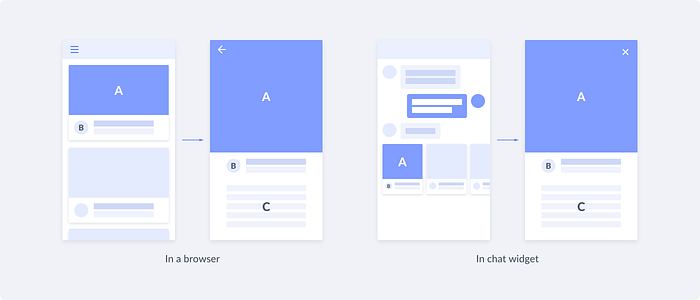
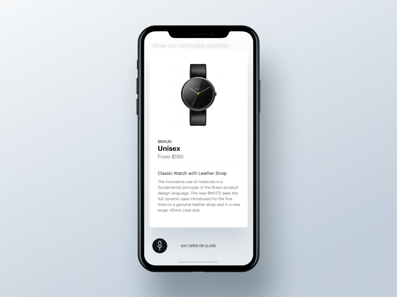
Here’s an example of applying this rule to a VUI interface. A beautiful transition makes it very enjoyable to receive content and feed from a chatbot.
4. Emphasize on users’ input
When a user is filling out a form, animations emphasize on the user’s input and provide instant feedback on the result of an action. This type of animations is an enhancement of user’s behaviors like swiping, tapping, and typing. They indicate a point of action and confirm that the action was received. Material Design has also specified this type of motion effects, and they call it creating choreography in motion.
5. Creation for displaying options
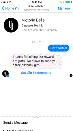
Most chatbots are designed to assist users to accomplish tasks. In the context of a chat, a chatbot will use UI widgets to enable in-depth interactions like selecting, editing and purchasing. For example, Facebook Messenger bots support chat extensions that appear like a web-view interface in a chat thread.
Chat extensions can display a list of options, allow single select or multi-select from an options menu, and provide a personalized message in response to the user’s input. Here’s an example of how the beauty chatbot Victoria Belle navigates the user to choose a free birthday gift based on a user’s information on gift and skin type.
The use of animations here subscribes to the same interaction model when we browse and interact with a web page. We scroll down to view more content, tap on input fields to type in information, and tap on the back or close button to navigate between different screens.
Closing thoughts
Animations and motion effects are an essential subset of the static screen and flow designs. Sometimes the efforts on animation designs for the product development haven’t been recognized. Also, since the implementation of motion effects varies from one framework to another, the same animation that appears on the web could look differently on mobile.
I’ve heard many times since last year that chat will become the new web. It’s not to say that chatbot services will replace websites and web applications, but it’s an on-going momentum when we see emerging services like e-commerce, customer support, collaboration and productivity tools are all branching out to chatbots. I can see animations will play a big part in a well-designed chat experience.
Other great reads if you’re looking for references:
Apple Human Interface Guidelines — Animation
Google Material Design — Motion Design
Facebook Messenger Platform — Messenger Bots
If you enjoyed reading this post, please tap 👏 to like it! Also, if you have any thoughts, please share a comment with me!