Member-only story
My favorite monospaced fonts
Being obsessed with pure functionality and perfect readability.
If you’ve read a few of my other pieces, you already know that I’m kinda backwards. I enjoy old tech (where applicable) and the nostalgia and focus associated with using it. So, it comes of no surprise, that I have a thing for old typewriter and computer fonts.
As I am working as a graphics designer, I naturally work a lot with typography and I stumble across new and old fonts on a regular basis. This is the source of my habit collecting fontsets that I like. Especially monospaced fonts.
If you’re a font-afficionado as well, read on to get to know some of the most beautiful and practical monospaced fonts.
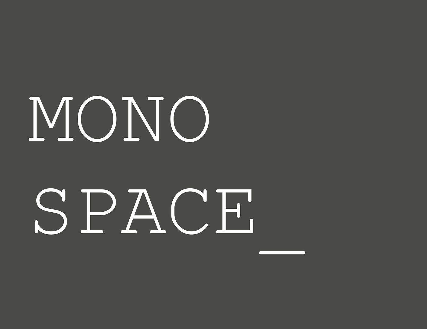
Monospace fonts
What does “monospace” mean?
Simple answer: All letters take up the same horizontal space. They all have the same width. This was necessary, back in the day of typewriters and early computers. Typewriters had a fixed number of letters, that could fit into any one line of text, so the letters all had to be the same width. It was similar on early computers, like the C64 and early IBM compatibles. These old computers usually were capable of either showing 40 or 80 characters in a line. Imagine them as separate blocks, that could be inhabited…