
My struggle with colors, part II
Building an accessible color system from scratch.
In part I of this article, I talked about the need for a color system for digital products foreseeing growth. I declared a good color system to be: accessible, systematic, and scalable.
Let’s recap these essentials.
Accessible
It is essential to follow the Web Content Accessibility Guidelines (WCAG) 2.0 and target Level AA for section 1.4.3 so that the visual presentation of text and images of text has a contrast ratio of at least 4.5:1.
This will allow the system to be used with confidence and in turn improve the general usability of the product.
Systematic
In order to reduce subjectivity it is important to utilize a standard for tone generation, such as the HSL color model. In the previous article I illustrated a breakdown of the natural hue wheel into 12 brackets to be used in conjunction with the numeric weight system to name tones.
Scalable
Scalability will become an emergent property of a color system which practices standardized naming and tone generation techniques. This will allow the system to scale with predictable growing needs.
Building Blocks
To build this color system on a strong foundation, we need our essentials cemented into the building blocks listed below:
- Tone scale
- Naming
- Hues
- Tone development
- Guidelines to scale
Tone Scale
A good start to an accessible color system is the tone-scale. A scale allows the color system to be flexible, and adds consistency to the product’s expression. It is important for the scale to have enough steps that it allows for improved usage when designing an interface.
My approach to determine the tone-scale was to start at the mid-point and find a middle-tone for Grey. Thereafter, I extended that tone to both extremes by adding a tint/shade to it, in 20% increments. This results in a scale with 11 tones, and 10 steps, as shown below.

As your inquisitive minds might deduce, the tone I set as the mid-point (#757575) is not the perfect middle-grey in the sRGB color space, which is #808080. Why is that you may ask? In response, I ask, what actually is middle-grey? As with everything in life, there’s hardly ever a definitive answer. Ultimately, dependent on the color model followed, the mid-point for each will differ in tone.

What model should I follow? As mentioned in the first article, accessibility will be the cornerstone of this system. That is the reason why I did not follow any of the tones above and went ahead to find one that satisfies our criterion of accessibility.
I wanted a tone that will cut right in the middle to allow symmetrical accessibility served on either extreme: white or black.

Grey-50 at #757575 achieves a contrast ratio of 4.5:1 or higher, when in use over either white or black. This complies with Level AA of the WCAG accessibility standards for minimum contrast.
The 10 step scale leads to a very cool side-effect. Any 2 tones with a 5-step gap will result in a contrast ratio of 4.5:1 or higher.

This adds a strong layer of predictability to the system.
Naming
The 11 tones generated earlier, map logically to our numerical naming scheme, ranging from a weight of 0–100. Since the tones also include white, and black, we can eliminate those out for 9 tones of Grey in total. This results in a scale that ranges from 10–90 for each palette.
With the 5-steps to accessibility, we now have a clear and logical system through which we can determine what tone to use for text/icons on different background colors.
For example, if I use Grey-10 for the background, I know that Grey-50 will not pass the contrast ratio test, as it is only 4 steps from Grey-10. Thus, the closest accessible tone is Grey-60. Similarly, on a dark background of Grey-80 let’s say, text set in Grey-30 will be accessible.

The important lesson here is that when we make our products more accessible, we are not only making them usable for people with disabilities, we are also improving usability for everyone else.

Hues
Defining the hues is paramount. This task will be directly dependent on the needs of the product. Color systems usually consist of one primary hue, with other supporting hues to add flexibility so it can cater to a variety of states and functions.
Gestalt’s principle of similarity states: things which share visual characteristics such as shape, size, color, texture, value or orientation will be seen as belonging together.
To develop a scalable color system, it is important to ensure that a single color hue remains unmodified when generating tones.
When the hue is constant, variations in lightness or saturation will create monochromatic harmony. Colors also harmonize if they are of the same lightness and saturation, regardless of hue. This is called nuance harmony.
Colors possess another property, pertinent to our exercise; this is called luminance.
Luminance
Luminance is the perceived brightness of a color. As a simple observation, blue will always look deeper than yellow. Let’s convert the complete range of hues to a luminance scale to see this more clearly.

We can see that every hue has a different perceived brightness. To normalize this we can add/subtract luminance to/from each hue so it matches the luminance of our middle grey tone #757575.

Carrying out this exercise is a good step, but we quickly realize that WCAG calculates contrasts differently for different hues. Just as Grey-50 works both on a black or white background, a color with luminance matching that grey will not. It fails the contrast test and thus we need to tweak it to find a tone which passes. We will come back to this once once the hue selection is made.
Selection
I have picked the following 5 hues for the color system:
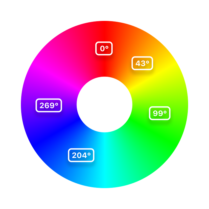
In clockwise order from the wheel: Red (0º), Yellow (43º), Green (99º), Blue (204º), and Purple (269º).
There is no particular reason to select these values. These are based on personal taste, needs of the system, the product, and ultimately, the user.
Once we have made the selection, we need to create tones and name them in accordance with our scheme, just like we did for Grey.
It is important to first find the middle-tone which will essentially follow the same principle set in this system. It needs to have a contrast ratio of 4.5:1 or higher, in use, both over white and black. This step is made easy by Colorable. It is an amazingly simple website developed by Brent Jackson, that allows you to develop tones using the HSL color system, and displays their contrast-ratio for the selected background color in real-time.
First, I developed the middle-tone for the selected hue for Purple (269º) by setting the saturation at 1.00 and lightness at 0.50. When we check the contrast-ratio on both white and black, we realize this tone is far from the middle we are looking for.
As a test, I restricted this Purple to a luminance matching Grey-50 to develop the 2nd tone, and realized that too fails the contrast test on a white background. This proves that the WCAG take into account the hue and also the saturation for a tone when determining its contrast over a background.
Therefore I played around with the saturation to determine a tone which wasn’t overly vibrant, and then moved the lightness slider till I found a value where the tone passed Level AA on both white and black backgrounds.

I extended this exercise to all the selected hues and locked Tone-50 for each.

Now that we have our middle-tone for each hue, we can generate a complete palette by developing the other tones as we did for Grey.
Tone Development
The steps that have been taken with regards to building a color scheme, have proven to be fairly simple and easy to put into practice. Having said this, tone generation on the other hand is a task that is mostly subjective to the system’s requirements.
As an example, if you are building a source code editor like Microsoft’s Visual Studio Code, you may not need a lot of tones for each hue but you will need a lot a variety of hues to differentiate between coding elements.

Comparatively, if you are building a product like Sketch, the opposite will hold true. Your system will include fewer colors, for which, the tones generated for interface wash will need to work in very specific ways.

For the purpose of this article, we will not go into the needs as much as the actual techniques you can use to accomplish this task.
There are a few techniques that allow predictable tone development.
- Mixing tint and shade
- Utilizing David Johnstone’s swatch and gradient generator
- Using Colorable to manually find tones equalling a pre-decided contrast
Tint and shade
Tint is produced by mixing a hue with varying amounts of white, whereas a shade is produced by mixing it with black. This is exactly the method I used to develop the Grey tone-scale. To generate 11 total tones starting from the middle (Tone-50), I progressively mixed 20% white/black to it. Let’s apply this method to find tones for Purple.

Note that when I mix white or black to a tone, it is not just making it lighter or darker, it is also reducing the saturation of the developed tone. This happens because white and black, have zero saturation.
Tones generated using this technique still pass a contrast ratio of 4.5:1 or higher for every 5 steps.
Using a swatch generator
There’s an even easier way to develop tones. Thanks to David Johnstone, I can simply input a hue, black, and white. and have the website generate a defined number of swatches spanning those 3 tones. In my case, 11 tones in total.
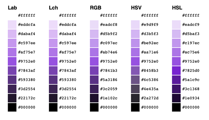
Additionally, this website gives you a way to compare how tones are generated from hues in different color models. Notice how the tones in the HSL model retain their saturation in the deeper end towards black. You will also notice that tones in the Lch color system maintain a better saturation gradient throughout.
Although it does look like it is producing a better looking gradient, the Lch color system fails to maintain the hue value throughout the different tones. For user interface design applications, monochromatic harmony is more important than how gradual the tones look stacked up together.
Tone development based on contrast
Since I wasn’t entirely happy with the output of both the techniques illustrated above, I decided to try a different one. To generate tones based on contrast, I used Colorable.
Colorable allowed me to input my middle-tone as both colors and then simply move the lightness slider up or down to find the next tone on the scale that had a contrast ratio of approximately 1.35:1.
There was some trial and error involved in order to find a contrast-ratio value, that if used to divide between tones, allows 11 tones ranging from white to black.
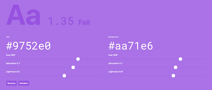
Utilizing this technique alone was not satisfactory enough. It required another step. I was not happy with how vibrant or dull a few tones looked, so I manually tweaked the lightness and saturation sliders for those tones whilst maintaining the contrast-ratio. This still enabled the approach to remain systematic, while allowing needed flexibility in the color system.
Below is the Purple palette as developed using all 3 techniques. Can you tell which one is which?

Once I developed all the tones I repeated this exercise for each hue to develop the palette you see below.
The Palette
In the final palette I created using this approach, you can see all the different tone-scales maintaining monochromatic harmony. Additionally, every tone is able to maintain nuance harmony.

Although the accessibility of colors is essential in the overall effectiveness of the system as well as the design in question, it is essentially only one aspect of the overall design process. There are various other elements that need to be deemed accessible to ensure that the color system is ultimately adding value.
The accessibility guidelines primarily target text within the interface; it should also apply to iconography dependent on the stroke width of lines.
Moreover, it is important to note that targeting Level AA means that we are optimizing the system for applications where the text displayed is smaller than 18pt or 14pt using a heavy weight. Subsequently, a thinner typeface might actually need stronger contrast to be accessible.
Guidelines to scale
The system can now scale systematically. Let’s assume we need more tones for Grey between White and Grey-10, because the interface demands a layout with different core components needing visual depth. Using the tinting technique, we can easily add more tones to the palette.

There are times when products require illustrative work, or other elements on screen that require use of specially vibrant colors to make something pop, or to grab swift attention of the user. The system has the scaling capacity to incorporate such accent colors as part of an alternative palette.
Using the same numeric scheme, based on contrast-ratio, we can develop more saturated tones for a select hue. This will allow for them to sit neatly within the palette, retaining it’s ease of use for the designer, as it will conform to the guidelines of the system.
We can develop accent tones and simply add a suffix to our naming scheme, such as Purple-40A, where A stands for Accent. This tone of purple should generate the exact same contrast-ratio as Purple-40.

Similarly, we can add a new hue to the system by taking the same steps for tone development as we did above.
Conclusion
These musings are from my second stop up top the steep mountain of Color. There is still much to learn. I will appreciate fellow designers sharing their struggle with colors and the steps they took to overcome problems in the digital-space. There is no better way to learn than to practice, and I will recommend every budding designer looking to create a system to experiment and to practice these techniques and discover solutions relevant to their problems. I will continue my journey into color, and see where it takes me next. Till I venture towards my next stop, build better systems, and most importantly, have fun doing so.
Special thanks to Noor for helping me proof this. Thank you for bearing with me through this. Your expertise make this article accessible and human.
Shoutout to my colleagues at KeepTruckin. Without their support, I wouldn’t have the motivation to go forward with this. ❤

