You're reading for free via Kat Allen's Friend Link. Become a member to access the best of Medium.
Member-only story
Naming design system components
Making it easier for everyone to speak the same language.
While I worked on the Design Systems team at Dropbox, we began an overhaul of the system with one goal in mind… To get designers and engineers speaking the same language.
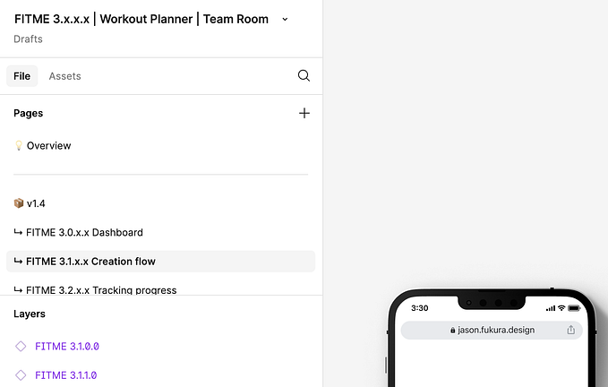
So many of the component names in our design documentation (Figma) didn’t align completely with their component library counterparts (Storybook). As you might imagine, it’s near impossible for two groups to be on the same page when the words in each system are so different.
We started with an audit of the components across both systems. We found exact matches in controls: things like Checkbox, Radios, and Toggles were already one-to-one. We found more theoretical matches in items like buttons and menus. There, we knew the pieces were the same (or pretty close) but their naming was a bit off. And, we identified some loaners — items in one system that didn’t even have a mate in the other. After a big clean up effort, it was time to align names and system structure. But, how?
We had a lot of discussions as a team. We’d create component naming and information architecture options, debate them, revise them, and repeat. The process was surprising to us. It was really difficult to make things simple. We learned so much. And, those learnings are what really shaped our work.
We developed a few principles that defined how we structured and named items in the design system.
Intuitive — Naming across the design system should be simple and clear while offering guidance when possible.
Consistent — Design documentation and the component code library should follow the same structure and labeling.
Scalable — Maintain broad naming structures, flexible labels, and flat organization to optimize for scalability.
Intuitive
Clarity is a better measuring stick than accuracy.
At times we’d come up with ideas, weigh the pros and cons, and find ourselves forced to choose between two fairly equal name options. To make decisions, we agreed that a good understanding of the term is what we’re after. And, we’re more focused on a name that’s intuitive, and immediately clear, as opposed to one that’s 1,000% accurate.
Guide users by giving them an easy starting point.
Instead of size listings of Small, Medium, and Large we wanted to let users of the design system know where to start. Since the word “default” is used to describe a component’s state, we opted to name the most commonly-used component size Standard. If a designer or engineer sees “standard” in a name, they can choose that option and go up or down from there (if that wasn’t what was needed).
Consistent
Labels in design documentation and code should align.
Our goal was to minimize discrepancies across design and engineering so that everyone can speak the same language. What does that mean tactically? Well, we aligned the component and prop names in Storybook to match the words and layout in Figma (your tools may vary). If a technical constraint prevents naming consistency, the engineers confer with designers to see if the components can be restructured or renamed to match.
Category, component, and variant names shouldn’t be company-specific.
Designers and engineers new to the company shouldn’t have to learn a different language to get stuff done. We defaulted to industry-standard nomenclature when it matched and opted for simple, easily-understood labels when we found ourselves in uncharted territory. And, though we’re fun people, we stayed away from pun-tastic or cutesy names — they just aren’t clear.
Scalable
Optimize for scalability with naming that also follows a system.
We focused our efforts on “ways” of naming and labeling. That means broad structures and general labels as opposed to a creative naming process for every item. With that in place, if we add or significantly edit components later, it’s easy to fold in those changes. In this way, naming follows a system — and each piece is easier for people to recall than if everything had a unique name.
Keep things simple.
In multiple instances we debated the right word for a hierarchical label just to later realize — we don’t need anything at all. We focused on keeping our system as flat as possible because growth of the system over time is likely inevitable. No matter what, unnecessary words shouldn’t get in the way of designers and developers accessing the tools they need.
I’m always curious about the process at other companies. Are other teams also finding it hard to keep things simple? Do share!


