You're unable to read via this Friend Link since it's expired. Learn more
Member-only story
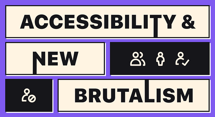
New Brutalism and web accessibility: what you need to know
New Brutalism is a trend that has been growing in popularity over the past several years. A rejection of the sleek and modernist style of buildings that came out of the post-war era, Brutalism is more raw and unrefined. In its rejection of glamor, Brutalism creates an almost industrial aesthetic, often with exposed concrete and other materials reminiscent of factories or warehouses.
There are a lot of reasons why it’s so popular with designers. It defies the trends of web design ubiquity. New Brutalism gives designers permission to have uninhibited creativity. This creativity is often expressed with characteristics like “asymmetry, broken hierarchy, broken grids, big bold typography…overlapping elements, geometric shapes, solid [and] bright colors” as described in “BRUTALIST WEB DESIGNS — The UGLIEST Design Trend of 2020”
With the rise of web accessibility as a key concern for usability professionals, it’s no surprise that Brutalist design style has caught the attention of designers. Many of its principles directly align with accessible design while others are totally at odds with them.
Here’s what you need to know about this trend and how to avoid creative pitfalls which break accessible design rules.

