UX Collective

We believe designers are thinkers as much as they are makers. https://linktr.ee/uxc

Follow publication

Member-only story

New UX pattern? Meet the Drill-In

Tom Parandyk
UX Collective
Published in
4 min readMay 3, 2022

From confirmation the change of state takes the user to the list of items affected by the action

This pattern is not the same as the double confirmation request for an action.

Toast asking for double confirmation of the action performed by the user

The purpose of the Drill-In pattern

  1. To put more control into the user’s hands
  2. To reduce the number of errors caused by applying an action to a wrong item without visibility
  3. To offer users the confidence of getting the job well done
  4. To enable flexible and accurate undo per item
  5. To show the full list of affected system data in case the change occurred in the off-screen elements
  6. To keep the initial view simple for most of the user roles and provide additional data when needed without forcing users to readjust the view

The Flow
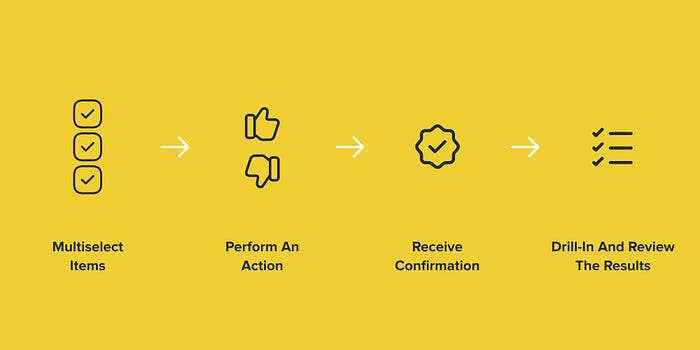
The user flow illustrated in four steps: multiselect items, perform action, receive confirmation, review the results

Long story short. This pattern offers the most value for use cases involving multiselection on a list or table as the flow’s entry point.

User multi-selects items:

Table with few rows selected and status column

Next, the user performs an action:

Three buttons with labels Approve, Report, Reject and a cursor on top of the Approve button

The action is applied right away (no double confirmation required), the system responds with a confirmation message, and the user decides to Drill-In the results of the action or ignore it and move on:

A toast notification message with generic text and “Drill-In” action button to display the affected data by performed action

Create an account to read the full story.

The author made this story available to Medium members only.
If you’re new to Medium, create a new account to read this story on us.

Or, continue in mobile web

Already have an account? Sign in

Written by Tom Parandyk

Product designer, eager engineer, strategist, wild innovator, proud dad, creative leader, aspiring musician.

Write a response

A toast, or a snackbar, simply confirms the state of the system after applying the action and offers another way to review all affected items and data.

- Visibility of system status
- Flexibility and efficiency of use
- User control and freedom
- Help users recognize, diagnose, and recover from errors
This is a brilliant global design improvement. And, as a UX veteran obsessed with choosing the correct…

--

Nicely written. As a concept drill-in is punchy. I would suggest that when implementing, ‘see more’ or ‘details’ is more common/friendly user language. Will be sharing this with my team for sure

--