Not just boxes: card components in design systems

Recently, I’ve been creating card UI components library for the design system. I noticed that there are instances when cards are designed and used differently between web and mobile. Also, given that cards may have unique attributes from one design system to another, it’s too generic to say that cards are box containers that hold pieces of information.

#1 Cards in Apple OS system
Apple uses both translucent and opaque cards in cross-platform designs, including iOS, macOS, and tvOS. The translucent and vibrant visual blurriness communicate a sense of depth and evokes a nice visual hierarchy. One success story of using cards in designs is the re-designed App Store as a part of the iOS 11 system released last year(2017). The new App store uses curated cards for “Apps of the Day”, which helps users discover the most in-trend apps and give download recommendations.

Meanwhile, cards are designed with additional affordances in tvOS. For tvOS, cards are optimized specifically for focus states. Designs adjust to leaving more paddings to avoid overlaps between cards. Cards are also sized up accordingly when they come to focus. In rows, cards are displayed partially offscreen to indicate that more content would be revealed.


#2 Cards in Google Material Design system
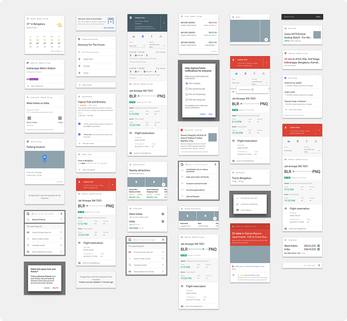
The discussion of cards becomes further open-ended when Google Material Design advocates cards as a fundamental UI component. Cards are broadly used in their web and mobile designs, in order to offer contextual information and make features more discoverable. For example, Google Now uses predictable cards as feeds based on users’ previous search history and encourages users to search and explore. It’s a step towards onboarding users to use conversational searching like Google assistant.
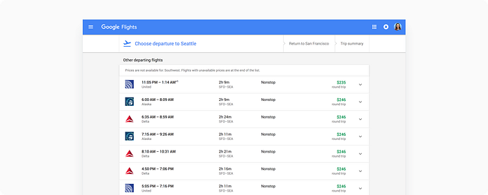
Another example, Google Flights uses interactive cards for flights information from different airlines and optimizes the browsing experience. Cards are used to provide the entire list of options sufficiently and help users make deliberate decisions.
#3 Cards in Windows Fluent Design system
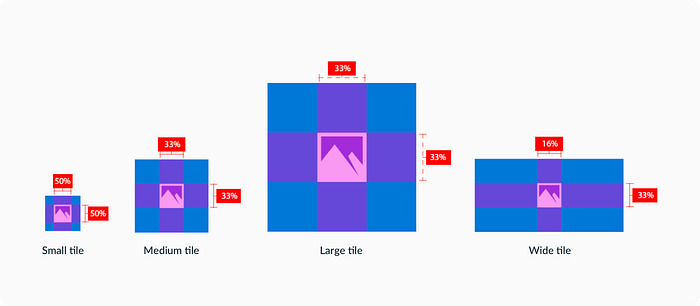
Though cards are excellent for displaying rich media content like full-bleed images, auto-played videos and looping gifs, the immersive experience that cards create can also distract us from scanning information quickly. For example, Windows 10 follows UWP (Universal Windows Platform) design guidelines and puts app icons in tiles(another way of calling cards) in the system start menu. Comparing to displaying app icons in a list, displaying app icons in tiles in a grid looks less efficient for quick scanning.
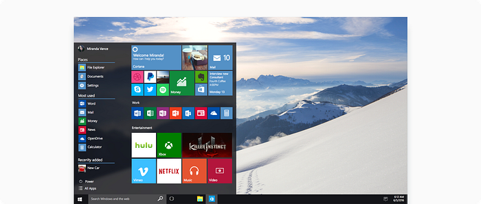
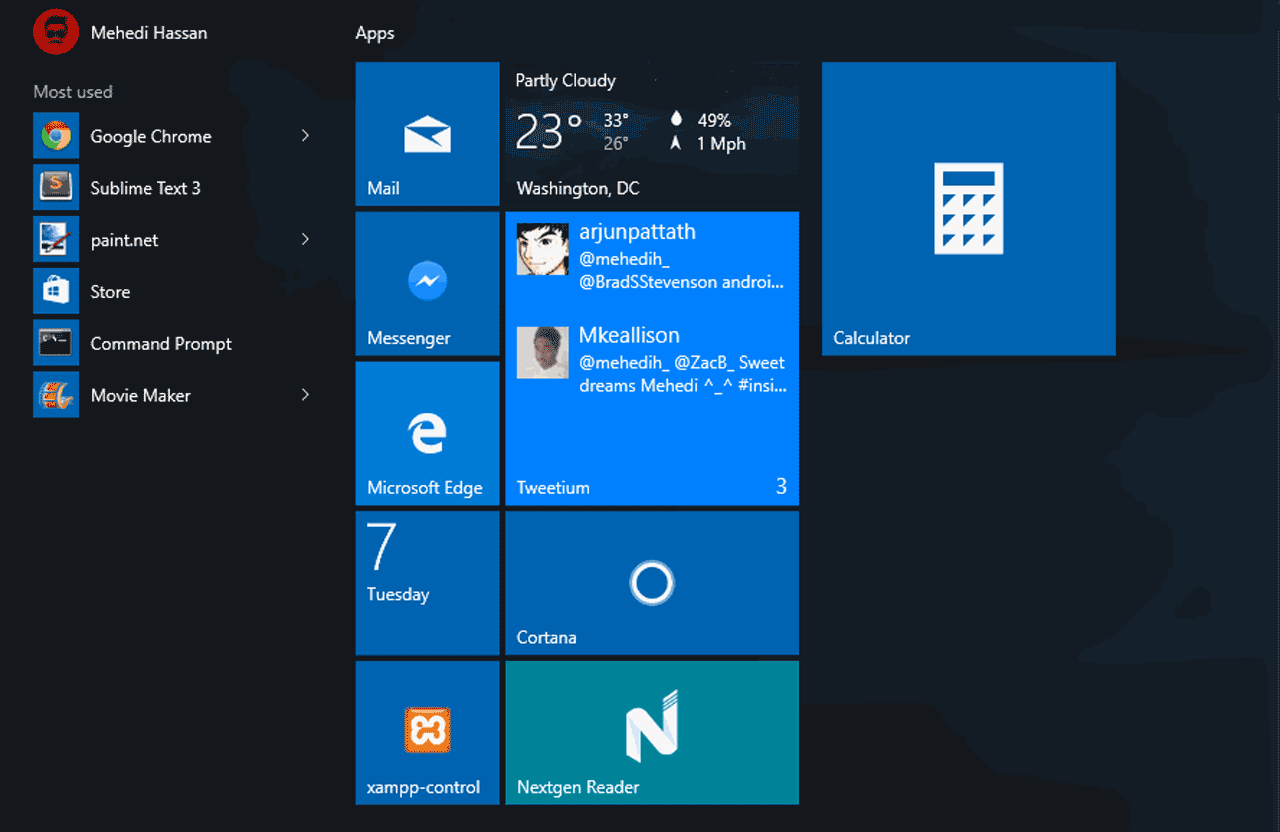
Also, since the tiles are designed to be resizable, the margin between an icon to the edge of the container looks redundant when a screen resizes — the tile containers become merely empty shells and they don’t communicate critical affordances such as the volume of the content and the potential interactions like tapping and clicking.
Closing thoughts
Cards are great when it comes to displaying heterogeneous content in one page — the borders of cards resemble physical cards and indicate how much content each card contains. Cards can also communicate a wide spectrum of screen interactions like swiping, scrolling, tapping and clicking. When we use cards in interfaces, we want to be diligent about when and where cards are used. Are they designed to display information in a feed? Or are they designed to bring users’ focus on action-required modals? When cards comply with different design systems, what are the universal and unique patterns?

