Member-only story
Notes and tips on Spatial UI
No more dark mode? And all curves baby.
Hi everyone, I recently caught up with WWDC’23 videos on Spatial UI and was intrigued by the mixed reality direction UI is heading towards. This new mode of interaction opens up new opportunities for delightful and novel interactions.
Here are some quick differences I’ve identified between Spatial UI and Screen UI:
1. Field of view
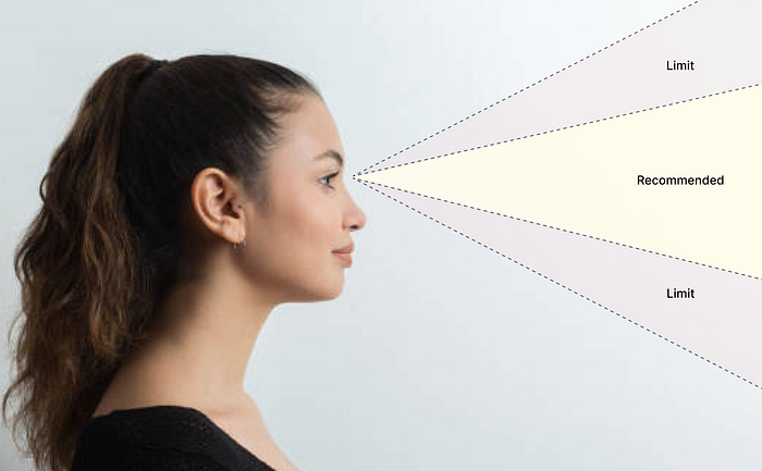
With Spatial UI, the design canvas transcends the boundaries of a digital screen. Our environment is the new canvas. Design considerations expand beyond eye-scanning patterns and encompass our field of vision.

For Spatial UI, apps should be designed to fit within the field of view and minimize neck and body movement. Try to keep the main content of the app in the center of the field of view, the most comfortable area for your eyes.

Design Tips:
- Place primary information in the center
- Place secondary information at the edges of the field of view, which remain accessible and doesn’t interfere with the main content
- If you need a large canvas for your app, go with a wider aspect ratio than taller
2. Say Bye to Light and Dark Modes
Introducing Glass, a new material that dynamically responds to lighting conditions. Unlike iOS and macOS, Spatial UI does not have a distinct light or dark appearance.
The contrast and color balance of the UI elements are adjusted to seamlessly integrate with the user’s environment, adapting to transitions from day to night. This adaptability ensures that the UI looks exceptional across various scenarios and lighting conditions.
It responds dynamically to lighting, adjusting the contrast and color balance to feel part of your space, like in this transition from day to night.

