Member-only story
Octordle, I need a word
A few improvements would turn this game from yawn to yum

It started, like many addictions, with one word game: the original Wordle. Every morning after the pandemic started, I’d start my day trying to guess the word in four or fewer tries. I got a kick out of delightful little morsels — “Magnificent,” “Impressive,” “Great.” Even “Phew!” was fun when I needed all 6 guesses.
Gradually, I added Quordle and Octordle. Having “grown up” on Wordle and Quordle, every time I opened Octordle I winced. The interface and the user experience are like something from the 2000s or even the 1990s — smilies? Every link with a thick underline?
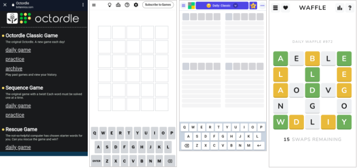
Octordle, owned by Britannica, encompasses three main games: Classic, Sequence, and Rescue. In each game, you must guess eight words in 13 to 15 tries.
I appreciate the programming wizardry that scores Octordle Rescue, and I like the intellectual challenge of different strategies for the three games . Having said that, it needs some serious improvements to hold its own not only with Wordle, but with my new BFF, Waffle.
Here’s my run-down of problems and potential solutions.
Problem: The home screen doesn’t open to a game, but rather to line after line of text listing each game, practice, and archive, and then a help section.
Solution: Follow the principle of all other games, and open with game play. Provide easy links to game play tips.
Problem: Once you’ve completed a game, it’s too hard to see your statistics, they are poorly presented, and there are too many extraneous pieces of information. Instead of providing a pop-up of your statistics right in each game, the user has to tap “home” at the top of the screen, scroll down to “help” and then tap on “stats”. By the time the user gets there, they’ve forgotten how many guesses they needed.


