Offboarding: Saying goodbye with grace

One of the major deciding factors when it comes to attracting/retaining users is the onboarding process. I myself have dropped off a product simply due to an onboarding that is far too tedious.
But as the title suggests, we aren’t here to discuss onboardings today, today instead, is all about Offboarding, and how it can have some profound impacts on users and your business.

As life may have it, some (if not many) customers will eventually decide to leave your product, and regardless of their exit, you can still find yourself in a strong opportunity, so as long as you keep a user happy.
Offboardings are just as critical as onboardings and should be given just as much attention, if not more.
Let’s take a look at why this is relevant.
Why it matters: The Peak-end rule

We base our memories of an experience on two factors: the most emotionally intense points (the peaks, be it good or bad) and the ending experience.
But let’s focus on the ending experience in this piece and why the last impression matter so much.
In 1993, Daniel Kahneman and Barbara Frederickson conducted research titled ‘When More Pain Is Preferred to Less: Adding a Better End’, where they demonstrated that adding a better ending to experience changes the perception of the entire process.
It is one of the ways to provide a good user experience, which are often used to retain the users to their product, typically by offering some benefits to the user. It offers customers a final chance to stick around.
The UX of the subscription cancellation
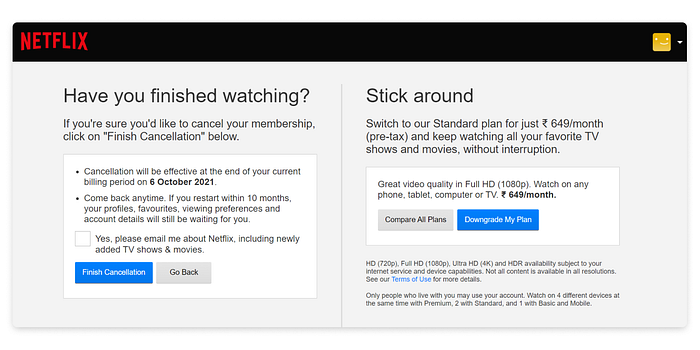
If a user wishes to cancel the subscription, the option to do so should be easily accessible. Moreover, let the users know they can return anytime, with a reassurance of their preferences saved for a while (or, in some cases, permanently delete data for security).
In the above image, Netflix also offers a suitable alternate plan to the user, should the reason for cancellation be the current plan.
It’s a good choice to bid users adieu on a good note, so they choose to return to your product if and when required.
The UX of account deletion
Many products make it either too hard to find the delete button or make you fill out a long form which can generally deter you from completing an account deletion. This can frustrate users and make them hesitant to sign up for an account. If you want to make deleting an account easy, make sure it has a delete button that is not hard to find.
Deleting an account could ideally include:
- An option for exporting or back up any content user has created or collected.
- Provide a few alternatives to solve their problem of why they are deleting the account in the first place.
- An option to temporarily deactivate the account until a specific date.
If a user is going to delete their account, it should be as painless as can be (ideally).


Take this example of Twitter’s delete account page. The delete button is clearly visible and easy to access. It takes only one click to delete Facebook.
Twitter also offers a few alternatives to deleting/deactivating the account, just in case the solutions offered could resolve the users’ reason behind account deletion.
Avoid dark patterns:

My mother wanted to delete her Amazon account a few months ago, so she sought my help. However, it wasn’t as easy as I thought it would be. I had to search through the account, Google it, read the FAQ, chat with customer support and require help, and still wasn’t successful.
A few months down the line, I read about dark patterns in UX design and came across a dark pattern, “Roach motel”, and completely identified having that same experience with Amazon.
Roach motel is a dark pattern where the user can easily get into a situation, but it’s challenging to get out of it. In this case, the Amazon subscription.
The bottom line, make it easy to delete/unsubscribe.
Dark patterns in exit-intent popups:
Sometimes these exit-intent popups use manipulative wording to shame users into taking action beneficial to the company but not the user.
It’s a dark UX pattern to guilt users into opting into something. This dark pattern is known as confirm-shaming.
Good Offboardings leave behind good impressions
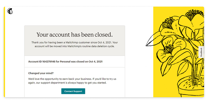
A good experience for a user, when it boils down to it, is a meaningful point of conversation, and thus, a means to better top-of-mind recall for a user. Products that allow users to easily depart from the platform with minimal complications and well-composed content and cross-links tend to bring about high satisfaction.
In a situation where the probability for exits and deletions is higher than adoption and retention, it becomes important to understand how to gracefully let go of a customer.
The Canvs Editorial team comprises of: Editorial Writer and Researcher- Paridhi Agrawal and Anjali Baliga, the Editor’s Desk- Aalhad Joshi and Debprotim Roy, and Content Operations- Abin Rajan
Follow Canvs on Instagram and LinkedIn. Don’t forget to follow us here on Medium as well for more design-related content.


