
Offline: When Your Apps Can’t Connect to the Internet
Internet access is not ubiquitous. Everyone experiences the frustration of being offline. When you design a mobile app which doesn’t work without internet, you’ve made a decision about when and where your app may be used.
But consider:
- You’re on a flight, and you don’t want to pay for Wi-Fi.
- You’re on a camping trip in a remote location.
- You want to unplug for awhile and get work done.
- You can’t afford a data plan for your phone.
There are many reasonable instances where users won’t have Internet access. Knowing this, how will you design your apps differently?
Does “offline” mean “no content”?
Not necessarily.
Whenever you open an app, it has the opportunity to download content. When offline, apps can use this content to improve the experience. And most do, but some go further than others.

Let’s do a walkthrough of some common social, mapping, and productivity apps, to see how they function offline.
Social apps
The typical use cases of a social app are to browse your feed, post comments and items of interest, and manage your network of friends. Let’s turn on airplane mode and observe.
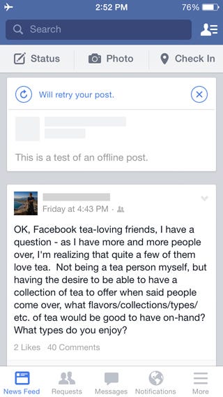
First up, Facebook:

We see pretty much what we’d expect to see: our news feed and an alert that we’re not connected to the Internet. There’s a fair bit of content too. Well done, Facebook.
Now, let’s page through the various sections of the app, and see what we find. First up, friend requests:

This isn’t a great experience. The explicit “No Internet Connection” alert is gone, replaced by a spinning indicator that spins forever. That’s not very helpful or informative. There’s a lot of unused whitespace that could be better utilized as well.
Next up, notifications:

This is slightly better. At least I can see some cached content, though it’s not a lot. Unfortunately, there are now two spinners. It’s not clear what the difference is between them, or what is happening. And that’s still a lot of wasted space.
Finally, the miscellany menu:
The most obvious thing missing is thumbnails for each item. This seems strange, as those thumbnails are static and shouldn’t change often.
Now, let’s try to post something:
This is really clear behavior. My post has been queued for submission with a message (not even an error!) giving me the opportunity to retry submission.
Since this is a post I don’t plan to keep, I’ll hit the “x” and discard it.
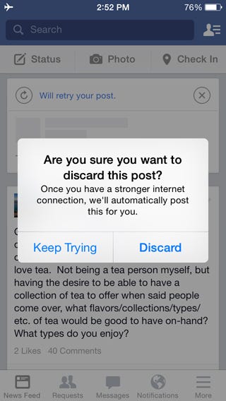
Well done, once again. I get a popup reassuring me that the post will go live as soon as I have an Internet connection, though I can delete it if I wish. Facebook provides an excellent experience while offline.
The good:
- Newsfeed is populated with posts
- Offline posting sets clear expections with very good messaging
The bad:
- Inconsistent alerts for “No Internet Connection”
- Loading spinners which never stop
- Poor use of available space on loading screens
- Missing menu thumbnails
Next up, Pinterest:

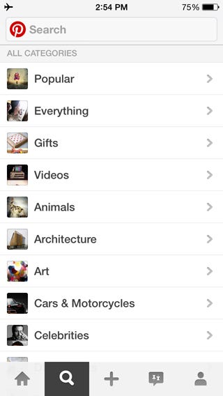
This is a very underwhelming screen to see when I first open the app. There is zero content here for me to browse. In addition, the app doesn’t explain why there’s a lack of content. There isn’t any indication that I’m offline.
As with Facebook, let’s page through the different sections. First, search:
Oddly enough, there is content here. I don’t expect search to work, but it’s interesting that there’s a landing page at all. Again, no indication that I’m offline.
Let’s type in a search keyword, just for kicks:

The search result screen is basically identical to my home page. It tells me there are no pins, but not why. Did I mistype my search term?
Let’s try to add a pin and see what happens:

So far, so good. I want to pin a photo, so I’ll click “Photos”.

I was able to easily select a photo. Let’s add my pin to a board:
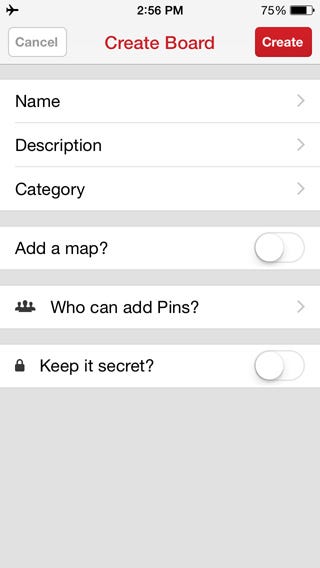
Bummer. Pinterest doesn’t cache my existing boards. I’ll have to create a new one:
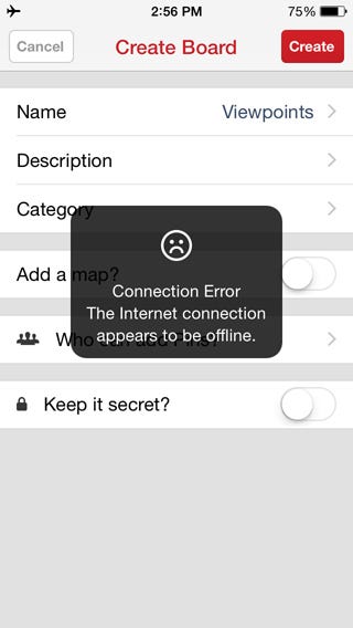
That’s very bad. Pinterest allows me to get through that entire workflow before telling me that offline pinning is impossible. It won’t even let me save a draft of the pin for later.
Let’s see what my profile looks like:

It looks like I have no pins and no boards, which is false, but Pinterest isn’t telling me why. Ironically, my stats are accurate (number of pins, likes, followers, following), but are in stark contradiction with the list of pins and boards below.
What happens if I click “47 Pins”?
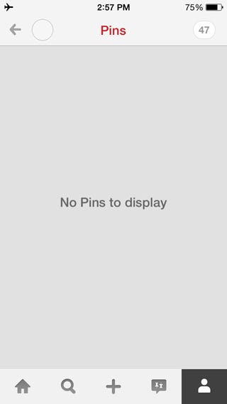
Yet another inconsistent view. The counter in the top right shows “47”, but the list below tells me there are no pins to display. This is a very poor offline experience.
The good:
- There’s really nothing great about using this app offline
The bad:
- No cached content (and no explanation why)
- I’m allowed to get far into the pinning process before learning it’s impossible
- Profile stats contradict what is shown
So far, we’ve seen a big difference in the offline experience of social apps. How does Instagram fare?

This feels very similar to Facebook. There’s a good bit of content preloaded, and a prominent “No Internet Connection” alert.
Let’s page through the sections and see what we find. “Explore” first:
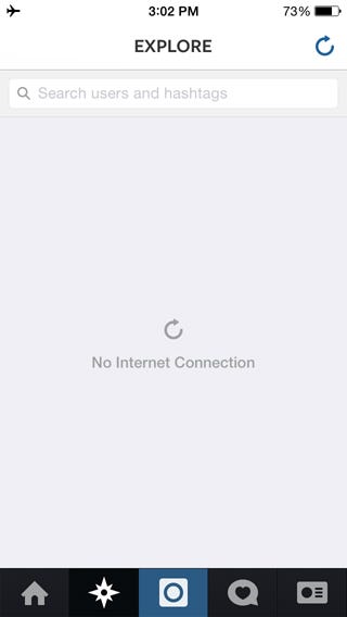
Not great, as there’s no content here, but at least we don’t have the infinite spinners of the Facebook app. A simple option to refresh the page is much more sensible.
What about my user profile?

Similar to Pinterest, none of this content is loaded. However, neither are the stats, which means they aren’t in conflict. Also, Instagram remains clear about the lack of an Internet connection.
Can we edit the profile?

Nope. In contrast to the clear “No Internet Connection” message in the previous screens, this one is very ambiguous. And a terrible use of whitespace.
Finally, let’s try the direct messaging feature:

A similar result to the “Edit Profile” screen. However, the messaging (and message styling) is different for no good reason.
Overall, I’d place the Instagram offline experience somewhere between Facebook and Pinterest. Good, but not great.
The good:
- The “No Internet Connection” signs are mostly consistent across the app
The bad:
- Can’t edit a user profile
- The only cached content is from the main feed
- Poor use of whitespace
Let’s look at one more social app: Twitter.

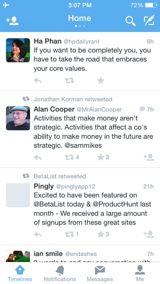
As with Facebook and Instagram, there’s a good bit of cached content available. Unlike those apps, there is no messaging to indicate that you’re offline. That’s not necessarily a problem, but I prefer to be told that the app is offline.
Let’s take a look at notifications:

It’s clear that Twitter takes caching seriously. The number of notifications here is impressive.
What about messages?

Here we have a clear message prompting us to retry. It should probably indicate the reason that messages aren’t loading, but that’s a minor quibble.
I didn’t have any direct messages when I took this screenshot. Later, I checked this screen, and it showed a list of direct messages while offline, with no message indicating any loading problems. This is very consistent with the timeline and notification sections.
Next, let’s look at my user profile:
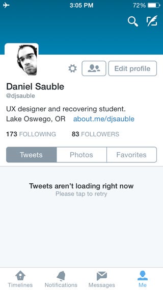
As with the other social apps, none of my personal content has been cached. But here, there’s a clear message that content isn’t loading.
Can I edit my profile?
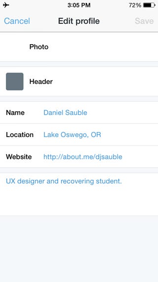
Maybe? No error message yet. Let me make a change and click “Save”.

Nope. And an incomprehensible error message at that. It would be better to disable the actions that are impossible to perform in offline conditions, like “Edit Profile”, and explain why, rather than letting users click them.
Now, I’m going to try composing a new tweet:
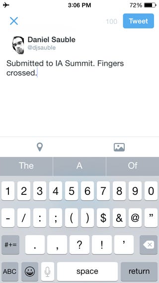
Click “Tweet”:
And… nothing happens. That’s not very reassuring. I expect confirmation that my tweet will post as soon as I have Internet connectivity, as Facebook does.
Let’s scroll through the different timeline views now. First, “Discover”:
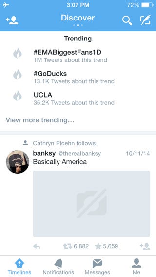
Cached content. Fantastic. Now, “Activity”:

No cached content here.
Let’s click the “Follow people” button, just for fun:
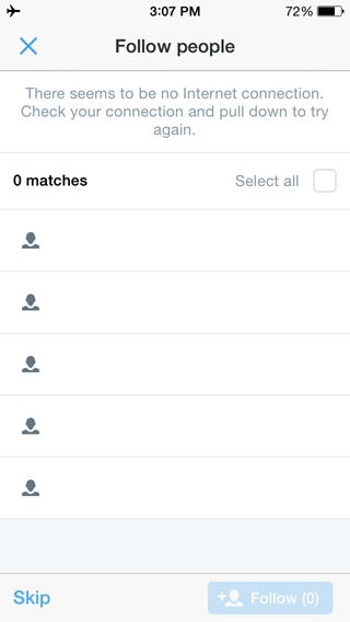
Not only are there no recommendations, this is a horribly-designed empty state. I’ve complained about poorly-used whitespace in other apps, but this space has been filled with useless UI, which is far worse.
The good:
- Lots of cached content. Far and away the best.
- Clear and (mostly) consistent Internet connectivity errors
- Offline posting works, though with the caveat above
The bad:
- Caching is handled very differently across the app
- Looks like you can edit a profile offline, until you can’t
- Awful “Can’t edit profile” message
- No confirmation after composing a tweet offline
- Poorly designed “Follow people” view
To sum up, none of these social apps nail the offline experience, but some are clearly better than others. In general, there’s lots of room for improvement.
Mapping apps
The typical use case of mapping apps is to get you where you need to go. Apps won’t get you new directions while offline, but how well do Google Maps and Apple Maps use their cache?
GOOGLE MAPS
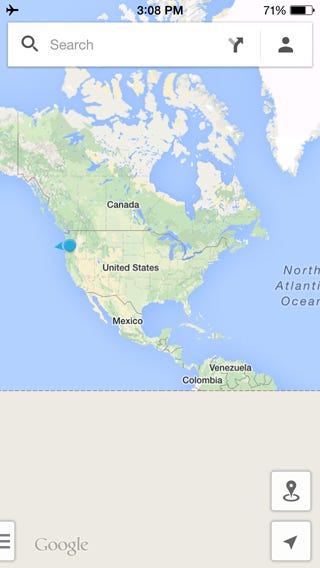
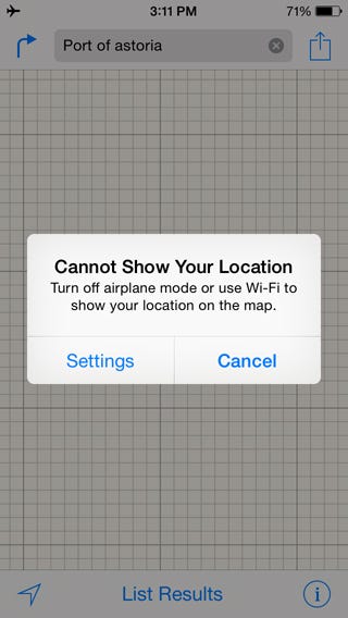
Remember, in offline mode, apps don’t know your current location. Let’s open Google Maps and see how it handles that:

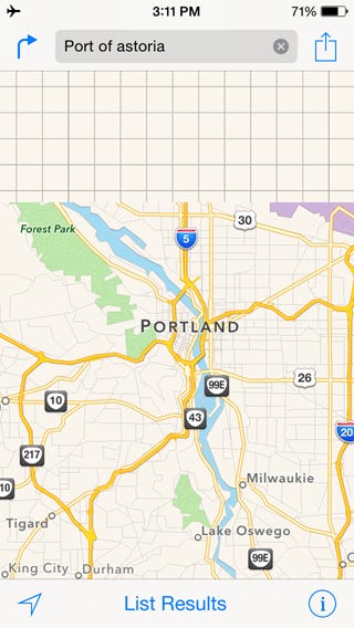
It remembers my last location, and starts me there. We’re zoomed in pretty far though. Mapping apps have access to a lot of data, and have to be selective about what they cache. Let’s zoom out and see what Google Maps has cached:
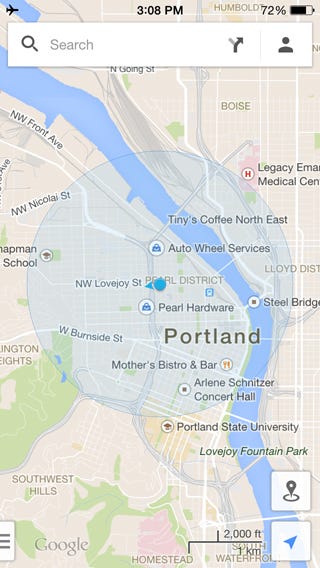
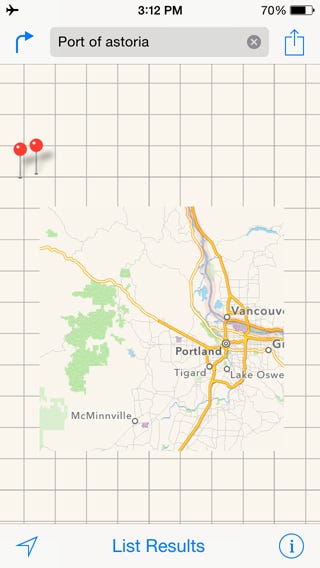
Downtown Portland. Can we zoom further?
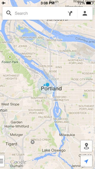
Portland metro area. More?
And there’s the cutoff. Not bad, all things considered, though I don’t know why they didn’t include a high-level map of the entire Earth, if only for context.
What else can we do offline?
Let’s try switching to Satellite view:
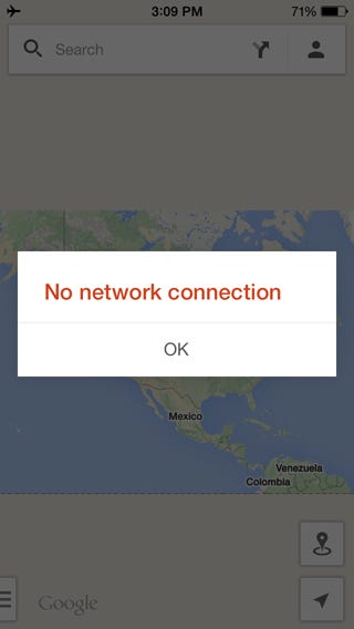
That doesn’t work. We have a cached street map view, but no other views.
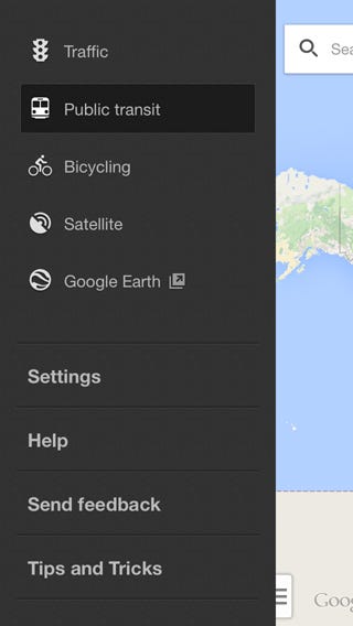
Let’s look into the settings:

There are lots of pages here. Since most of these aren’t settings that people will change often, I won’t go through these now. Some options work offline, others don’t, and the only way to tell is to try accessing each section, which feels disconcerting.
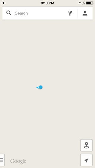
Once I finished with the settings, I switched back to map mode. To my surprise, the map had entirely disappeared. Bad news if I had been depending on it.
All in all, a reasonable offline experience, with a few nasty surprises.
The good:
- Remembers your last location
- Holds an impressive amount of map detail in cache
The bad:
- Forces me to guess what works online and what doesn’t
- Maps disappear and won’t come back
APPLE MAPS
Google Maps has a reasonable offline experience, so what about Apple Maps? Let’s open it and find out:
First, Apple Maps refuses to show my last position on the map. Also, it doesn’t appear to cache any of the map, at this zoom level anyway.
And now I get a popup telling me that I need to turn off airplane mode to see my current location. I click “Cancel” instead. Let’s zoom out and see if any of the map has been cached.
The answer is “yes, but not much”. Only Portland, Oregon and the surrounding area. Let’s zoom out farther.
This is strange. If you’re going to show a pin for my last search result, it would make sense to cache that part of the map.
Let’s try Satellite view:

Nothing. Not terribly surprising, given that Google Maps didn’t cache Satellite view either. All in all, a pretty lackluster performance.
The good:
- Not much good to be said about this offline experience
The bad:
- Very limited caching of the map
- Doesn’t show your last position
Productivity apps
Let’s finish with a productivity app. The primary use cases of a productivity app is to sync files across your devices, and let you open and work with those files.
DROPBOX
How well does Dropbox perform?
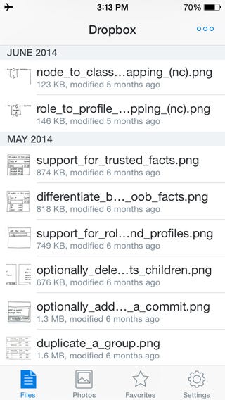
Everything looks great. What about photos?

Same here. Of course, this is what I would expect, since these files already exist on my device. Let’s look at the “Favorites” section now:
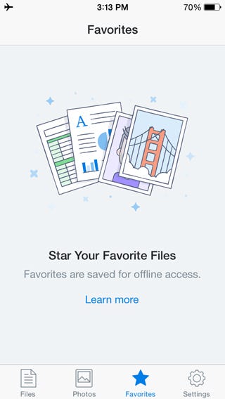
I don’t have any favorite files, but if I click “Learn more”…

…I get a “No Internet Connection” message. It seems like a strange choice to not cache instructions for using the app. Regardless, this is one of the nicer error messages I’ve seen. It’s informative, makes good use of the space, and is clever as well.
Let’s look at the “Settings” section:
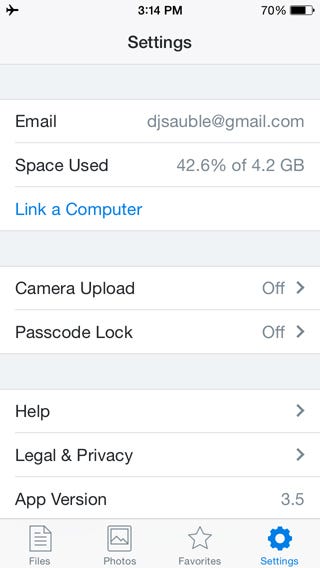
Lots of options here. I won’t go through these, but as with Google Maps, the only way to know which options work offline and which don’t is to click them.
Now, let’s try to upload a file to Dropbox:
I choose “Add Files”…
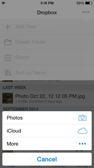
…“Photos”, select a photo, and…
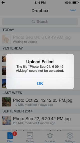
…get an error message. In this case, the error message is misleading. The message tells me that the upload failed, but when I close it…
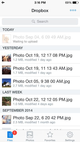
…Dropbox queues the photo for upload later, like Facebook and Twitter do. The behavior is good, but the messaging around it is confusing. But all in all, a reasonable experience.
The good:
- File uploads are queued while offline
- “No internet connection” error messages are well-designed
The bad:
- Help content is not available offline
- “Upload failed” message is misleading
Principles of good offline design
AGGRESSIVE CACHING IS A BETTER USER EXPERIENCE
When I open an app, I expect to see lots of content there, regardless of whether I’m connected to the Internet or not. If the content isn’t there, I’ll get frustrated and switch to a different app which does a better job of caching the information I want to see.
LET PEOPLE INTERACT WITH THEIR CONTENT. ALWAYS.
One solution to caching is to show the information, but keep it read-only. This isn’t adequate. If I’m reading a post on my social feed, I want to comment while the thought is fresh in my mind. If you make me wait, I won’t interact with it at all.
It’s okay if the information won’t be uploaded until I have an Internet connection. I just want to record my thoughts. Instead, remind me that I’m offline and that my posts will go online when I do.
MAKE ERROR MESSAGES INFORMATIVE AND CONSISTENT
A loading spinner that never stops isn’t helpful. If I don’t have Internet connectivity, and you don’t have my content cached, tell me. I won’t be offended, and I’ll be grateful that you set clear expectations for the experience.
DON’T LET PEOPLE START SOMETHING THEY CAN’T FINISH
If I get to the end of a multi-step workflow, only to find that I can’t complete it while offline, I’m going to be ticked off. Tell me up front. Better yet, don’t let me start the workflow. Consider hiding the workflow from the interface until I’m back online.
DON’T SHOW CONTRADICTORY INFORMATION
If you tell somebody that they have a new message, but when they open their inbox, there’s nothing there, they’ll be confused. Make sure all portions of your app are telling the same story.
WHEN CACHING, CHOOSE BREADTH OVER DEPTH.
If I can browse my feed, but not my own profile page, that’s a disjointed experience. It’s better to cache a little of everything than a lot of some things and nothing of others.
DESIGN YOUR EMPTY STATES WELL
They’re easy to overlook, but empty states often look… empty. Vast swaths of unused screen real-estate is wasteful and looks bad. Instead, use the potential frustration of an empty view to surprise and delight your users.
That said, even though an empty screen is bad, a screen filled with pointless UI is worse. Make your empty states simple and elegant, not cluttered and redundant.
NEVER SHOW THE RAW ERROR MESSAGE
Messages like Error: The operation couldn’t be completed. (kCFErrorDomainCFNetwork error 2.) are cryptic and scary. If you can’t connect to the Internet, tell people so in simple words.
REMEMBER WHAT YOUR USERS WERE DOING LAST
If your app is sensitive to location, be responsible and take users to where they were last. It’ll help them regain their bearings and know where they are. If you regain Internet connectivity, allow them to jump to their present location.
NEVER PURGE THE CACHE WHILE OFFLINE
I depend on my data to keep me informed, safe, and cognizant of my surroundings. If it suddenly disappers, I’ll be lost, perhaps literally. Wait until I’m back online before you refresh my data.
And that’s it. Designing offline apps can feel like an edge case, but your users will be grateful that you took the time to give them what they needed, when they needed it.
Additional resources
Here are some other articles about designing offline mobile apps. Mention your favorite articles in the comments, and I’ll add them here:
Daniel Sauble is a UX designer, speaker, writer, and one-time runner of ultra-marathons. He recently published his first book, Offline First Web Development, and is already plotting his next downfall.

