Optimizing the UX honeycomb
A small amendment to the classic diagram hopefully improves its UX 😉

Peter Morville’s UX Honeycomb is a well-established and extremely popular visualization tool, which depicts the 7 aspects of the user experience. Since its creation in 2004 it has featured in numerous books and articles, its been translated and canonized, to the point that it now serves as a pretty standard response to the question “what constitutes a good experience?”.
As with most theoretical diagrams, its typically used as a teaching tool to help students and new practitioners get to grips with the basics of UX, although it also works well as a checklist for designers and content creators.
As a UX trainer I frequently refer to the honeycomb in my courses and even though it covers all facets of UX effectively, it also feels quite problematic to me. There seems to be no connection between the 7 elements, or logic as to the where in the honeycomb they are positioned. When attempting to deconstruct and explain it during training courses, it just ends up being a list of items in random order. I always felt that it didn’t help students either understand or remember those 7 important elements.
While updating one of my presentations for a recent UX training course, I had a revelation. I made a small amendment to the original model and came with an optimized version, which turned out to be a success in the classroom as well. It made much more sense for students, but also for me explaining it.
Here is the original diagram:

And here is my small amendment:
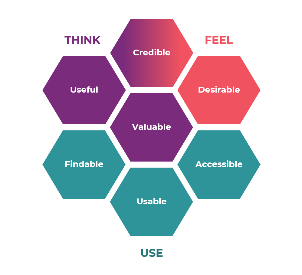
As you can see, the changes are subtle, but they make a difference. Here’s what I’ve done:
- The 7 facets are grouped based on how the user interacts with a product (uses, thinks, feels).
- They have been re-arranged within the honeycomb so that the relationship between them is visible.
- Color coding and labels make the groupings clear.
For me, the honeycomb now depicts how people use, think and feel about a product:
- Think: What do users think about the product? Is it useful? Is it valuable? Do they find it credible?
- Feel: How do people feel about the product? Do they find it desirable? Also, do they feel it’s credible?
- Use: When it comes to actually using the product, is it findable, accessible and usable?
You’ll note the double role of credibility. I originally had it in the “Think” group, but the more I worked on the new honeycomb, the more I realized that deciding if a product/website/content is credible, is a combined result of reasoning and emotion (i.e. “it feels credible”).
So, I think I’ll be using this approach from now on. I’d love to hear your thoughts on this in the comments or just give the article a clap if you think the new honeycomb is an improvement.

