Organizing a web design system for scalability in Figma
If you work on or work with a web design system in Figma, you’ve probably seen the conventional way of organizing a design system library…
Within one Figma project housing the library:
- One file contains the foundation or style-guide (colors, type, etc.).
- One file contains the web components for light mode.
- One file contains the web components for dark mode.
- One file contains documentation needed for embedding into the platform you house documentation — I.E. Zero Height.

It’s straightforward. It keeps things organized for the design system’s users. It’s easy for product designers to pull these assets from the library into their Figma canvas. Easy-peasy.
Well…it’s easy until you get one of these terrifying and menacing alert banners at the top of your Figma canvas. You can get a range of banners shown below, which I like to refer to with the DEFCON scale.


That’s what happened to my fellow design system teammates and me within our file containing our light mode web components.
We had branches that we could not merge in the main file, and couldn’t work in our light mode for web file without feeling like the file would self-annihilate.
Thankfully, our design system team was already prepping for our next new version of the library, Version 2.0.0, and we could use it as an opportunity to see what is causing this file memory issue in our current library and what we can do to prevent it in our new library.
What are Figma file memory issues?
Because Figma is cloud-based, each file (or tab) can only have 2GB max in both the browser and desktop application. But in general, keeping your file at a lower GB usage helps your overall file performance.
I’ve found that Figma doesn’t like it when you start to near 60% of this 2GB capacity. So you really only have 1.2GB to work with before the evil file memory banners appear.
To see what resources your file is using
If you’re wondering how much file memory your important work is taking, you need to bring up the ‘Resources used’ view in your file.
To do this:
Go to the top navigation bar → Click the Figma ‘F’ logo → Click on ‘View’ → Click on ‘Resources used’

After clicking on ‘Resources used’, a very small widget will appear at the top-left of your file’s canvas (or on the direct right of the assets panel).

But what do those numbers even mean?
- The top number shows the total number of layers in your file.
- The middle number shows much memory your file is using (in GB).
- The last number (will show) a live feed of how much memory current actions in your file are using (E.g., if you decided to move a portion of work to the side of the canvas).
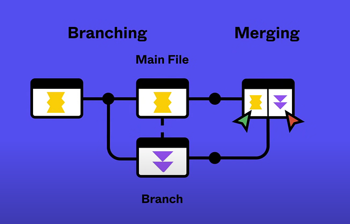
So why wouldn’t our branches merge back to the main file?
Our light mode for web Figma file was housing about 1.05GB of design work, but we could not merge branches with changes. Huh…we are under the 60% capacity, so what is going on?
When you create a branch from the main file, you are creating a duplicate of the main file that is a ‘temporary’ second file. When you merge it back to the main file with your updates, Figma must briefly combine these files to assess what changed.
If both files start at 1.05GB each, with the branch likely getting additional data to store (let’s say 0.5GB), when they are briefly combined to be analyzed for changes, they will add up to be 2.15GB. That is a BIG no in Figma, and it will refuse to even think about processing the files.
Back to my point above of keeping your file under 1.2GB. If you plan on using branches, you should consider keeping your file well below 1.0GB to be safe. It is never fun redoing work.
Key takeaway
Because a design system library can house a lot of atoms, molecules, and organisms, it has a high-risk of eventually having file memory issues as more and more components needs of product designers are addressed and the general design system matures.
Workspaces, teams, projects, files, oh my!
In Figma, there are macro to micro levels with how things are organized.
Workspace → Team → Project → File → Page
Workspace: This is your organization’s collected teams & resources (E.g., your company name).
- There is usually only one workspace, and everyone in an organization/company falls into this workspace when given a Figma license from your company.
- On enterprise Figma plans, you can create custom workspaces so this will be dependent on companies and their needs.
Team: Gives you a designated space to house certain projects & files (E.g., the design system team).
- There can be many teams in your workspace, depending on your organization’s needs.
- It’s typical to split teams by what product or project you work on, and you may have access to multiple teams.
- You can create an unlimited amount of teams on organization and enterprise plans.
Project: A collection of files that houses work for a certain scope for a team (E.g., the design system library).
- You can have an unlimited amount of storage within projects, across all plans, so you can have as many files as needed to complete a project.

File: A specific piece of the project (E.g., the button component).
- One individual file can only hold 2GB, as stated before.

Page: A certain part of a file (E.g., the light theme button component).
- One file can hold an unlimited amount of pages, but it is not recommended to have an excessive amount of pages in one file to help with the file’s performance.


Note: At my workplace, we have an enterprise plan so I am speaking with that perspective. There may be other nuances to this section based on differences between starter, professional, organization, & enterprise plans.
What caused our Figma file memory issues?
As I found out while auditing our design system library, we were practicing bad habits that heavily contributed to our file memory.
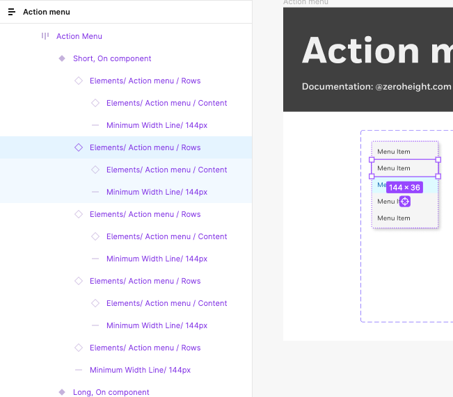
❌ We used one file to house all components in light mode for web (and the same for dark mode). We offer 55 components that each has its own page in the file, including large organisms or patterns such as a data table & data visualization.

❌ We placed documentation assets into the library’s component pages. Documentation is a great thing, but it can’t be housed in the core library due to these file limits (other than the embedded Figma documentation).
❌ We had ‘nested’ component elements in the official component’s page. Though the nested element supports the component, it should not be included within the library offered to designers. We also found an issue of designers pulling nested elements to use by themself, which is not the design system’s intention.
Note: Nested elements can be seen as a building block to the official component, and can help make quick updates to one elements versus all instances of it in the master component.
❌ We had hidden layers in master components. Though hidden layers aren’t shown in the UI, they’re actively using file memory. This habit also impacts users of the design system since they cannot delete these layers without detaching the component instance.
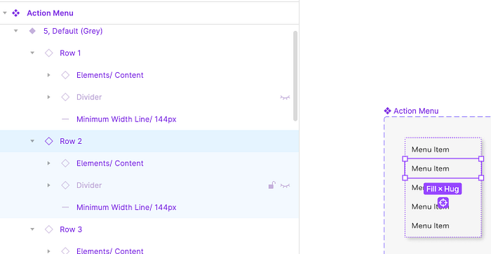
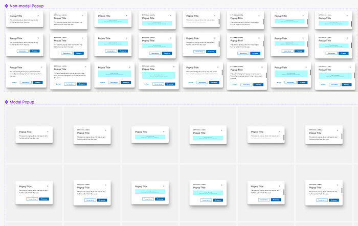
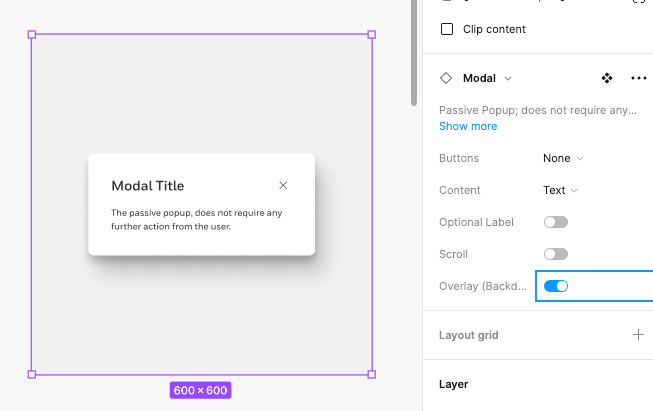
❌ We offered near duplicate components variants that could be overridden by product designers. E.g., we had both non-modal & modal components that were the same minus one overlay layer.
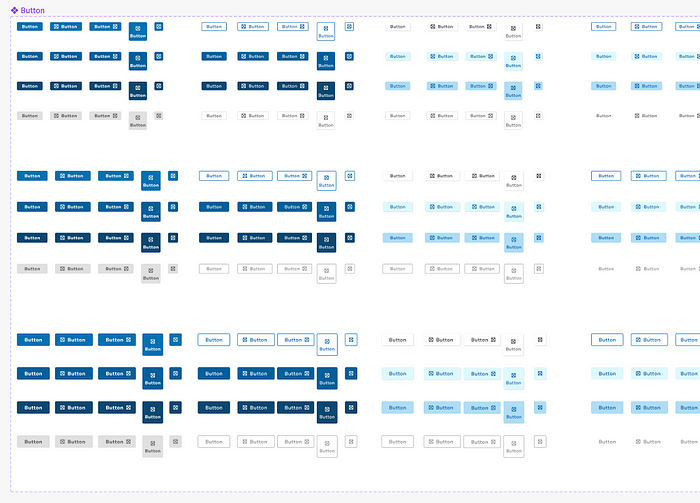
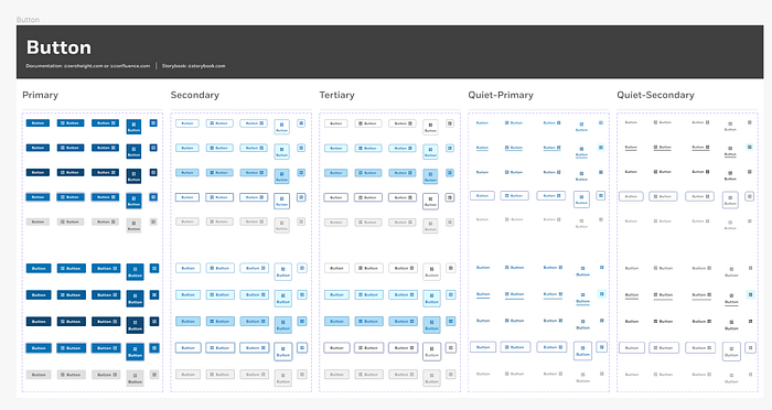
❌ We offered one giant, complex component versus breaking it up. E.g., we had one button component holding ALL variants.
Our Figma file memory solution
To address our bad habits, we tackled each specific issue head-on to prevent file issues as our project scales, as well as the overall performance of our files that hold our design system.
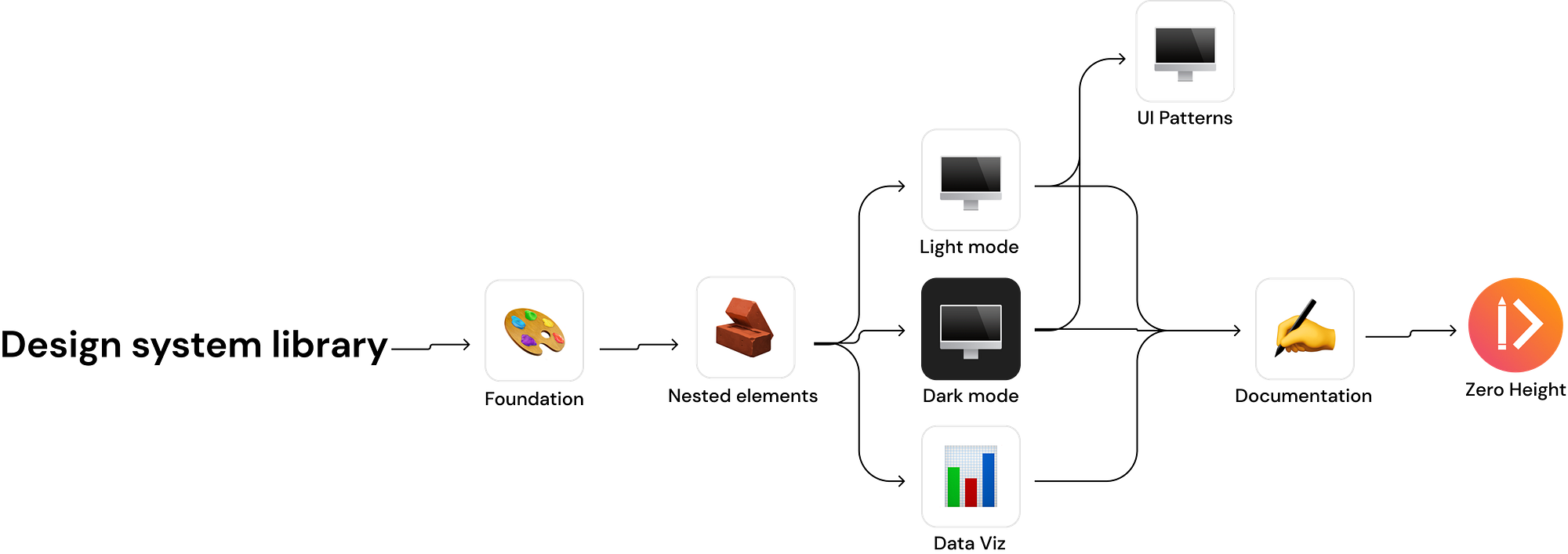
✅ We created both a UI Patterns and Data Visualization Figma file to house patterns and large organism components. This would help take large chunks of data from the light mode for web file.

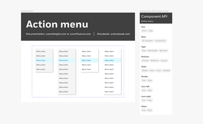
✅ We removed documentation from the core library and added links to our documentation in Zero Height, as well as added Component APIs to help designers quickly understand component structure.
✅ We migrated every component’s nested elements to a Nested Element file to reduce file memory and prevent designers from using them. This file would support both light mode and dark mode components.
Note: This file would not be activated as a design system library to pull assets from.

✅ We audited and removed master component’s hidden layers when migrating components to the new library.
✅ We audited components with near duplicate components and gave justifications for keeping or removing the duplicates.
In the case of the modal, we added a boolean property with the overlay to allow it to be a modal or non-modal so we could remove both the modal and non-modal components since they are so similar.
✅ We broke apart complex components for designers to have a larger variety when pulling components from the asset panel.
We broke our button into five components by hierarchy so all five button types appear in the asset panel and help with Figma performance.
In closing
Along with eliminating the bad practices we had in the previous library, I created the below file structure for our team to follow.
After migrating all components to our light mode for web file, the file memory clocked in at 0.3GB, which is about a 70% reduction from our original library. Of course, this file size will increase as we mature the library, but this puts us in a comfy spot to scale our design system.
This solution for me and my design system team’s file structure may not be the best solution for you and yours. Maybe the conventional design system file structure mentioned in the beginning works for you, and that’s great!
But being proactive about avoiding Figma file issues is something every Figma designer should do. We can all acknowledge bad habits we may practice in our Figma files, and avoid them moving forward.
May you delete all hidden layers and prevent a DEFCON 1 Figma file.
Helpful resources
‘Design system structure for teams, projects and files’ from Figma
- Offers guidance on what design system structure will work best for you and your design system team.
- Link: https://www.figma.com/community/file/985175703891677674
‘Move published components’ from Figma Help Center
- Provides step-by-step instructions on how to move master components without breaking instances & ruining existing designs.
- Link: https://help.figma.com/hc/en-us/articles/4404848314647-Move-published-components

