The challenge of skeuomorphic design & older technology
Reflecting the real-world is often a great way to communicate a button or icon’s function to the user. However, this can quickly break down when there is a fundamental difference in the way users view the world or relate to older technology.

In a recent article published by UX Collective, “The floppy disk Save icon: Visual language of an era long-gone”, author Scott Oliveri highlights a challenge with Skeumorphic design. The Save Icon may seem obvious and intuitive to most of us, yet for a huge number of younger users who have never handled, let alone seen, a floppy disc this icon has little relevance or any real-world association. As described by the Interaction Design Foundation…
Skeuomorphism is a term most often used in graphical user interface design to describe interface objects that mimic their real-world counterparts in how they appear and/or how the user can interact with them. A well-known example is the recycle bin icon used for discarding files. Skeuomorphism makes interface objects familiar to users by using concepts they recognize.
— Interaction Design Foundation
This doesn’t mean that there is something inherently wrong with skeuomorphism but merely that it becomes challenging for users when the real-world counterparts evolve past our previously agreed upon designs.
This reminded me of a TikTok (yes, I’m on TikTok) that demonstrated this phenomenon of different perspectives perfectly. Each person was asked how you would gesture to someone that you’re on the phone. This generated two very different and telling responses.

After I my picked my jaw off the ground it seemed fairly obvious as to why the younger person would use their full palm and not their thumb and pinky. After all, they grew up in a world with rectangular, glass smartphones while I remember learning to use the phone on a radial dial.
Although I soon moved on to using flip phones and smartphones, I never forgot what a phone used to be. So, when I saw the phone icon on the iPhone interface it just made sense. For the younger generation though, there isn’t this intuitive link. They first have to just learn the icon and its function, then make the connection to the real-world counterpart.

They first have to just learn the icon and its function, then make the connection to the real-world counterpart.
Of course, this is not evidence that younger users don’t know what a traditional phone looks like but rather it showcases how life experiences manifest in the ways we communicate. Whether it's through gestures or icons, we simplify the abstract through our own contexts and hope that it connects with others.
In fact, there is a huge portion of modern design that is reliant upon our understanding of older technology. Folders mimic manilla folders in a file cabinet, mail icons mimic envelopes, and camera icons mimic analog cameras. Here are some examples from the iOS icon set.
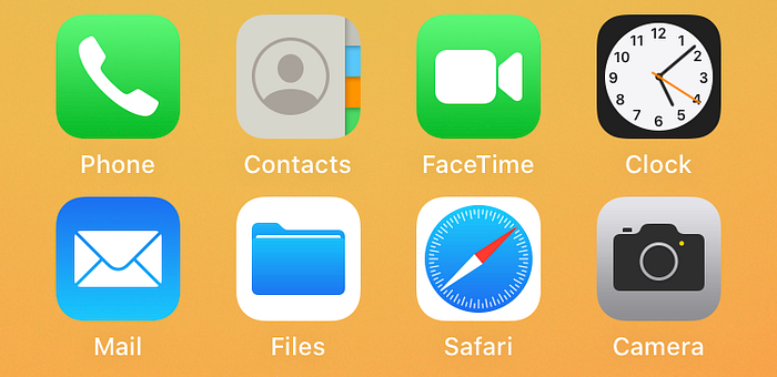
Note that these aren’t necessarily bad icons. In reality, most of them are really effective due to their strong correlation to the real-world. Additionally, many of these are so ingrained in our visual language that we just get used to them, and changing them could be even more confusing for users.
The challenge for designers is to design something that communicates across all contexts. Designers need to recognize their own blind spots and understand that there are users every day who are adopting modern technology, bringing their own life experiences and perspectives with them.
This doesn’t mean we need to change all of the icons that reference older technology. In reality, the strength of these icons might be in their distinguishable characteristics and consistency of use. As demonstrated by Scott’s article, finding a new icon for ‘save’ is not that easy. You end up getting something that looks more similar to a download or upload icon.
What we can say for sure is that the best skeuomorphic designs reference their real-world counterparts with minimalism in mind and evolves through the years. This gradual change is crucial to help users adjust to each new design. For example, the ‘pin’ in the Google Maps icon has changed significantly over the years.
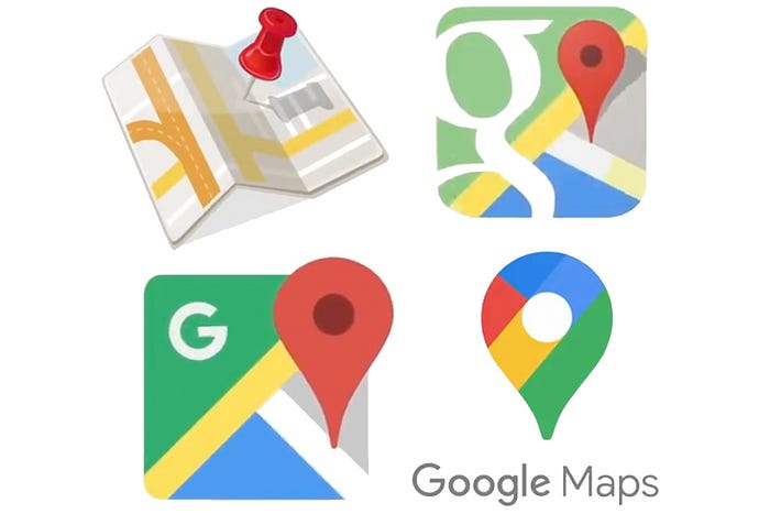
The app first started out as a much more literal reflection of the physical pins and fold-out maps. The pin then slowly evolved to be bigger, friendlier, and more inviting to the user while still coupling it with the physical map. Over the iterations we see the pin become the flagship marker of the app while the map becomes more abstract. What results is a minimalist icon that suggests the functions inside the app with only a small degree of association with the real world. Of course, this all didn’t happen at once. Gradually through the years as the technology and users evolved designers reevaluated their designs and tweaked them to better represent their functionality.
So as technology and users continue to evolve remember that your personal experiences may be very different from others. So much so that one day when you gesture that you’re on the phone, someone might think you’re about to go surfing.


