DESIGNING FOR EXPERTS 101 🦄
Over-complicated? Over-simplified? The UX Efficient Frontier


Designers:
We are not our users.
We are even less our expert users.
I’ve seen many candidates forget this important detail during our design interviews.
We usually show them a complex screen of our B2B financial products, used by financial advisers and investment experts, and ask them to explain the design process they’d recommend in order to improve the product. Some would then proclaim: “Wow there’s too much information, I’m pushing for a major redesign — I would never be able to use this.”
So… what about understanding users’ context…? I do not actually expect them to ever use a product like this. Not unless they intend to become financial experts someday.
Turns out, we all have the bias to think that all products are meant for us. In the team, we’ve made this mistake too (story here), I’ve been wondering why this bias is so prevalent in designers, compared to developers or project managers.
Is it because the vast majority of UX courses and bootcamps today don’t have time to task their students on complex topics like healthcare, education, and banking?
Is it because people prefer shiny Spotify or Deliveroo redesigns for their portfolio?
Is it because it is harder to define what good design is for expert users?… What are expert interfaces anyway?
Into the intimate world of expert interfaces
Behind every mainstream app, there is an advanced version for its expert users — for its “power users”, or for its internal employees. You don’t get to see this advanced version very often. Unless you are part of this intimate circle.
Take booking systems for example. Every good booking system today offers a simple and step-by-step booking experience… But what about travel agents who book tickets all day long?
Business professionals and employees don’t need to be spoonfed. Their job is to know how their work “works”.
See how different the 2 following screens are — both from Eurostar, a train railway company that operates between London and Paris. On the left, the interface for customers is kept very simple. On the right, however, the “behind-the-scenes” interface for Eurostar employees is much more compact:

Eurostar employees use this interface all day long and need to see detailed seat availability, inbound and outbound date combinations, currencies options… the list goes on. And they need to see all of it on a single screen so they can service customers efficiently.
Here’s another example from Societe Generale CIB, where I work:
We offer clients 2 different interfaces for their foreign exchange (FX) needs. One is for non-experts, the other one is for foreign exchange professionals. Both products use the same back-end systems but they are designed very differently.
Why? Because user contexts are so different.
Product 1: SG Markets MyFX
This product is for treasurers of small and medium enterprises in France. Everything is kept very simple, and users are supported step by step in the process. The experience is close to what you would expect from a neo-bank for your personal banking.
But what about treasurers of larger international companies, foreign exchange specialists, and our internal employees? They would be limited by such a simplified interface. They have to follow multiple currencies at the same time and deal with financial instruments. So instead, they use…
Product 2: SG Markets Foreign Exchange
Again, this one is for FX professionals and internal employees. Here our promise is to allow them to work efficiently and keep them in the flow of their work, to be professionals.
Unlike large consumer base products — that offer the simplest experience to the largest number — products for Experts or Employees have to be tailored to their specific professional usages.
Depending on the audience, the designers’ challenge is to find the sweet spot between the “not too simple” and “not too complicated”.
So how do we find that sweet spot?
Let’s call the UX Efficient Frontier to the rescue!
Introducing the UX Efficient Frontier
The initial concept of “Efficient Frontier” comes from a financial theory on managing efficient investments, while considering risks AND returns.
After working many years in B2B design, I realized that this concept can be adapted for UX to help design relevant products — while considering peoples’ business AND interface expertise.
But first, let’s clarify the differences.
Business expertise
Business expertise represents a person’s knowledge in an area or topic due to their studies, business training, or work experience. It also includes the mental models on how they approach their tasks and processes.
For example, most people in finance are quite literate in Excel and often expect to be able to manipulate data as efficiently as in Excel — something that can give cold sweats to designers!
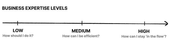
Interface expertise
The interface expertise is a person’s knowledge of how an interface works due to their training, habits of using it, or experience from using similar interfaces. As this increases so is their ability to recognize familiar interaction patterns, instead of having to analyze or recall from memory.

And now, if we plot the 2 together. …

- Any design above the curve is over-complicated: you are making it harder for the users to use your service.
- Any design below the curve is oversimplified: you are destroying user value and putting them at risk of not being able to do their work.
- The curve is the “UX efficient frontier”. It represents the sweet spot between your users’ business VS interface expertise.
Let’s have a closer look.
Understanding and using the Frontier
Here are some examples to better understand the curve and its shape:
Example 1: LOW interface expertise for LOW business expertise
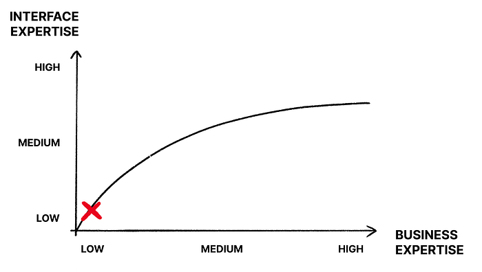
This is where most products with a large consumer base aim to be. Think of your consumer needs about getting food delivered, listening to music, booking a train ticket, etc., when you are not a food-chain management expert, music publisher, nor travel agent.
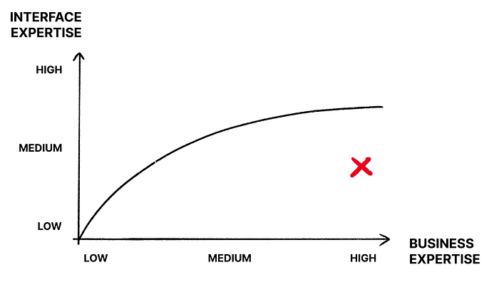
Example 2: HIGH interface expertise for MEDIUM business expertise
That’s the category where a lot of legacy tools fall into. They have been designed with the system in mind, not the users. Projects also assumed that business expertise meant interface expertise. End result: people are overwhelmed and complain about the complexity of the interfaces.
This is our bread-and-butter as a B2B design team. We constantly assess how to design the best experience for professional users while accommodating their business complexity.
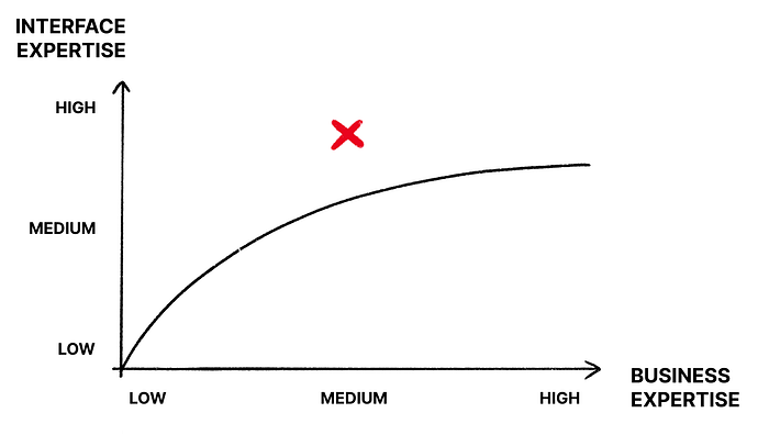
Example 3: LOW interface expertise for HIGH business expertise
Danger zone. The interface has been dumbed down too much. With the grand promise to make work easier and simple (and of course screens ‘sexier’), we’ve deprived our users of the useful parts and the control choices.
To me, this is by far the biggest challenge for designers who get thrown into a complex project with limited access to users. The risk is high that they’ll end up designing a black box.
As Don Norman said in his book and conferences on Living with complexity:
Life is complex and tools must match life.
This is why the frontier is a convex curve and not a linear line:
- People progress in life. You can start introducing advanced interface features such as shortcuts and keyboard navigation quite early on. Users with lower business expertise can ignore them until they become more proficient.
- People regress faster in their interface knowledge. Don’t design only for HIGH interface expertise levels. For example, don’t rely only on keyboard navigation. Even business experts forget how their tools work once on holiday — It’s already hard enough to remember your work password after a week off!
So what’s the conclusion of all this?
When I first talked about this theory at an event in 2018, I had no idea that this Design x Financial idea would lead me over the years to take a portfolio approach with our design projects.
Like in the original theory on risks and returns, we consider our users’ expertise levels and tackle projects differently depending on where we aim to be on the Frontier. The financial 2 products I mentioned earlier can be mapped like this:

The second product aims at covering a wider range of the Frontier. We address different levels of financial expertise with user settings, for example by allowing the display of additional financial data for advanced users.
In terms of product portfolio, we have different products to serve different user contexts. Perhaps ironically, it is thanks to our open architecture with the reuse of the same back-end systems that we became able to be user-focused — and less system-focused. We can now design and say that ‘efficient’ is not always simple, and ‘simple’ is not always efficient.
So more than ever, designers are needed to tame the complexity of life.
I hope this can help!
🦄