Member-only story
Can we make Pantone’s color of the year more accessible?

A lot of people seem to want to play with the Pantone colors of the year. Maybe these colors inspire more creative people. Or maybe it’s because it’s rare to get two of them. Note however that their use in the web, or digital assets, can have an impact on the accessibility of your creations.
In my article on Myths about color accessibility I tried to define accessibility as follows:
In our domain, Accessibility is the practice of making websites or application usable by as many people as possible. We often think it’s applicable to only people with disabilities, which is by definition the case, but it definitely benefits other groups of people in some specific cases or context.
Where user experience tend to satisfy a precise group of people, accessibility tends to include as many people as possible in a common good experience, but both are not mutually exclusive.
If you want better definition, this one isn’t necessarily the more explicit. I can invite you to read this post by Interaction Design to get a better big picture, and some concrete example on this topic by Nicholas.
Pantone 2021: The Colors
For those who have not followed the 2021 trends, here are the colors that Pantone has decided to highlight for this year.
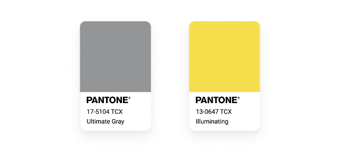
These 2 colors, for their technical definitions and their naming, are more simply grey (Ultimate Grey) and yellow (Illuminating), with, as parameters, the following equivalences:
- Grey:
— sRBG: 147, 149, 151
— Lab: 62, 0, -1
— Hex.: #939597 - Yellow:
— sRGB: 245, 223, 77
— Lab: 89, -3, 70
— Hex.: #F5DF4D
I talk about equivalence because the screen rendering and the original Pantone rendering have neither the same mode of creation nor the same synthesis. (Additive for the screen, Subtractive for the print).
Now that the presentations are made, I would like to show you how to compose an accessible color palette from these Pantones, with two main objectives: to offer you tools…


