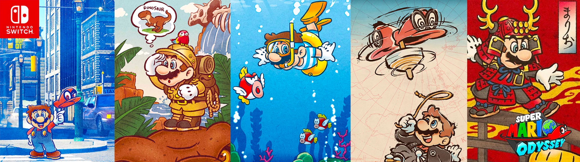
What Super Mario Odyssey taught me about UX Design (Part II)
This is the conclusory article in a two-part series. Here I discuss how feedback is designed in Nintendo’s 2017 Switch game — Super Mario Odyssey, and how we can implement similar practices in future UX design projects.
 While playing Super Mario Odyssey, I found myself asking an abundance of questions throughout the game — Am I on the right track? Did I collect that power-up item? Have I almost defeated the boss? A similar situation occurs while I’m using digital products — How do I ensure I clicked this button? Did I press the button? Was my email was successfully sent?
Our actions call for a reaction; a simple response from performing an interaction — whether the action was successful or not — goes a long way. This confirms to us that our actions were received by the system and is being acted upon.
We call this: Feedback
All About Feedback
Let’s unpack the term further — What is it and what purpose does it serve? Feedback is a core component of positive interaction and experience design for a number of reasons:
- Feedback indicates to users how they should interact with a product
- Communicates the results of a users action in a visible and understandable manner
- Allows users to feel in control of the system they’re using by highlighting the current context they’re in
Essentially, Feedback serves as a form of communication between our designs and users to help adjust their behaviour in a desired direction.
Feedback loops are everywhere
Outside of digital products and games, we experience feedback loops on a regular basis in our everyday environment.
Feedback is not solely confined to visual. Other modes include — the use of touch to communicate with users through haptic feedback, as well as audio feedback.
For instance, when we lock our car we expect to hear an audible clicking sound, or if you receive a call while your phone is on silent — we would receive haptic feedback through the devices’ vibrate mode, if activated. These are all modes of feedback which indicate to us that our actions have been detected by the system in use. In both day-to-day and digital product experiences alike — and we will soon see the same apply to games as well — feedback provides us with a sense of security and eliminates any form of misunderstanding.
Even the smallest of actions should produce an immediate reaction that is visible and understandable.
Feedback in Digital Products
Positive user experience and interaction design always has some kind of feedback. Take the classic example — Buttons. We most likely interact with them on a daily basis whether it is a button on the dishwasher, microwave, or on the UI of a mobile app; they’re responsible for communicating actions users can take. Aside from using appropriate visual signifiers to make the element look like a button such as colour, shape, size, etc. they should also be able to communicate clearly to users the result of any action.
Example #1 — Spotify
On the largest subscription music streaming service — Spotify, the iconic Spotify green Pause/Play button differs in appearance when in default, Normal state vs. Hover state. For the latter, there is a slight gradient and size change when the user hovers over the button. In this instance of feedback, the visual change indicates to the user that the button is ‘clickable’ and reinforces where the user is. Although only a slight change in its appearance, designing different button states is effective in providing feedback and clearly indicating what actions the user may complete.

Example #2 — DoorDash
Skeleton Screens — also known as temporary information carriers, offer a great alternative to traditional progress bars and animations. After I select my item and proceed to checkout, I am immediately met with a skeleton screen. This form of feedback indicates to me that the app is working on my request and that actual progress is being made.

Feedback in Super Mario Odyssey
As with the case for digital products, all interactions within games should have feedback associated with them. By have the system react to the player’s actions, they learn and understand the game better. On the flip side, without acknowledgment, an interaction can lead to an unnecessary repetition of actions and errors.
Natural, immediate feedback involving the perceptions such as haptic, visual, sound and other sensory experiences are very well present throughout Odyssey. For instance — a player’s joy-cons will rumble when treading certain grounds; this is haptic feedback hinting at a hidden Power Moon, an increase in scale when a mushroom is attained, or even the clink sound when a coin is collected.
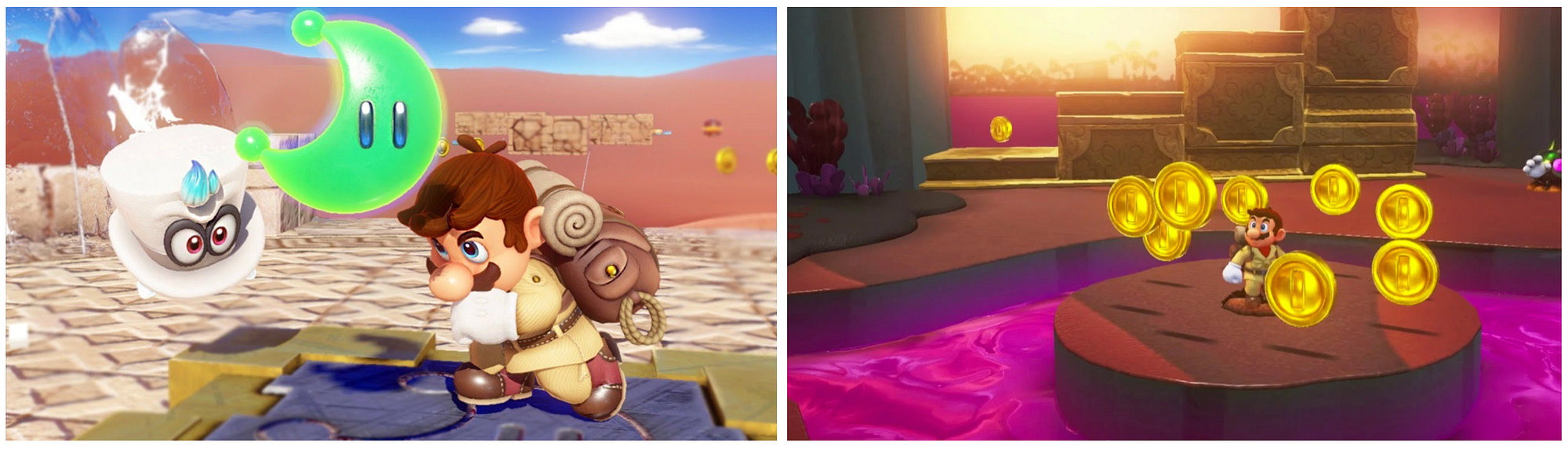
However, most admirable regarding the design of Odyssey’s feedback lies within that provided by our friendly ally — Cappy.

Feedback from Cappy
Throughout the gameplay, in both moments of triumph and demise Cappy is there to guide the player towards their goals. Feedback from Cappy comes in the form of ‘speech bubbles’ where he will tell you if you’ve missed a Power Moon in a specific area and even provide you with hints on how to tackle a Boss! Noteworthy is how tone, frequency and timing are considered with the feedback design.
Cappy delivers feedback in a tone where we feel we are being encouraged rather than bossed around
I recall Mario Party being the only series where Bosses are accompanied by health bars. Every other boss in the Super Mario franchise relies on visual cues as forms of feedback to indicate to the player that their attacks are effectively working. In Odyssey, when the player successfully attacks the Boss, there is typically a shift in its appearance and behaviour, or its abilities and mechanics are altered, typically ramped up from the previous.
So how do we give the players further concrete indication that their action was successful? Cappy provides conformational feedback. A simple statement — “That’ll teach you!” or “Just like that!” after an attack towards Bowser provides a sense of security to the player and encourages us to keep going. The player is ensured that they are a step closer to reaching the end of the Boss Battle.
Feedback is goal-oriented. It guides users to perform a desired action to ensure in return they find value within the product. As designers, we put thought into what the players motivations and goals within the game, and design feedback connected to that.
Successful onboarding provides them the resources and ability to accomplish those goals while informative and immediate feedback guides and steers players towards achieving those goals.

In digital products and games alike, error prevention is always ideal yet inevitable in most cases. In Odyssey, the players health bar gradually empties in response to incorrect contact with an enemy or harmful object. In this feedback loop, the player will understand the negative effects and learns to avoid the same action in future gameplay. Error handling design techniques in games are typically more intrusive, and serve more as a ‘warning’ whereas in digital products an error message or validation may be used to offer greater guidance and aid to correct the error.
In Odyssey, before corrective feedback is provided, players are given a chance to independently play the game. They are given the chance to draw out their pioneer spirit first and foremost. After all, games are meant to invite a challenge. Instances where the player flounders around the same area for a prolonged amount of time or repeatedly struggles to complete an objective, Cappy jumps in by providing some informative feedback to steer the player in the desired direction.

Frequency and timing here are key. Providing the player with feedback at too high of a frequency can lead to information saturation leading them to feel overwhelmed while on the other hand infrequent feedback may lead to errors and misunderstandings.
Notice the tone as well, it is encouraging and provides direction rather than punishing the player. In both digital products and games, the user or player would appreciate a helpful path away from error rather than being punished for incorrect actions.
Epilogue
Super Mario Odyssey is the epitome of what a top-notch game should be — fun, challenging, out-of-the-box. The Odyssey design team did an admirable job of placing themselves in the perspective of the players — they truly understand the players motivations and goals within the game and provide feedback that is meaningful, contextual and non-interruptive. Feedback is given to us in all the moments we would want and expect, it complements rather than complicates the overall experience. As UX product designers there are endless valuable takeaways from Odyssey we can to apply towards future projects.

Thank you for reading, I hope you enjoyed reading this two-part series as much as I did writing them. Part 1 is available here for your viewing, if you missed it! Please feel free to share your thoughts and improvements to this article. I’m always looking to learn more.
Power Moon update: 332/880

