Member-only story
Paypal unsolicited redesign – a UX case study
Why did we choose to redesign Paypal?

Paypal is one of the most famous services to exchange money via Internet, founded in 1999 and merged with Elon Musk’s x.com in 2000. Today is one of the most used ways to exchange money via internet.
We are Carolina Niglio, Edoardo Galati, Fabrizio D’Onofrio, Emanuele Agosta and this is why we decided to redesign the PayPal app.
We were all registered to PayPal to make transactions, but only one of us had the app. The first impressions were quite worrying. Even if we knew what PayPal does, we weren’t able to understand the flow and to build a conceptual model of the app.
“A conceptual model is the explanation, usually very simplified, of how a specific object works. […] They are often conceivable in the object itself.” — D. Norman
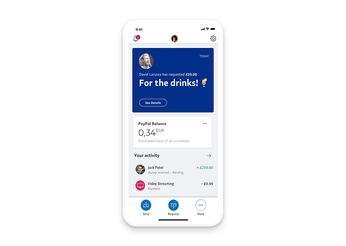
The main reason for this lack of intuitiveness is that the tab bar, which should be a clear representation of the app features and structure, and instead contains direct actions.

During the examination of the UX flow of the app we identified three main areas of attention for the user.
1. User profile and settings

Starting from the top the contents are:
- Notifications: they are identified with the ring bell icon but they look more like suggestions for using the app and profile configuration.
- Profile and settings: nonetheless close each other, they bring to the exact same screen, so there is no need to repeat.
2. Summary

The app launches on a screen where there are a lot of information about last transactions and balance, but they’re not displayed in a useful order. In fact, the first…

