Perception of color in the interface: why we see it differently
About inclusiveness in interfaces and how a designer should take into account the peculiarities of color vision

Hey! My name is Nikolai Komissarov, I lead the design team of Pulse (pulse.mail.ru) and media projects in VK, and I am also involved in social projects of the company.
Recently, while working on one of my products, I found that I see color differently than other people. If I look only with the right eye, the colors are more saturated, with the left they are dull, and if I look with both eyes, the color turns out to be medium in saturation.
In this article, I share basic information about the features of color vision, as well as useful tools and resources that I myself use. I would be glad if you continue the topic with your knowledge and cases in the comments!
Color, eye, brain: a bit of theory
A lot can depend on how a person sees and feels color: for example, his impression of the product, whether he will be comfortable interacting with it. This feature is not on the surface: if the interface as a whole is well thought out, convenient and pleasing to the eye, in most cases it will cope with its tasks anyway. And comparing two sites with similar content, users will choose the one where they are more comfortable — thanks to a well-developed UI.
But if you look a little deeper, it turns out: there are cases when two people perceive the same interface in completely different ways. This can be influenced by the peculiarities of color vision.
To understand all the problems, you need to have an idea of what color is and how it is perceived by the human eye.
Color is not a property of an object, but a feature of its perception. For example, in the daytime or under artificial lighting, all objects have a saturated color. But when the light level decreases, the color contrast also decreases — until all objects turn gray (for example, in the dead of night in the complete absence of light).

Color is perceived differently by us for a number of reasons. One of them is the features of the structure and work of the human eye.
There are special receptors in the retina of the eye: cones and rods, each person has an average of 7 and 130 million, respectively. The cones are responsible for color perception, while the rods are responsible for twilight and peripheral vision.
Rods are receptors for twilight vision. They always work, regardless of external conditions, and provide general visibility: thanks to them, we see the outlines and sizes of objects. Cones, on the other hand, actively work only in light conditions — and as it gets darker, the intensity of their work decreases, so objects appear gray.
In addition to the physical properties of the eye, the perception of color is influenced by the psycho-emotional state of a person and previous experience. That is, it is important not only what a person feels here and now, but also the emotions experienced in the past.
Causes of different perceptions of color
It turns out that the difference in the perception of the same color can be caused by several reasons:
- An uneven number of cones in the retina. The more cones a person has, the more shades he distinguishes. And there are also possible violations in the work of cones, then there are violations of color vision. We will name some of them below.
- Difference in lighting level. Visual interface elements are, in fact, pixels, consisting of three primary colors: red, blue and green. If these colors are combined or their intensity changes, they are also perceived in a new way. And they look the same only in absolutely identical conditions — for example, in the complete absence of lighting. If you add light, it will mix with the one that emits each element of the image, and the perception will change.
- Psychological characteristics of a person. Much depends on the brain. For example, if we see a lemon at night, then in fact it will be gray. But the brain is more likely to perceive it as yellow.
The context, experience and personal characteristics of the user affect how he sees the interface, but this is a separate extensive topic. In this article, I propose to take a closer look at physiological features and color vision disorders — and how they can be taken into account in UI design.
Color vision disorders
Such disorders are congenital and acquired. The latter are observed in various diseases of the retina and optic nerve, especially their atrophies. Sensitivity is reduced to all three primary colors: red, green and blue.
But also color vision can be weakened for individual colors — when the work of cones is disturbed. Then there are such disorders:
• protanopia — the user cannot perceive red color;
• deuteranopia — impaired perception of green;
• tritanopia — the user does not perceive blue;
• monochromacy — color vision is absent, only black and white perception is preserved.

How to adapt the interface for people with color vision impairments
Users with these disorders have impaired perception of one or more of the primary colors, and because of this, they do not distinguish between shades. Therefore, in an unadapted interface, the elements for them merge into a common mass — and it is difficult to understand and navigate something.
There is currently no cure for color blindness (color blindness) and other color vision disorders. But we, designers, can make interfaces more accessible — for example, by checking them for compliance with the WCAG standard before publishing.
WCAG (Web Content Accessibility Guidelines) is an international standard with general recommendations on how to make the Internet accessible to all users, including people with disabilities. The WCAG standard is used all over the world to minimize the difference in the perception of interface elements by different users. Here is the WCAG recommendation for non-text elements:
The contrast of interface components and graphical objects must be at least 3 :1 in relation to the surrounding colors.
Exceptions are allowed for minor elements — that is, images that are not very important for understanding the content.
How can a designer adapt the interface in practice:
- Provide high contrast elements (enough contrast specified in the WCAG standard). You can check the contrast level using Adobe Photoshop. And if you need to fix it, apply an adjustment layer or a Black & White filter to the finished layout.
- Highlight important elements with captions and additional graphic accents. The disadvantage of this method is the risk of overloading the interface, and then it will be harder for people without color blindness to perceive it.
- Creation of a separate topic for colorblind people. Time-consuming, but the most effective way to solve the problem.
Tools to help you work on interfaces
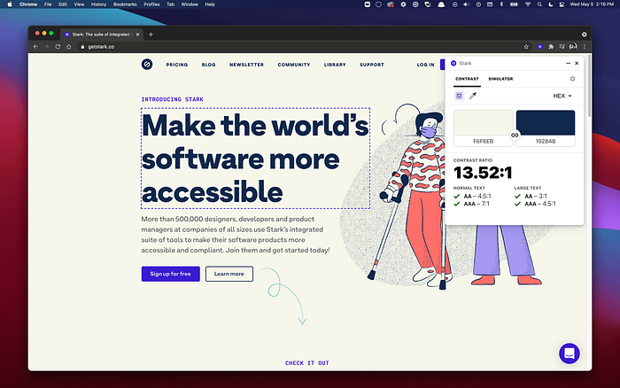
- Stark
There are options for different platforms and programs, such as the Figma plugin and the Google Chrome extension. Stark offers a set of tools: for example, to see the contrast ratio of elements relative to each other or to test the interface using simulators of various perceptual disorders.
- Adee Comprehensive Accessibility Tool
The Stark alternative is a currently free plugin for Figma. It can be a little buggy, but overall it does its job well. - Funkify
An extension for Google Chrome that will help you see interfaces through the eyes of visually impaired users. There are also some interesting simulators on the funkify.org website: for example, helping to understand how people with autism see the Internet.
Useful materials about inclusiveness in interfaces
→ [En] Considering color blindness in UX design (with five examples) — an article that became my starting point in studying this topic
→ [Ru, En] Color and its properties — an overview article on Wikipedia
→ [Ru, En] Color perception — Wikipedia article
→ [Ru] Color vision — article in the Great Medical Encyclopedia
→ [Ru] Violation of the perception of shades of red and green, red-green color blindness and total color blindness — an article from Zeiss, a manufacturer of optics and optoelectronics
→ [Ru] Emulation of visual impairments in Microsoft Edge — instructions for the tool
All these materials will help to delve into the topic and remember that the perception of color is an individual thing. We see color in the interface differently due to physiological, psycho-emotional characteristics, depending on the lighting and the quality of the monitor. Therefore, designers collect a knowledge base and use special tools to make interfaces more accessible to a significant part of users.
Thanks to Viktor Salomahin for the main picture for the article ✨