USER EXPERIENCE
Make your personas great again in 7 simple steps
Less decoration and random data — more focus and usefulness
Sometimes I think we, designers, have forgotten what personas are and what this method was created for over 35 years ago. I often hear from colleagues that personas are out-of-date, and such a trending framework as jobs-to-be-done is much better. However, there are no bad or good tools. When used right, any tool can be fruitful. This article is not about new things; it’s about going back to the roots.
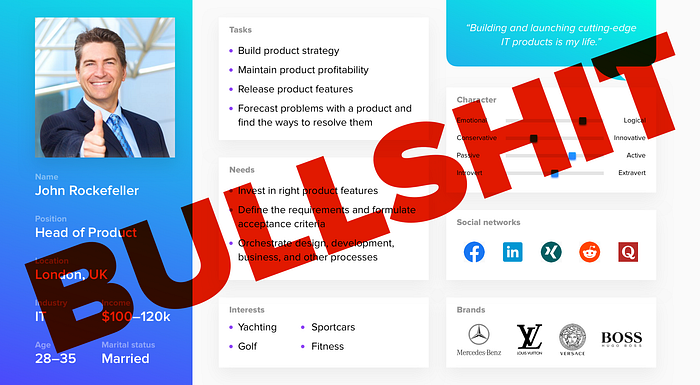
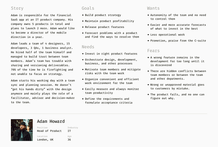
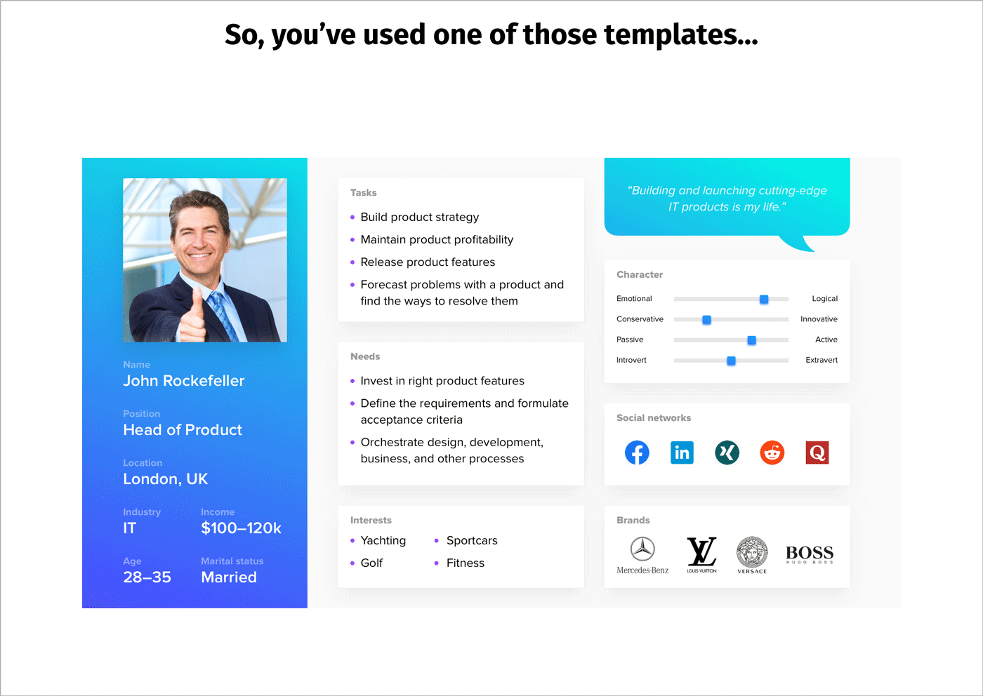
Step 0. So, you’ve used one of those templates…
Such a beautiful design deliverable, isn’t it? Not really.
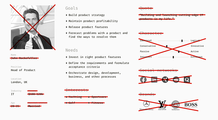
Step 1. Remove visual effects
A persona is a fictional character based on real UX research findings. It’s a vivid, concentrated image of people’s motives, behaviors, and goals. If you decorate it with shadows, gradients, and font styles, you run the risk of adding information that only looks important. Remove fanciness — and it’ll be easier to spot and mercilessly edit out all the bullshit.

Step 2. Delete irrelevant or made-up stuff
“Businessmen” stock photos, “quotes” from inspirational communities on Linkedin, funny persona names, and SEO terms (income, marital status, interests, brands) — all these bits of data usually don’t help to design an excellent service or product. Personas in UX aren’t marketing segments; they are behavioral models.
Just as a globe is a model of the Earth, a persona is a model of your user.
Step 3. Take the focus off demographics
Too much demographical data can make designers think stereotypically and attribute wrong traits to people (here’s more on representativeness heuristic bias). As a result, you make assumptions about people’s emotions and thoughts instead of observing and understanding their real-life behaviors.
Step 4. Tell a story
A frequently overlooked element is a story, which describes the way of thinking and background. If there is no story, a persona lacks tangibility and realism. People aren’t robots and often behave under the influence of unrelated circumstances. A story describes aspects that determine the usage of a product or service, which you are designing.
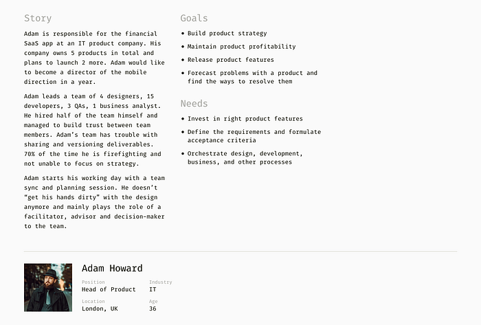
Step 5. Add more needs, wants, and fears
How many goals and needs have you written? Three? Four? Try finding more, and don’t forget about the fears and wants people might have mentioned during the interviews. This will help to understand not only business concerns but also personal perspectives.
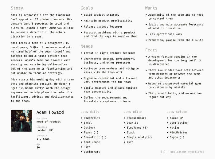
Step 6. Describe the relevant experience
If you are designing, for example, a software product, try listing the solutions a persona already uses and note how enjoyable that experience was. This section gives insights into people’s habits, things that don’t need fixing at all, and niches for something new.
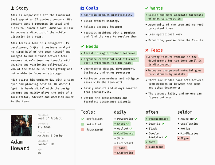
Step 7. Prioritize and emphasize
Finally, the fun part! When helpful content is ready, it’s time to put emphasis on the key points and make the document easier to read for the team. For instance, highlight the most crucial findings based on how significant they are to the people involved in the research.
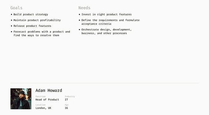
Look at the picture below and ask yourself: which one helps to make a design decision or to come up with a design hypothesis?
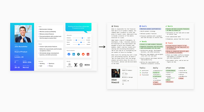
For me, the second one works better. For example, the size of Adam’s team and their current software environment helps to choose familiar interaction patterns. The “Needs,” “Fears,” and “Wants” sections are clues to the value proposition of a solution.
Summary
Let me make myself clear: all the recommendations above aren’t one-size-fits-all, and neither are they silver bullets. A persona is an evergreen document — it’s regularly improved and updated. I do encourage you to experiment further, and here are some ideas for the next steps.
- Develop a concise persona version for more accessible communication with non-designers and outside of the team.
- Track somewhere which data pieces from your personas have backed up a certain decision or hypothesis. Adjust personas correspondingly.
- Notice which information from personas aroused the most discussions and questions in your team. Explore these aspects more thoroughly.
Back to the roots
Of course, the steps above show a direction, not the ultimate recipe. And I didn’t focus on the basics, which are already explained many times in the books. So if you are interested in personas, feel free to explore the ideas of people who invented and developed this technique:
- “The Inmates Are Running the Asylum,” a book by Alan Cooper.
- “Designing for the Digital Age,” a book by Kim Goodwin.
- “Perfecting Your Personas,” an article by Kim Goodwin for Cooper Journal.
- “The Origin of Personas,” an article by Alan Cooper for Cooper Journal.
- “A Closer Look at Personas: Part 1 and Part 2,” articles by Shlomo Goltz for Smashing Magazine. An extensive reading list is included.
- “Just-Right Personas: How to Choose the Scope of Your Personas,” an article by Kim Flaherty for Nielsen Norman Group.
- “3 Persona Types: Lightweight, Qualitative, and Statistical,” an article by Page Laubheimer for Nielsen Norman Group.

