Pick the right fonts, damnit!
4 fonts rule over 70% of websites, and it’s not a good thing…

“95% of the information on the web is written language. It is only logical to say that a web designer should get good training in Typography.”
“Web Design is 95% Typography” By iA
Fonts are all around us. They’re also the main component of most websites.
As a curious - and really into fonts - designer I wanted to check the variety of fonts used online to see if designers take into consideration the importance of fonts.
To do so, I asked my talented CTO from Fonts Ninja to help me gather some data … We ended up analyzing fonts from 1.5 million websites 👨💻
We used our homemade Fonts DNA algorithm (the one we use on our browser extension) to identify what fonts were present on these websites.
The results were pretty clear… and alarming from a design perspective.
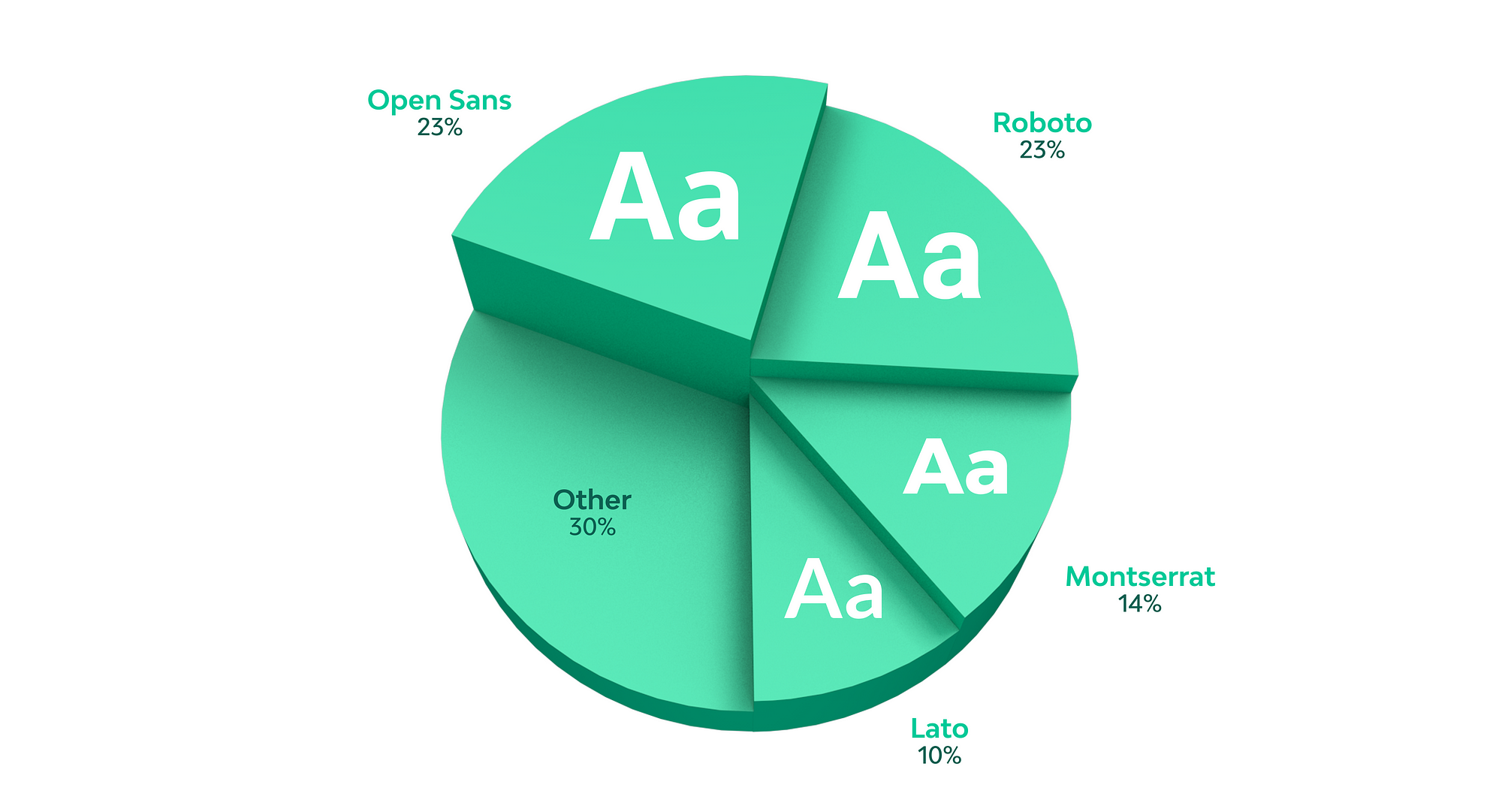
Only 4 fonts rule over 70% of websites we analyzed, and they’re all Google Fonts.
If you check some “best Google Fonts” articles, you’ll notice most of the time the same fonts make it to the list.
Google fonts are free, lots are nice, some are great, but there’s no way these 4 fonts are the best choice for every design.
It’s a designer’s job to pick the best font for each project.
As designers, we don’t use the same color over and over… it should be the same thing with fonts.
Why should we pay more attention to fonts?
Fonts have a business impact
That’s right, even if it’s hard to measure fonts’ direct ROI, as part of a brand identity, they’re really important. Don’t take my word for it, instead check this article from Mc Kinsey.
« Good design is good business. The revenue growth of top design performers was almost double that of their industry peers »
Of course, when talking about “design”, you get a lot of things in the mix, from design strategy to production. But defining a clear and good visual strategy will imply using the right fonts to define a brand’s identity and tone of voice.
Fonts are key to brand identity
“The way a company brands itself is everything — it will ultimately decide whether or not a business survives.” Richard Branson
Have you noticed how many logos are just made of fonts? No illustrations, just the right typeface. That’s how powerful a font could be to define a brand identity.

Even when they’re not the main element of a logo. Fonts define a huge part of brand identities.
Take Deliveroo’s website for example, when you replace their original font with Open Sans, their website became dull and interchangeable with anyone.
Their custom font (evolution of the Stratos font) makes their website easily recognizable and these bold and round characters seem joyful and fun, giving you this warm and welcoming feeling.

Fonts convey emotions and context
When you only consider the functional aspect of fonts, their readability, you’re only using half the power of a typeface.
Choosing a font only based on the fact that it’s readable, would be like randomly choosing any color because it’s not white. You have to consider how the right font could improve your product’s identity by adding context and personality.
That’s where fonts shine, they’re a subliminal introduction to a brand’s product, and the first thing people are going to notice (before even reading the actual text).

The logo is also meant to look young, fun, and unthreatening […] This was a prescient move — since Google unveiled this design in 2015, concerns about data privacy have reached a fever pitch. The Secret History of the Google Logo By Aja Frost
Need more proof? Check this experiment which demonstrates how a website could be perceived more or less trustworthy depending on the font you use.
Fonts stand out
Applications are more and more looking alike. With the emergence of UX studies, designers are more aware of good practices that make applications easier to use and learn.
But when most applications are using the same elements, colors, and grid… using the brand’s identity font makes a design unique and recognizable.

This is Dropbox’s iPad app. The default San Francisco system font gives you the feeling of “being at home”. But At the same time, they’re using the Sharp Grotesk to add more identity to their application.
Subtle but efficient, you know you’re using an app from Dropbox.
What’s keeping designers from using the perfect font for every project?
There are a lot of reasons why we don’t always pick the best font for a project, here’s some issues I gathered from my own experience and from fellow designers.
Discovering fonts
“I don’t know where to find new fonts 😭 “
That’s a huge issue. Discovering fonts is hard. While we’re working with Fonts Ninja on new solutions to help designers, you can find some inspiration here :
- Fonts Ninja for Chrome Our free browser extension let you identify fonts on websites and bookmark them (also available for Safari and Firefox).
- Typewolf Daily font inspiration website
- Font In Use Title says it all :)
- Behance/typography. A great mix of new fonts and font in use
Price (and clients)
“Why should I pay for fonts when I can use a Google font for free?”
I hear this a lot. It’s a legitimate question especially if you’re working for an early-stage startup that doesn’t have any cash to waste.
But keep in mind that the average price for one font style is $70. Most websites use 3 styles (same or different typefaces). It means the average cost of using the perfect fonts on a website is $210, which shouldn’t be an issue for most clients. Also, you can find a lot of fonts in the $30-$50 range.
In case you don’t have any budget for fonts, you can always turn to open-source fonts :
You can find more open-source foundries here : https://gitlab.com/raphaelbastide/libre-foundries
License
“I always choose an open source font because I’m not sure which license to get and I don’t want to infringe any licenses”
Probably one of the biggest issues for me. Licenses are a mess (I’m actually working on an article about it).
While there are no good solutions to compare font licenses (also working on that 😉), some foundries and distributors are working toward simplifying them.
- Font Spring A big font distributor, but pushing things forward with their “Worry-Free” license. Basically removing the Webfont quotas.
- Black Foundry Although the web license is not unlimited, you’ll be good as long as you don’t get more than 1 million visitors/month… this should give you enough to work with.
- Branding With Type Cool font catalog and no Webfont quotas.
- Swiss Typefaces An easy to use flexible license enforcing the “Desktop License” model. You’ll have to pay for the number of people installing the font (starting at a comfortable 10 workstations), and then you can make as many projects (print, web, …) as you want.
- Blaze Type Flexible license, similar to the one from Swiss Typeface.
- Newglyph This foundry takes it to the next level. They offer a global license (unlimited workstations, websites, app, …) for their standard and variable fonts. Which means you get a really sweet deal and huge design possibilities… and also you make the planet a better place. I told you fonts can make a difference 🙌
My point is …
Fonts are powerful. They’re not just some graphics designer’s gimmick.
Fonts are one of the best tool to create emotions and define a brand’s identity.
As designers, we have to pay special attention to them. It’s easy to get lazy and always pick the same fonts, but when doing so, we’re not working toward making the most out of our designs.
Of course, some clients will ask for the cheap alternative, but you know better: Their projects deserve better than a cheap “good enough” font.
Pay more attention to fonts and spend some time to educate your clients.
They will benefit from it… and so do you.
BTW, did you noticed this page uses 3 differents fonts and none of them were Google Fonts? 😉
I hope you enjoyed reading this and found it helpful. Follow me to read my next articles on typography and design.

