Preattentive attributes of visual perception and their application to data visualizations
Understanding preattentive visual properties can help you more effectively communicate what you want your data to show.
Have you ever noticed that when looking at representations of data, such as graphs or charts, your eyes seem drawn to certain parts of the image? For example, in the image above, maybe you first notice the leftward cluster of tall bars on the top two graphs. These properties that we are drawn to notice almost immediately are called preattentive attributes of visual perception.
Preattentive attributes are hard-wired within our visual systems, and apply to just about everything that we can visually perceive. This concept of preattentive visual properties can be applied to data visualizations in order to more effectively communicate what we want our data to show.
Before we dive in, it’s important to note that the list of preattentive properties described here is not exhaustive. Instead of describing every single property, we’ll focus on the ones that apply most directly to the creation of commonly used data visualizations.
In his book Information Visualization: Perception for Design, Colin Ware outlines the four categories of preattentive visual attributes: form, color, position, and motion. Let’s go through each one in more detail.
Preattentive Attribute #1: Form
The category of form generally encompasses the shape and dimensions of how your data is represented, both on their own and in relation to the rest of the data in your visualization.
The attributes of form include line length, line width, orientation, size, shape, curvature, enclosure, and blur.

Of the four categories of preattentive attributes, the category of form gives us the most options to work with. Writing for the data science blog DataScience.aero, Pablo Hernández explains the usefulness of the category of form: “The form category has many sub-attributes which can easily be used to either draw or reduce attention to a value/characteristic of a data set… Though size and length are usually the most used options in data visualization, consider other categories. You may be surprised at the infinite combinations of visualization options.”
Though most sub-attributes of form are good options to utilize, Hernández goes on to caution us on using variation in size/area to visualize data. “Keep in mind one tip”, he writes, “area is one of the worst ways that our brain receives data information as we find it very hard to compare size, even though we usually love pie charts!” Our relatively poor ability to discern differences in area, especially within circles, is one of the main reasons that experts in data visualization recommend against the use of pie charts.
Some of these attributes, such as line length as Hernández mentioned above, are already built-in to certain data visualizations. For example, in a bar chart, the category with the greatest value is naturally the bar with the greatest length. But we can use other attributes of form more intentionally to call attention to certain aspects of our visualization.
Below is a histogram of some dummy data, graphing a sample of 750 data points of retirement ages in Matplotlib. A few issues pop out: (1) the text is a bit blurry, which is distracting, (2) the lack of distinct borders or spacing between bars is unpleasant and makes it difficult to tell which age bracket each bar lines up to, and (3) the width of the bars do not properly line up to the age brackets themselves.

What do you notice in the graph above at first sight? The data is normally distributed, with a mean around 65, and a minimum and maximum around 55 and 75 respectively. The largest grouping of data contains around 200 data points.
Using the preattentive attributes of form, specifically blur, enclosure, and line width, we can greatly improve our data visualization. In the new histogram below, the blur of the text is reduced, so it’s no longer drawing our attention in a negative way. Enclosure and spacing are added to the bars, to make it easier to distinguish one bar from the next and see which age bracket each bar lines up to. Finally, the width of each bar has been reduced, making it possible to see more specifically where each grouping of data falls with respect to retirement age.

Do you notice more details in this histogram that you may have missed on the first one? We can still see all the basics that we outlined on the previous graph, but now we can see that there is an unexpectedly high frequency at 67. This could be something to look further into. We also see that the mode is 64, and we can approximate the frequency at any specific age of retirement. These are all nuances that we could not see with the first histogram.
It’s clear that the second graph more effectively visualizes our data in a way that is easy to analyze and interpret.
Preattentive Attribute #2: Color
The category of color includes the hue and intensity of the colors in your data visualization.

Using different hues can draw contrast between different parts of your data. Similarly, if you want one part of your visualization to stand out, the intensity of the colors in that section can be increased.
In the article “Perception in Visualization”, Christopher Healey of North Carolina State University writes on the concept of “feature hierarchy” to describe the use of preattentive attributes such as hue in multidimensional visualizations. “One promising strategy for multidimensional visualization”, he writes, “is to assign different visual features to different data attributes (i.e., building a data-feature mapping that maps data to a visual representation). This allows multiple data values to be shown simultaneously in a single image.”
In other words, the preattentive properties of form and color, for example, can be utilized to show multiple values (or in the case below, groups) of data simultaneously, where they might otherwise be difficult to pick up on.
Let’s take a look at another graph of dummy data, keeping this concept of feature hierarchy in mind. The line plot below shows a graph of some x variables with respect to some y variables.
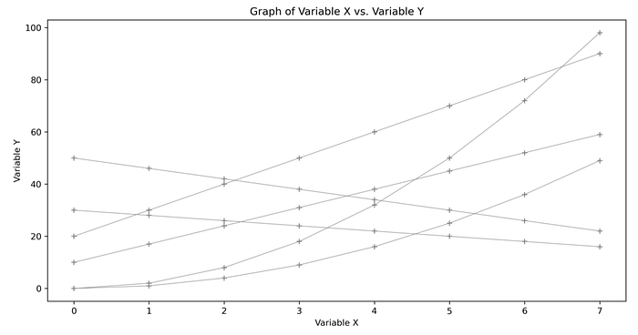
The lack of color in the graph and the uniformity of color intensity make it so none of the lines in particular stand out. But say there were actually three unique groups of data in this dataset that we wanted to highlight. In the histogram below, each group of two lines of data are shaded a different hue. Notice how much easier it is to tell the different groups apart now.
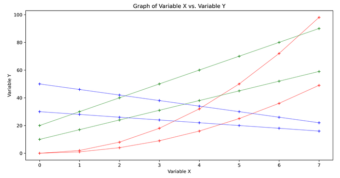
The three distinct groups are easier to pick up on in this graph because they have been mapped to the visual representation of hue (red, blue, and green).
Preattentive Attribute #3: Position
The category of position includes both the two-dimensional position of the data in your visualization, and the spacial grouping of your data points. Two-dimensional position can be thought of as where on your image a data point or points reside (low, high, off to the side, etc.). Spacial grouping can be thought of as how tightly or loosely packed a cluster of data is.
In the scatterplot below, the cluster of data around the bottom left stands out. It isn’t because of the form of the data — all the data points are the same size circles. Neither is it because of the coloring — the four different colors are quite evenly distributed throughout the graph. The bottom left stands out because the spacial grouping of the data is much tighter in that section of the graph than the rest of the graph.

Another element of the graph that may have stood out to you are the outlying green dots in the top right of the plot. The two-dimensional positions of these data points are especially distinct from the rest of the data.
Preattentive Attribute #4: Motion
The last category of preattentive visual attributes is motion, which consists of flicker and direction of motion.
Think of how quickly you notice a flickering traffic light, or the flicker of the turn signal of a driver in front of you.
Motion can also be brought into the two-dimensional realm—if the direction of the motion of an object is distinct from the direction of the objects around it, it will tend to draw our attention. Think of a crowd of people walking in the same direction, but one person walking the opposite way. That person will stand out amongst the crowd.
It’s less common that flicker and motion are utilized in data visualizations, both because they cannot be displayed in stationary mediums such as paper or images, and because they can easily be so conspicuous that it becomes distracting. In an article on preattentive attributes, the Interaction Design Foundation warns against the overuse of motion in visualizations: “Care should always be taken when employing motion in information visualizations and other designs. This is because the motion can rapidly become annoying or distracting from the rest of the information that is being presented.”
Despite its drawbacks, utilizing the attribute of motion may be something to consider if you want to draw special attention to a certain trend or insight in your visualization.
Takeaways
Keeping preattentive visual properties in mind when creating data visualizations can give us a toolkit to draw from so our data can tell the most compelling story. Here are some takeaways based on the concepts we’ve covered:
- Use the subcategories of form to make your visualization clearer, easier to interpret, and more detailed. Are line lengths and widths optimized for the rest of your graph? Can enclosure or blur be utilized to make certain text, bars or lines more distinct and clear? Does the orientation of your data feel natural, or strange?
- Use colors intentionally in your visualizations to draw contrast between different groups of data, or to represent a sequential progression by varying the hue and/or intensity of colors.
- Think about the messages that the positions and groupings of data in your visualization are sending. Can the axes of your graph, or the increments of the axes, be adjusted in order to paint a clearer picture?
- Consider if your data visualization could be improved by utilizing motion. Flicker and direction of motion can be powerful methods of grabbing attention. However, use motion sparingly as it comes with its own limitations.
Final Thoughts
The preattentive attributes of visual perception are going to be present in your data visualizations whether you are aware of them or not. Thinking consciously about whether they amplify the takeaways, insights and trends that you want your data to show, or whether they detract from them, can be the difference between an effective and an ineffective data visualization.
References and Further Readings
- Colin Ware. Information Visualization: Perception for Design. Morgan Kaufmann, San Francisco, CA, 2nd edition, 2004. https://www.researchgate.net/publication/224285723_Information_Visualization_Perception_for_Design_Second_Edition
- Pablo Hernández. Learn how the brain works for kick-ass visualisations!. https://datascience.aero/brain-data-visualization/
- Why you shouldn’t use pie charts. The University of Melbourne. https://scc.ms.unimelb.edu.au/resources/data-visualisation-and-exploration/no_pie-charts
- Christopher Healey. Perception in Visualization. https://www.csc2.ncsu.edu/faculty/healey/PP/#Sag_Science:85
- Preattentive Visual Properties and How to Use Them in Information Visualization. Interaction Design Foundation. https://www.interaction-design.org/literature/article/preattentive-visual-properties-and-how-to-use-them-in-information-visualization

