You're unable to read via this Friend Link since it's expired. Learn more
Member-only story
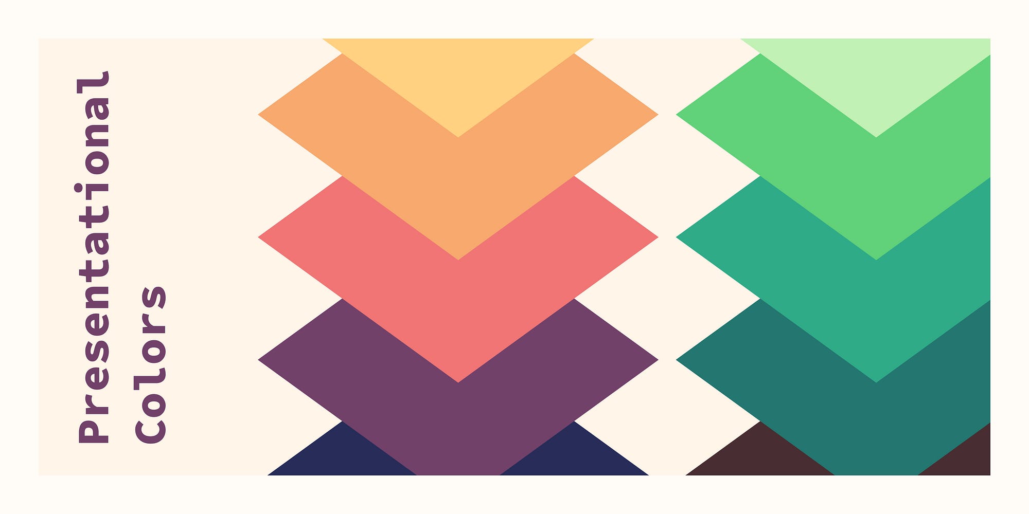
Presentational colors
Design tokens for data visualization and more
Presentational tokens bring the color into data visualisation¹ and customizable UI elements. They are the colors used for labels or folders and similar elements. What makes them specific in design token terms is, that they don’t have a semantic meaning. Unlike danger and success color tokens, presentational color tokens are used for anything.
However, unlike the base tokens in your color scales, presentational colors still change depending on the current theme. There may also be a need for a specific contrast between presentational colors. This makes them a specific edge case that sits between base tokens and semantic tokens².
What makes a presentational color?
Presentational colors are visually distinct. But they don’t have a specific meaning in the UI or company context.
They differentiate elements on a decorative level. For example, labels may use different colors to differentiate them better. This only works for people without cvd (color vision deficiency). In most cases, this is acceptable, as the color does not communicate any meaning. Users with cvd can still read the label text.
You should be able to exchange presentational colors without functionally affecting the UI. If you can’t it is not a presentational color.³
Use cases for presentational colors
Data visualization (dataviz) is arguably the most common use case for presentational colors. Up- and downwards trends normally use green⁴ and red⁵. Apart from this, we choose colors somewhat randomly to represent data.
This is actually beneficial for users with cvd. Since you don’t lose information if you see purely decorative colors in a different way⁶.
Tags, labels and other organisational elements like folders, lists or groups⁷ also use colors. Assigned at random or by the user, they help differentiate the items. While colors help quickly find what you are looking for, they are not essential.


