Presenting data visualization to engage your audience
As researchers, we need to communicate data in a way that makes sense to the audience. Naturally, the process and artifacts differ depending on the type of data. Sometimes, we play an audio clip from a user interview; other times, we create graphs for visual storytelling.
Recently, I partnered with a senior researcher (Priya Noel 👋) on a project where we visualized a good amount of data. To be purposely vague, we collaborated with Offering Managers to run a survey in order to better understand our customer profiles. The survey included 21 questions and we collected a total of 47 responses. Given that the stakeholders wanted not only the high-level summaries but also the opportunity to take a deep dive into the results, we decided that creating charts were the way to go. Showing charts would be much more efficient than walking the stakeholders through an Excel spreadsheet, since it alleviated the burden to read the entry in each row and mentally synthesize the information.
We ended up creating 26 charts which we used during the presentation to stakeholders. During the presentation, I noticed certain chart designs sparked more meaningful discussions, while the others caused more confusion than necessary. Here are my takeaways from this experience, which I’ll dive in individually in the following sections:
- Necessity. Think about if a chart is necessary at all
- Labels. Label everything. Titles, legend, series labels, and axis labels are the four basic elements you can (and arguably should) include
- Context. Provide context behind how the data is processed for each chart, so your audience has the right frame of reference
- Encodings. Be intentional about visual encodings
- Shneiderman. Follow Shneiderman’s mantra to explain a chart: “overview first, zoom and filter, then details on demand” (spoiler: this is probably my favorite takeaway)
Disclaimer: all the charts in this article are examples with made-up data. Opinions are my own and not the views of IBM.

(1/5) Think about if a chart is necessary at all.
We are ultimately responsible for getting our point across. During a presentation, it’s not the audience’s job to derive insights from a complicated graph. If we do create a chart, it’s a better bet to choose a representation that is easily understandable, unless the effort it takes to explain the chart is worth the reward and impact. This then implies that sometimes, it’s a better bet to not use a chart at all.
I spent hours on a network graph that ended up being more confusing than useful. I wanted to use the network graph to show that the relationship between entities A and B was much stronger than entities A and C. What ended up getting the point across was simply me saying, “A and B are xx% more likely to be used together than A and C.”

In summary, charts are there to support your point. They are not the point. Prioritize practicality; lose the chart if it’s ineffective.
(2/5) Label everything even when it seems blatantly obvious to you.
I think it’s much more efficient if someone can flip through my presentation deck without listening to me babbling for 30 minutes. This means when charts are involved, labels are crucial to making them self-explanatory. To make a deck standalone, it’s important to be thorough. Here are the basic elements that would help achieve that:
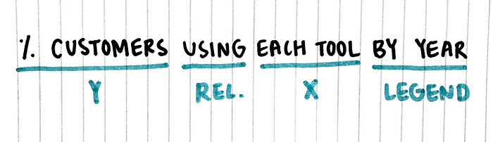
- Title. A concise summary explaining what the chart is showing. One way to go about writing a title is to state the axes, explain their relationship, and include additional information you might have in the legend. See example below.
- Series labels. These refer to the values of your data attributes. Whether or not to include them depends on the context; I’ve found it useful to include them anyway so I can easily call out the exact values when needed.
- Legend. If you’re using any visual encoding elements (colors, shapes, etc.), lay it out. This helps remove a lot of the “what am I looking at” or “what does the blue mean” questions.
- Axis labels. Describe your axes with words. There are two elements here: the name (e.g., % customers) and the category/value labels (e.g., 20%, 40%, 60%). If your value labels are in special units, mention them (e.g., “20” could be 20 counts, 20%, or 20K… you get the point). Proper labeling helps reduce miscommunications.
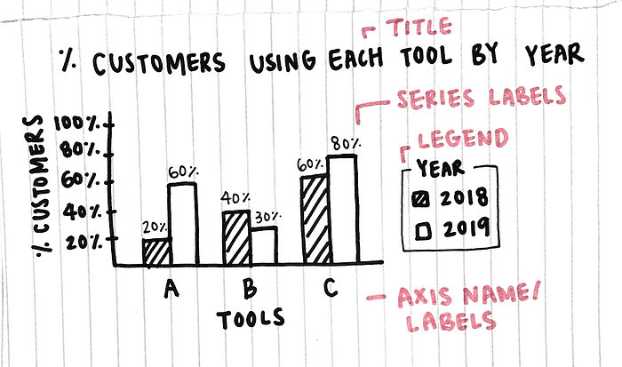
In summary, your charts are much more effective if they are self-explanatory. Label everything.
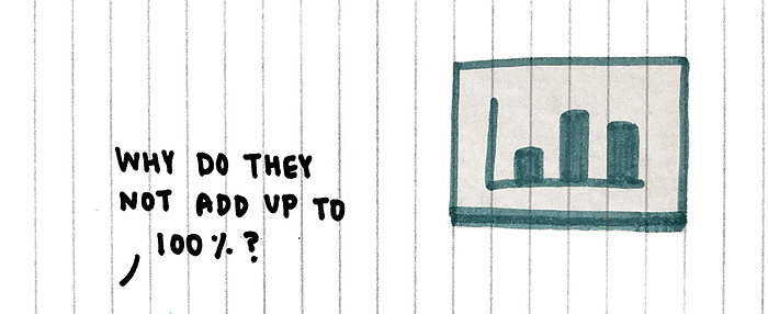
(3/5) Provide a brief overview on how you processed the chart data.
I found it really helpful to explain how we processed the data for a chart before diving into the details. This not only provides your audience with a glimpse of the process, it also helps clear potential confusions upfront. Some common questions I’ve answered include:
- Why do the numbers not add up to 100%? (Because it’s multi-select)
- Why did the sample size change? (It didn’t, I only excluded xx from the analysis because of xyz)
- How did you get this exact number? (I cross-referenced their answers between questions 3 and 4)
Again, it’s on us to mention these upfront so that the audience has the right frame of reference. This way, we can better engage them in the discussion, rather than allowing the lack of context occupy their attention.
In summary, explaining your process provides the audience with more context and a better sense of the chart they’re looking at.
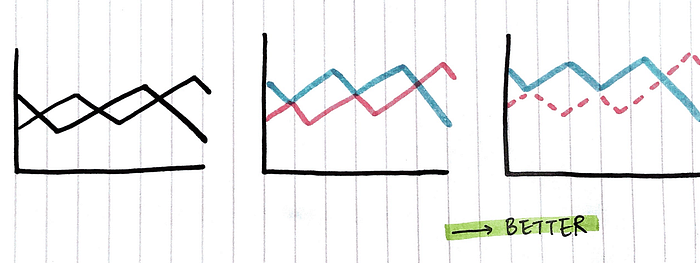
(4/5) Be intentional about visual encodings. Think Gestalt, visual hierarchy, and the implications of colors.
Many factors influence the way we perceive visual information; this isn’t anything new. The Gestalt Principles outline several: proximity, similarity, and closure, all of which can be applied to design (Eleana Gkogka wrote a great article on this). Jock MacKinlay, Technical Fellow at Tableau, also outlined several useful encodings for when we map data onto pixels: position, color saturation, density, to name a few.
Simply put, the way we play with spacing, texture, and colors can have a big impact on the understandability of a chart. Here are some concrete suggestions on designing your chart:
One. In a bar chart, leave the appropriate amount of spacing between columns, especially when the bars are grouped or stacked. Spacing helps communicate grouping.

Two. In a line chart, use at least one encoding to distinguish the lines (unless your visualization is interactive and allows the audience to do a quick hover for details). For static charts, the Gestalt principle of continuity is not always your friend here — if the lines intersect or show an unexpected trend, it becomes easy to misread the graph.
Three. When using colors to represent different levels of an ordinal variable, experiment with polarization: in saturation (e.g., muted to vibrant), hue (e.g., green to red), or brightness (e.g., dark to light). The natural progression helps with processing. Picking random colors — especially when the variable includes 4+ levels — becomes hard to keep track.
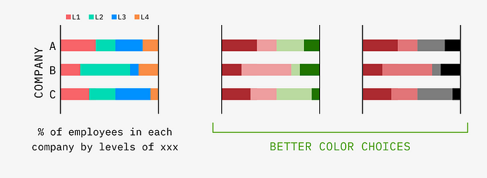
In summary, be intentional about how you use visual encodings. Spacing, colors, etc. can make or break a chart.
(5/5) Overview first, zoom and filter, then details on demand.
Ben Shneiderman, Professor at the University of Maryland, proposed this Visual Information-Seeking Mantra that explains how we engage with visualization. The idea is that we make sense of a visualization by trying to get an overview of what’s going on first, then zooming in/filtering out irrelevant pieces to focus on specific ones, and lastly, cueing up details. From breadth to depth, the information funnel feels almost like a reverse pyramid.
While the mantra is most often applied to interactive visualizations, we can still apply it to static charts, especially in a presentation format where we’d explain what the chart is showing. If there is something in a chart that you’d like to direct the audience’s attention to, follow these three steps:
- Overview first. Tell the audience what they’re looking at (basically, the title — e.g., “this is a plot showing companies by age and size. Each dot represents a specific company.”)
- Zoom and filter. Direct your audience’s attention to a specific portion of the chart. You can do this verbally or by adding visual cues such as colors, texture, and outlines (e.g., “see that dot in red”)
- Then details on demand. Give the details. What exactly is it showing? What are some other relevant information that might matter here? (e.g., “this dot is company xx… it’s interesting here because…”)

This is my favorite takeaway because it’s such a solid approach to guide the audience through a chart. As an anecdote, in school, one of the professors loved saying “Shneiderman without the c” (and he made sure we memorized the spelling by including his name as a question on the midterm exam).
In summary: overview first, zoom and filter, then details on demand.
Data visualizations, when done well, are a great artifact to engage your audience because it allows the audience to see what the data is showing without digging through SPSS or Excel. To summarize the article, here are my takeaways on creating/explaining data visualizations from doing this quantitative research project:
- Necessity. Think about if a chart is necessary at all
- Labels. Label everything. Titles, legend, series labels, and axis labels are the four basic elements you can (and arguably should) include
- Context. Provide context behind how the data is processed for each chart, so your audience has the right frame of reference
- Encodings. Be intentional about visual encodings
- Shneiderman. Follow Shneiderman’s mantra to explain a chart: “overview first, zoom and filter, then details on demand”
That’s all, folks! Thanks so much for reading.
References
- Carbon Design System by IBM
- Gestalt Principles in UI Design by Eleana Gkogka
- Automating the Design of Graphical Presentations of Relational Information by Jock Mackinlay
- The Eyes Have It: A Task by Data Type Taxonomy for Information Visualizations by Ben Shneiderman