Member-only story
Prevent component detaching in design system with slots
Empowering designers with guided freedom, balancing creativity and consistency in design systems

Long Story Short: Add slots — empty placeholder components — to strategic places in your design system components where users might need to insert additional content. When needed, design system users can select these slot layers and swap them with any desired element.
Core principles
Let’s start with a brief history: The concept of slots in design systems originated from the Web Components specification introduced by the W3C, where the <slot> element allowed developers to create flexible, reusable UI components. This idea was further popularized by frameworks like Vue.js, Svelte, and then React contributed indirectly with its use of children and render props, influencing how slots were conceptualized. From a design perspective, the concept of slots aligns with principles of modular design and atomic design, allowing creating flexible and scalable blocks.
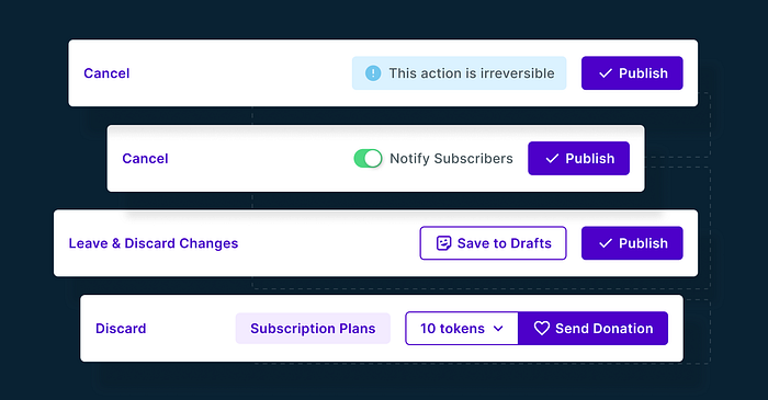
Imagine a Dialog Footer component in your Design System with a Cancel Button on the left and a Primary Button on the right. This is your standard layout. However, sometimes you might need to add extra elements like infographics, secondary buttons, or warning messages. These you don’t use very often, they are considered edge-cases.

Do you want to have all the edge-cases available in your design system? The answer is usually no. Even if you could anticipate all the edge-cases, it would significantly increase your memory footprint (how much Figma memory your design system consumes). Instead of publishing one modular component to your design system, you’d end up with a large set of variants that most your end-users (designers) won’t need. This approach will sooner or later overload your design system and bloat your end-users’ Figma files.
Instead of trying to include all possible variations in your design system, you can use Slots. A Slot is a component — often hidden, but sometimes visible — that can be easily replaced…


