Designing for suicidal users: preventing suicide the modern way
Every month, over half a million people in the US make suicide-related searches on Google. The automated response that is supposed to stop them and save lives feels lifeless.
This needs to change now.

Back in college, I was that 1 in 5 college students who suffer from anxiety and depression. Pressure from trying to get good grades, looking for jobs, relationships, and becoming an adult drowned me with worries (often innocuous ones now I look back).
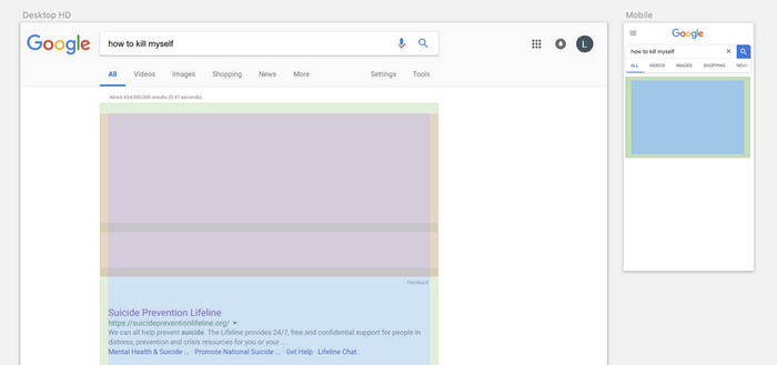
One time in junior year, I had a surprisingly exhausting day — one of those days when you’ve already completely filled up your calendar, but new meetings and problems endlessly show up. That night, I lied in bed overtired yet wide awake from paranoia. After failing to fall asleep for almost 3 hours, I got up and Googled,
“how to die easily”
And this is what I saw.


Let me make myself clear. Yes, I was mildly depressed but I wasn’t seriously suicidal. I was triggered mostly by twisted frustration (exacerbated by lack of sleep), than by an actual suicide ideation.
But even to me “You’re not alone, confidential help is available for free. Call 1–800–273–8255” sounded very much aloof and merely political. It’s as if someone was crying out for help, and you’re just flicking a name card of a therapist without even looking in their eyes.
Thankfully, I scoffed at it and eventually fell asleep. But to this day, I can’t imagine how frivolous the “support” must look to those who are actually desperate to end their lives. It was a lazy mechanical response with a bland sincerity like water.
1. The Problem
I survived. I am at a much better place now, but I simply couldn’t forget the lifelessness of the response that’s meant to save lives. I went back to see if anything had changed.

Unfortunately, they were still all variations of simply providing contact information of hotlines. The end-goal is to put a halt to suicidal thoughts and make users pick up their phone to call for further support. To reach this end-goal, users will have to
- Perceive the information and feel the need for help — At this stage, most people are already trapped deep in their dark emotional chambers. They’ll be among the hardest to impress, and a phone number wouldn’t mean anything to them. (barrier)
- Pick up the phone and dial — Physical constraint that just adds another step to the process. What if your phone is out of reach? (barrier)
- Stay on hold to get connected to a counselor — You’ll be greeted by a scripted automated message. To me, this always felt wildly impersonal, and I’ve actually hung up a couple of times before reaching a real person. (barrier!)
These users weren’t even asking for help in the first place. They were asking for ways to kill themselves. Passively offering an option to get help will not work. Instead, We must present something personal and relatable so that they feel that people care and help is always out there.
2. Looking at the numbers
I used a couple of search analytics tool to understand the extent of this issue.
Google Trends — Determine relevant keywords and their trends.
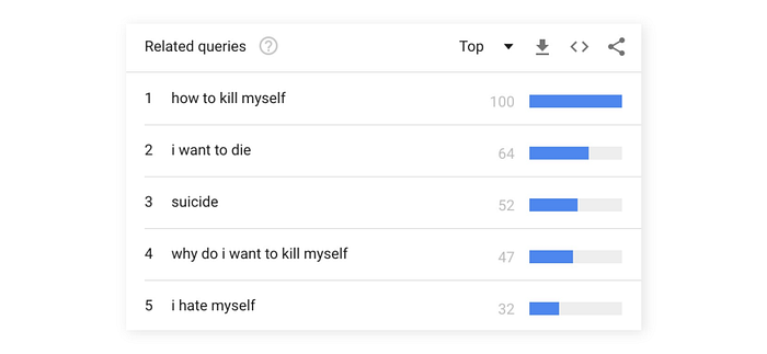
Google trends can be used to determine popularity of keywords. It also provides Related Topics and Queries, which came in handy when determining relevance and accuracy of keywords.
For example, the first trend I analyzed was quite obviously “suicide”. However, Related Topics and Queries for this term indicated that the outcome was influenced by viral trends such as Suicide Squad or the Logan Paul incident.
To rule these misleading results out, I chose more specific sentences like “how to commit suicide”, but Related Queries were still affected by popular media references, mostly about celebrities tragically ending their lives.
So I decided to entirely get rid of the term suicide, and went for “How to kill myself”. Bullseye, all Related Queries were about mental disorders and suicidal thoughts.
From this data, I retrieved ten most popular keywords that accurately represented suicidal searches. I combined these to plot a five-year trend for the ten keywords.
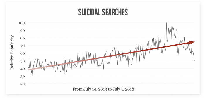
Without a doubt, depressed and suicidal searches were rising at a steady and alarming rate.
Ahrefs Keywords Explorer (AKE) — Find more keywords and exact statistics.
AKE is a fantastic tool to access exact search metrics.
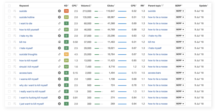
I first tested the metrics of 10 keywords I previously got from Google Trends. AKE showed that each of these keywords belonged to a broader parent topic such as ‘how to tie a noose’, ‘I hate my life’, and ‘kill me’. When I unfolded these parent topics, I got hundreds of child keywords that represented suicide and depression.
I then ran a combined analysis for all the related keywords.
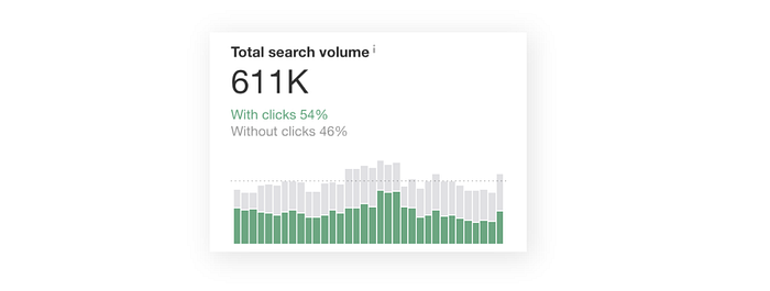
The result was absolutely devastating: 611,000 suicidal searches per month just in the US (that’s more than the entire population of Wyoming). What’s worse, only 40,000 users clicked on the first link (Suicide Prevention Lifeline). Although this doesn’t really tell much about conversion, a 6% click rate to a top suicide-prevention link seemed low enough to think that there is a better way to help people on the verge of making life-threatening decisions.

From a 2017 study, 89% of suicide attempt survivors said their actions were impulsive. 52% of the survivors said they would’ve reconsidered their actions had they received care and support.
Based on these chilling stats, it was evident that we cannot wait any longer to come up with something that would put brakes to impulsive suicide ideation, and guide people to reach out for help.
3. Inspiration
The first thing that popped into my head was an experimental suicide prevention project in Korea. There is a bridge in Seoul where people jump of almost every day to end their lives. One genius solution proposed by the city was to place banners with supportive quotes on the railings. Anyone who wants to jump over would have to read them.


Some of the quotes were by famous people, some were in narrative styles of close friends and family members such as “How are you doing buddy?”; “It’s a little cold out here today.”; “Did you eat anything yet?”
The city officials said “We didn’t want to barricade people. We wanted to turn their hearts around the right way.”
As you read the quotes and walk along the bridge, you will eventually reach an emergency phone booth where you can speak directly to a counsellor. From a UX design perspective, this was an ideal solution. The whole experience, from going up the bridge depressed to feeling supported and calling the hotline, was seamless.

Criticisms
One of the most important things about depression: Everyone has different problems, and an advice that works for one person might have an opposite effect for another.
Here are a couple of controversial phrases on the bridge.
- “Why don’t you go down and grab a cup of coffee with a friend”: Intended to give some peace with a casual routine — Would be detrimental to someone who doesn’t have many friends, or who has financial problems and can’t afford a cup of coffee.
- “This too shall pass. Think of it like a gust of wind”: Intended to tell people that problems are temporary and it gets better — Would be detrimental to people who suffer from incurable illness or insurmountable debt.
People were also concerned about the long-term effects and the extent of the project. The signs were indeed successful in faltering suicidal thoughts on top of that bridge. But it was unclear if people had ended up getting support afterwards. Without continuous therapy, suicide ideation can circle back at any time, and seeing the same quotes again might not be as effective as the first time. The experience was an instant painkiller, but not necessarily a cure to exterminate the virus.
Solution
Online search website would be a perfect platform to implement effective suicide prevention in which we persuade the users to get support. Needless to say, it will get more exposure than any other preventive methods. On top of that, with interactive and evolving content, we can recreate and enhance the seamless experience of the bridge project. Without any physical limitations, we can also present a much more personalized experience that targets individuals, solving chronic problems that many methods faced in the past.
4. Key Components

Identifying causes for suicide ideation to understand users
This is the first step to a personalized content. Know your enemies — identifying the causes will help us sympathize with users more.
According to a research conducted by the Korean Ministry of Health and Welfare, the leading cause for suicide attempt was mental illness (31%), followed by relationships (23%), arguments (14.1%), financial problems (10.5%), and physical health (7.5%).
I wrote down as many causes as I could from research and experience. I sorted them into five very broad categories, so that all victims can relate to at least one of them.
- Relationships (loss of loved ones, arguments…)
- Achievements (academics, career…)
- Society (gender inequality, sexual-identity, mid-life crisis…)
- Body & Mind (physical and mental health, addiction, violence…)
- Emotions (Feelings of guilt, regretful decisions…)
Conversational experience for interaction and engagement
The current automated interface feels impersonal because it is too uniform (besides the sterility of design).
An interface that reacts to users’ actions can give a sense of care and involvement. A sincere conversation, rather than a one-way display, would be much more effective in delivering a personalized message.
Universally effective quote to grab attention
To tone down suicidal thoughts on the first encounter, I needed a striking catchphrase that will at least temporarily hold back suicidal conviction and grab user’s attention.
The first quote focused on the fact that although death might seem like the best option, there will always be better ways with proper support.
“There’s always a better choice than taking your own life.”
This will also trigger curiosity — users will naturally want to stay engaged in the conversation to further explore the “better choice” mentioned in the quote.
The second quote actually came up as I was editing. It was inspired by lines from the original Deadpool comics (Special thanks to my colleague Cheongho for the suggestion).
In this particular scene, Deadpool saves a woman from jumping off a building using his iconic dark humor. When she comes down to the ground, she asks Deadpool to take her back home. Instead, Deadpool takes her to a counseling center and says,
“I’m smart enough to know I am dumb enough that I can’t help you. But they (pointing at the counseling center) can” — Wade Wilson, a.k.a. Deadpool.
This felt electric. I realized how inflated the first quote could sound. I (or the machine) am neither someone who properly understands people’s problems nor who can provide an answer. Search engine is simply a messenger that guides users to professionals who can actually solve their problems. With that, I thought the following quote would be much more appropriate.
“We are only a search engine, and cannot give you answers to your hardest questions. But we can help you get there.”
With a Socratic mindset of accepting the shortcomings, we can finally carve a path to professional help for the users, instead of senselessly providing unqualified advice. Accepting the imperfection can also make things look more friendly and approachable.
Personalized quotes to avoid misinterpretation
One big issue with the suicide prevention bridge in Korea was that the quotes weren’t always effective to everyone. We can avoid this by asking the users why they feel suicidal, and displaying different quotes depending on what the causes are.
Success stories to show that there is a better option than suicide
Even the same words will be more powerful when it comes from people who share similar experiences. Upon reading real life stories that users can relate to, they will want to know more about ways to get support and live through their tragedies just as the survivors did.
5. Design
Respecting Google’s design DNA
This is a redesign, not a new service that I am launching. One principle I value the most when redesigning an existing interface is respecting the original design principles. Design is never just about making it look pretty. Design is a manifestation of a company’s philosophy and core-values based on years of research and testing.
My initial plan was to have a full-screen display for a more immersive experience. However, I was well aware of Google’s cardview-like display for themed content and decided to be consistent with that. From Chrome’s developer tool, I studied the grid system of the search interface and simulated it in Sketch.
I also chose the original typeface used in Google’s search interface (Roboto). However, I customized font size and weight hoping that such small variations wouldn’t be too distracting.
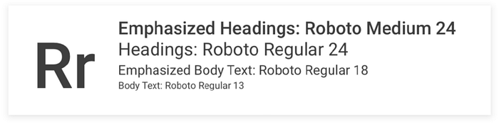
I selected symbols and icons from Google Material Design library to further pursue design consistency.

“Blue is the warmest color”
Just like the movie title (watch it if you want to cry your heart out), blue gives relaxation and is the most used color in mental therapy. Blue can reduce tension throughout the body and help people with anxiety and depression.
Considering our audience, I didn’t want to use shades of blue that were too aggressive. I chose a low saturated, dreamy but not hazy colors (summer sky in San Francisco) to soothe suicide ideation victims.
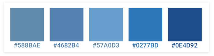
For buttons with emphasis, I used a color with slightly more saturation for better contrast.

6. Overall experience

Greetings
This is the first interface users will face and interact with upon a suicide-related search.
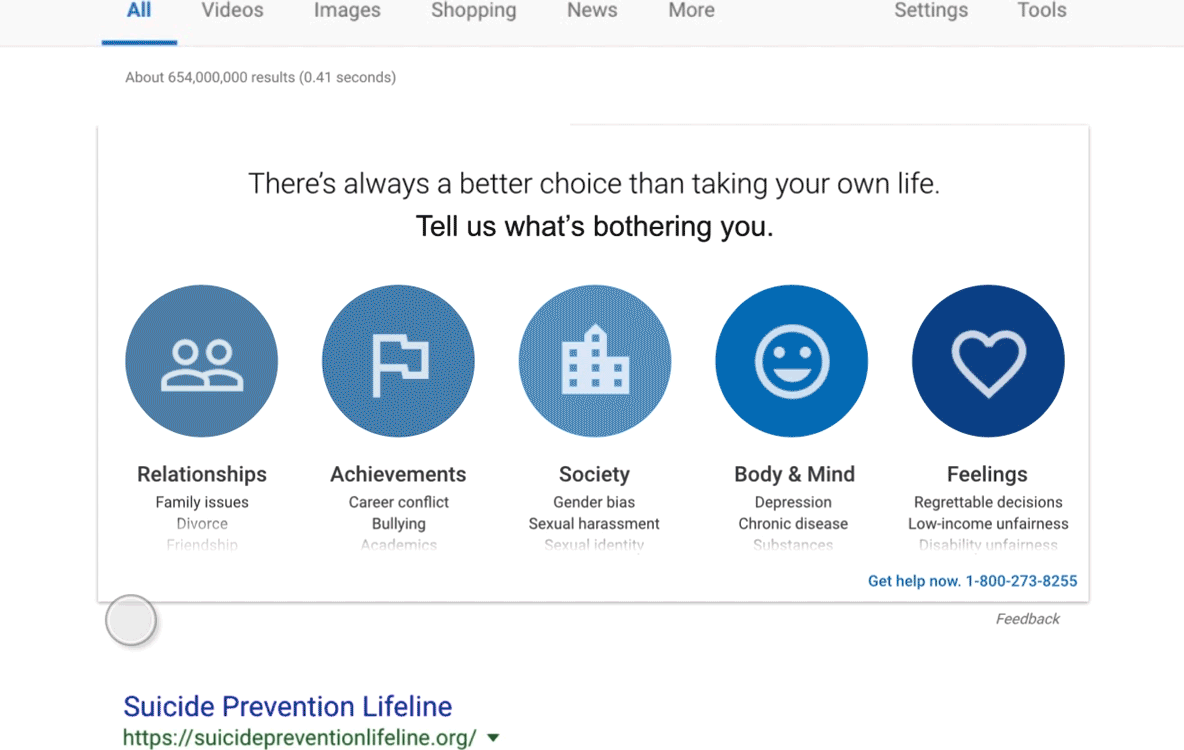
On the top will be a quote that grabs all users’ attention (1. There’s always a better choice…OR 2. We are only a search engine…), followed by a friendly question that asks to choose one of five main causes for suicidal thoughts. These are five very broad and vague categories, and detailed examples of each will slide up from the bottom when users hover on the icons. On the bottom-right, there will be a contact information so anyone can call for support at any time.
Icebreakers
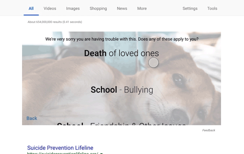
Within the chosen category, users will be asked to narrow down and specify their issues. If they don’t think they chose the right category, they can always go back to the beginning. If users don’t see a relatable case anywhere, they can select the final option “No, but I want to tell you more”. This will take them to a text-input interface where they can freely write about their issues, since I believe sharing issues out loud can always relieve stress to a certain extent.
Follow-up
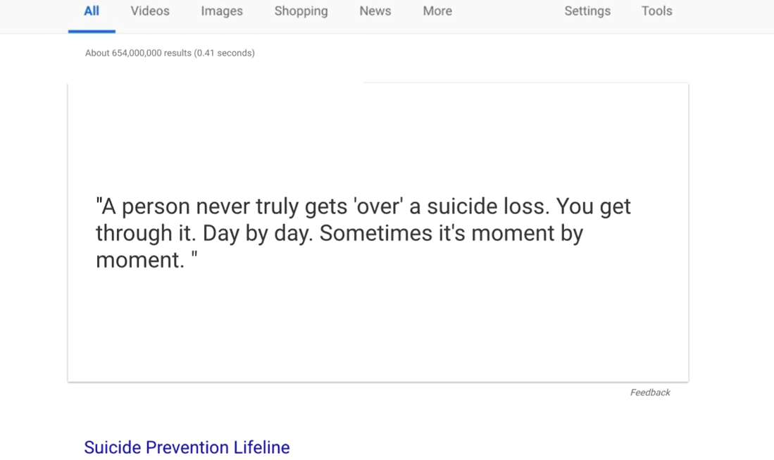
Based on the user’s choice in the previous step, a fully personalized content will be displayed with an inspirational quote and a survivor’s story. The experience will end with an emphasized contact information of suicide hotline.
(For users who selected “No, but I want to tell you more” option in the previous step, a safer and more general quote and story will be displayed instead.)
Demonstration
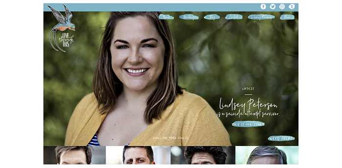
John, a college student, has failed all his exams and lost his scholarship. He can no longer pursue his education. Out of hope, John has had suicidal thoughts for almost a month. He finally thinks that nothing will ever get better, and looked up for ways to kill himself on Google.
7. Closing up and future plans
I wanted to design an automated response that was sincere and caring. Machines (at least for now) are not as sincere as humans. It was very important to accept this as it allowed me to focus on what machines are superior at — processing variables and displaying dynamic content. And when capabilities of machines and humans are properly utilized together, we can transcend physical limitations of previous suicide prevention methods and deliver sincereness to infinite number of people.
As a humble middleman between the dark side and the light, the new interface will guide hundreds of thousands of suicide ideation victims to the best bet we have — human support.
For the past couple of months, I gained knowledge on suicide simply from online resources. The project is nowhere near perfect, and I wouldn’t be surprised to find numerous flaws and fallacies.
But I think this is a good starting point. I would love to work closely with experts in psychology, design, HCI or any relevant field to talk about the shortcomings, discuss possible improvements, and hopefully save more lives.

