Member-only story
Principles of UI design: Alignment
How Medium successfully uses alignment to create structure and deliver a better reading experience

There are several principles of User Interface Design which construct each and every design composition. These principles include Balance, Hierarchy, Alignment, White Space, Contrast, Movement and Proportion. In this article, I intend to use Medium as a prime example of how to successfully employ the best use of the alignment principle.
Introducing Alignment
Alignment is the design theory which builds order, organisation, and as a by-product from successful implementation, improves readability. Composition alignment is often a subtle art and one which requires close attention to small detail, yet if delivered accurately, the distinction between a polished and non-polished interface is clear to see.
Alignment is often easily omitted as it’s one of the few design principles which is in fact invisible. Alignment is a hidden background process which is used to manipulate and position foreground active elements in a simple yet powerful way.
Alignment is especially important amongst publication sites and news platforms. If delivered successfully, alignment vastly improves the customer reading experience. I therefore intend to demonstrate how Medium have understood the intricacies of alignment within their user interface design in order to create structure and order throughout their site.
Vertical Alignment
It’s quite easy to confuse vertical and horizontal alignment as each refer to the opposite axis when thinking of the visual positioning of elements. Vertical alignment is when the placement of the top, centre and bottom elements align together on the same horizontal plane.
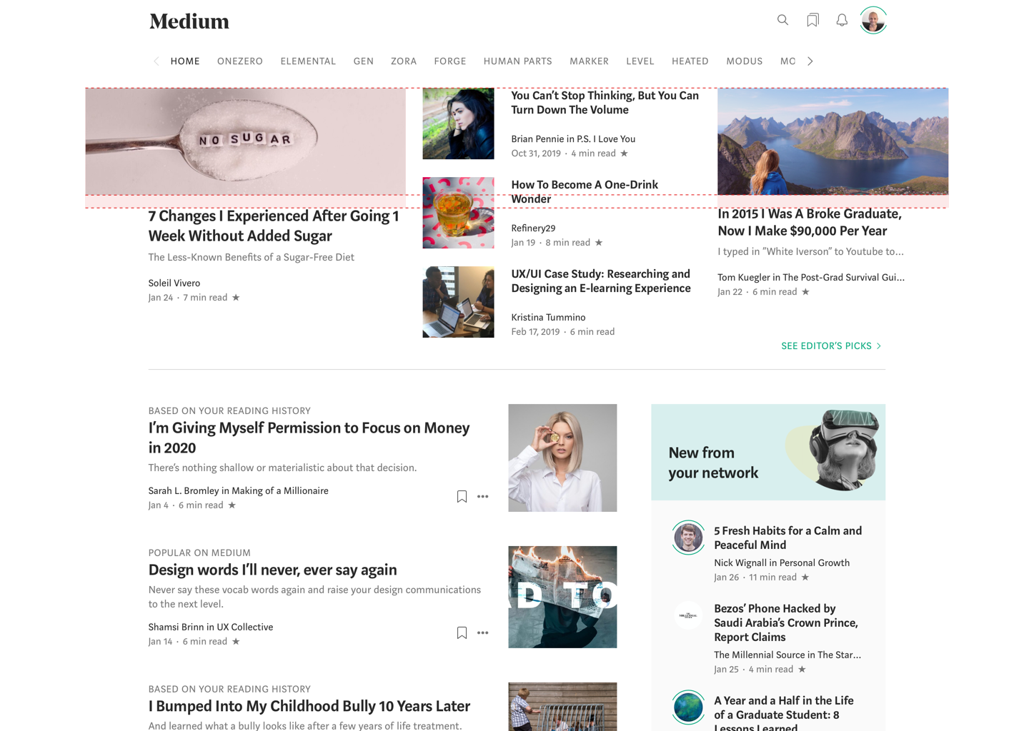
As you can see from above, the opposing left and right columns on Medium’s homepage use vertical alignment to align the top and bottom of each article image while each article title is also aligned on the same horizontal plane.