Designing a mobile bar drink menu — a UX case study
Dealing Room: Bar drink menu X Stock market conception

Introduction
Back in early June, in the full-stack programming boot camp that I was in, like the rest of the cohort, our team was tasked to ideate and pitch a feasible business idea in the form of a web/mobile application: from validating the idea, designing the application, developing and deploying to cloud, even to pitching to potential investors and headhunters, everything had to happen in less than a month.
Thankfully, this isn’t a lone-wolf suicidal mission: three other mates and I formed a team with very different backgrounds; hospitality, engineering, pharmacy and digital marketing.
The project was a massive victory for the entire team: we got offers from headhunters and clients expressing their interests in collaborations, not to mention this product is the very first product we’ve ever developed.
As such, I think it would be a good idea to turn this into a case study, to encapsulate our thought process on how to build an interesting product that people actually want.

For a better reading experience, this case study is arranged into six sections:
- Problem Defining & resource evaluation
- Research
- Ideation
- Branding
- Execution
- Pitching
1. Problem definition & resources evaluation
One of the perks of being a mentor at Startup Weekend is pitching isn’t a stranger to you anymore. An investment pitch isn’t about how many features does the new application will have, but how does the proposed idea will solve a current problem that is worth the effort. Of course, we shan’t forget the ultimate goal of the pitch is to spark interests and attract enquiries, it’s called a “pitch” instead of an “essay” for a reason.
Eventually, after taking the pitching requirement into consideration, we first came up with a rule of thumb on how to decide the direction of the final product. We avoided a good deal of arguments and disagreements by doing so, so to save us from breakdowns and waste of time on things that do not matter.
As a production team, our lives is wedged between a rock and a hard place. Stakeholders and investors on one side, real application users on the other side. Their interests usually do not lie on the same side, balancing the force is a dangerous mission only for the braves. In our case, instructors at our Bootcamp, investors and hires at our pitching event being the investment side, bar/restaurant owners and their customers being the other side.
With that in mind, the first thing we did was to address our constraints:
Constraints
- Time — 1 month to do’em all, ain’t nobody got time fo dat
- Knowledge and experience — 0 to none full-stack development experience prior to this project
Rationale
- Common topic — Topics like Lifestyle and F&B are more approachable because of the relatively low entry barrier
- Avoid reinventing the wheel — an exhaustive amount of knowledge and experiences are required to properly reinvent the wheel
With constraints and challenges in mind, we conclude that the objective of our team is to:
Ideate and develop a web application that intrigues investors interests, satisfy our users, yet the difficulty of execution is manageable for a team of newly trained full-stack developers.
Defining the problem
Encourage the purchase of slow-moving goods
“Slow moving goods” is the bane of retails and F&Bs. For most restaurants and bars, the responsibility of determining the stock intake usually lies on the shoulder of the chief/manager. However, tracing the reason of fluctuation can be daunting, and sometimes beyond comprehension. Back in my part-time days, through observation I realized that marketing trend, seasonal promotions, and even movie trends, any one of them can be the driving force of consumption. Pinning down the real reason behind the demand fluctuation is no piece of cake.
To ease the financial burden of overstocking, and the tragic of wasting perfectly edible-but-past-best-serving-time food, the least expensive way of solving the problem, isn’t building a blockchain-powered AI training model with a self-adjusting algorithm, instead to improve and optimize the decision-making process of our consumer. Offering external influences that are relatively unbiased towards the restaurant, encourage crowd decision making through users’ micro-transactions.
2. Research
Solving a question without understanding the question is a common mistake among businesses and startups. Having new ideas is highly encouraged, but one should never forget to understand their commitments before committing.
User’s persona
User: Millennials and people ageing from 21–35 who are looking for excitement while enjoying a good time with acquaintances, have a higher tolerance against price fluctuation. Prioritizing experience over justifying the value of their spending.
Insights
- Short interaction interval between users and the application
- The application should only act as a dining experience enhancer
- Dark background operates better in a dim environment
- Users are mostly seeking gratification instead of information processing
Knowing this, we set out to find how we could encourage purchase at the fingertips of the users, one whose focus was to have a good time instead of making the perfect order for the table.
Current pain point
Bar/restaurant customers:
- Want some sound suggestion when making the order
Bar/restaurant owners and managers:
- Left with pushy/traditional/biased promotion method to influence sales
- E.g. discounts, group buys, today’s special, etc
Current Offerings
The idea of combining the idea of a stock market and the bar/restaurant menu is not new, however, the idea of group peer micro-transactions seems to be the answer to our question.
Since this business model is still relatively unpopular, which means solid improvements are relatively easy and less expensive to achieve, comparing to other highly competitive fields like social media and blockchains.
3. Ideation
User case
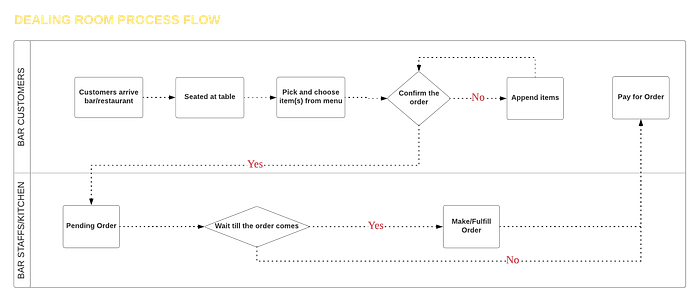
We mapped out the critical path (necessary steps required to complete the goal of the application) of the users and use it to help determine the layout of the design.
To be more specific, we rank each node with a score, where the score is a combinational score of the importance and the rate of exposure of the node. In our case, “Pick and choose items from the menu”, “confirming order”, “Pay for order” are the necessary nodes, we ranked them the highest. The result of that is those three nodes now have become pages that are accessible directly from our bottom menu. The lowers ranks are nested under pages and layouts that are relevant to the flow.
Defining Features

Under regular development circumstances, the features of an application should be determined by the feedback of the users; observe and invest in how the users interact with the mock application, record their thoughts and instinctive feedbacks, in order to formulate and prioritize the feature backlog.
However, an investment pitch with an actual product demonstration is just as hard as winning a Wimbledon without ever touching a racket. After a bit of a struggle, we’ve decided to take a different approach, where we skipped the investment phase by hypothesizing our environmental inputs.
After a half-day Sprint session, our team collected features that intrigue us, and condense them into a Post-it matrix. The matrix was inspired by the Google Venture — Design Sprint, and the job tree of my beloved game “Final Fantasy Tactic, where the matrix is consist of the following elements:

- Short (<8 words) description of the idea
- Prerequisite of the feature (What needs to be done to acquire this feature)
- The consequence of the feature (What does this feature give birth to)
- Level of difficulty (How hard is it to add a button… says the clients)
- Estimate of time (How long is it going to take to complete the feature)
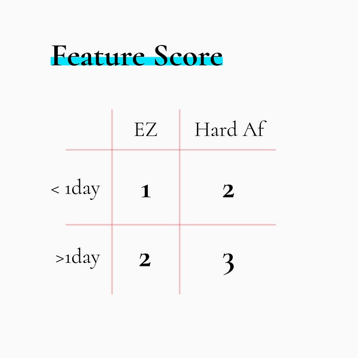
The goal of this matrix is to balance the cost of development and the satisfaction of the solution, even the best idea on the world requires on-point execution to make things happen. After working with different teams and in various projects, the phrase “enough resource” is nothing but a myth. Victory only belongs to those who understand their own limitation as well as the challenge.
Know thy self, know thy enemy. A thousand battles, a thousand victories.
We want the features to be relevant to the applications’ vision and goal, yet suffice to demonstrate our skills as a full-stack developer without drowning our audiences with geeky tech-specific details.
4. Branding
Even it’s merely a simple guideline, it still plays a critical part of product development. The guideline unifies the style of expressions at telling a story, which in our case is the web application that we were building. It is extremely difficult for me to imagine the first 3 books of the Harry Potter series is written in Old English, and the rest of the series with modern slang and colloquial like “dank af”. Also, it helps everyone on the team to better visualize what the vision of the product is. It’s improbable to tell a story without knowing where the story is going, especially when you are only one of the many authors.
In retrospect, we could’ve done a more extensive design system that enlisted the style of each component, with the help of design system documentation applications like UXPin.
Logo

If you ever had the experience in starting a small business or designing a company’s new logo, you’ll realize logo design is one of the trickest bottlenecks of all times. Designing and committing to a logo is almost like marrying your daughter, everything about the fiancee is a bloody mistake.
Also, the variety of designs for logos are like lipstick colours to men, most of us can’t tell the difference, but we get smitten when we chose the wrong one.
So when it comes to picking/designing the direction for a logo, the only criteria that I have are:
- A symbolical reminder of what your business is really about
- A subliminal injection of the impression of your business
Without a doubt, the final production of the design should be satisfied with the right amount of skill level and sophistication. It is extremely difficult to imagine Facebook or Prada order their logo on Fiverr in the ghetto.
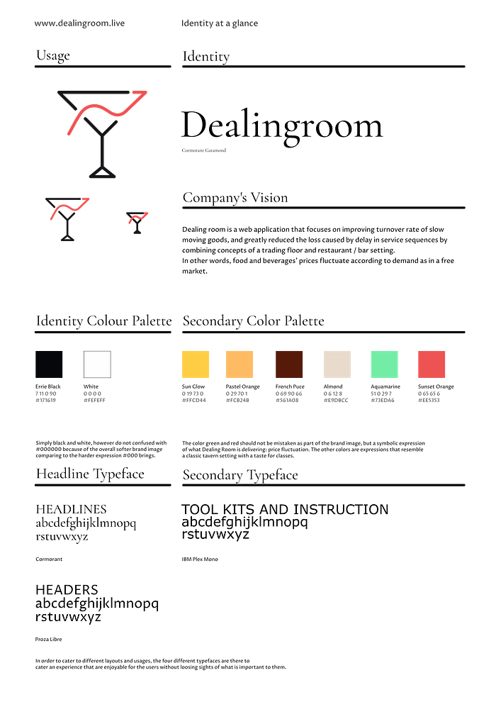
With keywords like “drinks”, “bar”, “stock market”, “ups-and-downs” in mind, and a bit of tinkering, we came up with a logo design where one side of a Martini glass is replaced with the sparkline of the stock market.
Colour and Impression
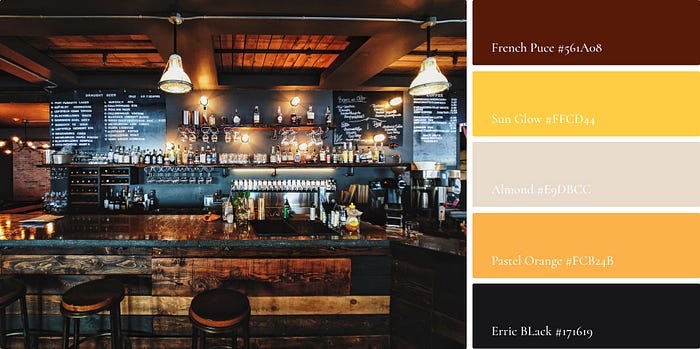
Taking the user and the environmental input into account, the impression of the brand should be a mixture of subtle, classy, interesting, with a hint of excitement. A slightly off-black and off-white makes a great contrast to make the menu and text pop, especially when the users will be using the application in dimmer rooms.
We took Orange, Gold, Puce and a fade Almond to recreate the impression of a classy whisky bar, with a well-mannered bartender serving you a glass of Glenfiddich 15-yr old single malt Whisky on rock, while the band on the corner is dancing your mood with their smoothest blue-jazz.
The green and the red are also part of the identity is because the stock market is also a major part of the application, where red and green indicates the bear and bull market.
When designing a design system, it’s always a good idea to anticipate different cases where the application might encounter.
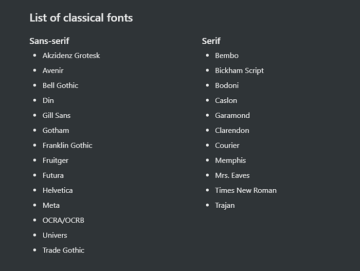
Typography
Picking different typeface can be quite a headache from time to time. There is no rule on how many typefaces one should use in a single application, as long as they serve their purpose well.
In the project, we used three different typefaces: Cormorant being the accent, Proza Libre being the main body text and IBM Plex Mono for tooltips and instructions.
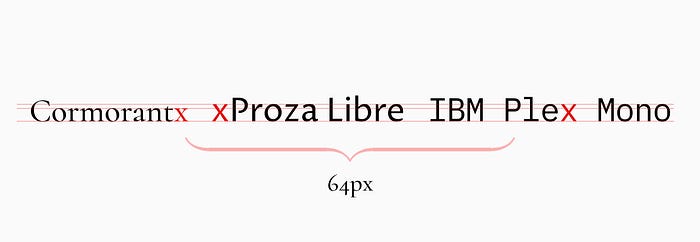
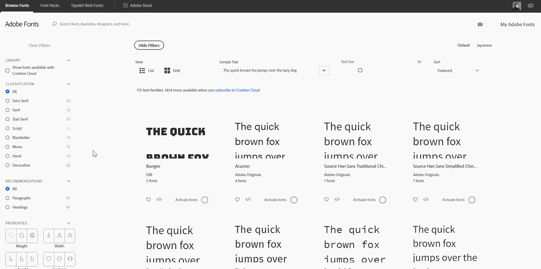
In retrospect, while choosing typefaces for your application or website, it’s highly preferable to opt for typefaces that share the same x-height. Meaning, pairing typefaces that their lowercase “x” shares the same height because they are like cousins in visuals, where familiarity are less difficult to match with each other. There are tools that make the research much easier; Adobe Font offers a free filtered font search for its users, allowing them to find out what fonts share the same x-height without Photoshops and rulers on screens.
The reason behind picking Proza Libre as our body text is because of the distinctive difference between uppercase and lowercase. Also, a stroke style that is heavily influenced by broad-nib pen, calls for a better fit with the harsh reading environment as well as the desire to portrait a lighthearted, chill impression. One can imagine our users reading the drink menu under the jazz-mood lighting while trying to figure out, which magic potion should they get to help them escape from the stone-cold reality.
Tips for starters: One of my favourite modern designer Chris Do, the founder of “The Future”, suggested a list of typefaces for those who still haven’t master the art of typefaces.
5. Production
Task Management

Development phase was less than 3 weeks in total, in order to allow the team to work around their own schedule without falling off from other team members’ progress, Trello served as our single source of truth for progress checking and updating. Especially when you and your team don’t want to waste 2hrs on reporting progresses every day, task management system like Trello, Notion or even Monday is definitely the way to go.
Hi-fi prototyping and rationale
UX design isn’t black magic or unicorn per se, but a combination of research, understanding the audiences and use case, sympathetic thinking and prioritization of information presentation.
When an infinite amount of options are presented, usually the process of decision making is paralyzed by the overwhelming amount of possibilities, making it an unpleasant process. Human makes their decisions based on the urgency and the severity of consequences, this is one of the reasons why marketing campaign with a “branded” time limit usually generates more sales than a regular season discount.

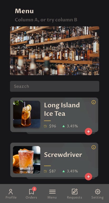
To approach the design with a dash more of understanding and a little less of mere gut feelings, we split our information cluster and call-to-actions into three priority tiers: “high”, “medium”, and “low”. The rule of thumb is to only have 1~2 “high”, to help the user to focus on their priorities as much as possible.
There are different ways of handling the “medium” and “low”. We design that the “medium” as a trigger/access key to connect to our “low”. The detail of the item on the menu and the performance is an information cluster that does not get access as much. Imagine this, when was the last time you went into a restaurant, and the first thing is to start reading their recipes and their sales performance. However, the existence of the performance of each item shall become a key decision factor along with the price fluctuation when the same information cluster has made available to the users.


Note: Click here for the project prototype on Figma
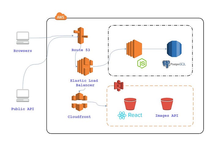
FYI: Full-stack implementation
6. Pitching
Presenting the idea in front of investors and headhunters were challenging yet engaging: feedbacks from different perspectives was not only intriguing but also it helps us to see what we’ve missed through bootstrapping the idea. It was definitely a pleasant surprise to see the crowd receive our concept so well.
After rounds of feedbacks after the presentation, we consolidated the ideas and feedbacks into different phases of implementations if this project were pursued.
Afterwords
The experiences that I gain from working as a translator/digital marketer, and being genuinely curious about human-centric designs helped me gained a solid start. Understand that the product is not a standalone creation, but it should be a harmonious marriage between the needs and desires, the resource and expectation management, and the execution of message expression. In business terms, a holy trio, if you will, between product management, development and marketing.
Without a doubt, there is no way I can accomplish these without a strong team and supports, as well as a library of references that I always refer back to.
Team members
“Go fast, go alone; go big, go with a team”
The best ones whom you can find to form a solid team, are with hustlers and problem-solvers, not to mention that the unique background each possess enriched the project with different professional perspective, and they are:
- Andrew Cheung, a hustling hotel hospitality consultant who is passionate about better education for the young minds
- Harrison Chan, relentless biomedical/medical engineering degree holder who’s now a web dev at Tink Labs,
- Judith Curtit, a passionate industrial pharmacist who started a custom Jewelry business in Hong Kong
Last but not least, guiding us from 0 to full-stack development within 4 months, torched by our after-hour-desperate debugging hell-cries. Being the real heroes behind the scenes, they are:
- Alex Lau
- Gordon Lau
- Michael Fung (No LinkedIn, no portfolio, nada)
Note: They are now running a programming Bootcamp “Tecky Academy” in Hong Kong, help to equip people with the latest web technology for better career opportunities.
Bonus: Tools and applications
- Poster design — Photoshop, Inkscape(Free)
- Task management — Trello(Freemium), Notion.so(Freemium)
- Database design planning — Draw.io(Free), Lucidchart(Freemium)
- Wireframe & prototyping — Figma(Freemium)
- Typography — Adobe Typekit, Google Fonts(Free)
- IDE — MS Visual Studio Code(Free)
Bonus: Learning Resources
- [Design psychology] The Design of Everyday Things — Donald A. Norman
- [Web typography] Better web typography for a better web — Matej Latin
- [Design advice] The Futur — Chris Do
- [Sprint session] The Design Sprint — Jake Knapp
This project was quite a fruitful learning journey for me, and I hope that I can help those who got stuck with what I’ve learned from the project.
If you have any questions about how my team and I approach or tackle any specific tasks, what other technologies we used in the projects, or even what other resources we can recommend, just leave a comment or even reach out to me through email or LinkedIn. I’m more than happy to help however I can.
Ivan facilitates Sprints to help collaborations with programmers and designers to powerup startups and SMEs by building web products and applications that make a difference.
Do not hesitate to find him on LinkedIn or his portfolio page about any interesting ideas or opportunities, he promises he won’t bite.

